Data journalism has enjoyed increasing exposure both within and without journalistic circles in recent years. One of the most visible examples of this has been the proliferation of infographics – a broad term covering a variety of visual story-telling tools and techniques. The quality of infographics you will find online today is very wide ranging, but increasingly some of the best examples have come from analysis of sporting events.
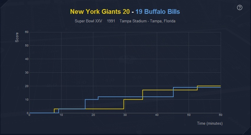
One such example is this effort, shown below, created by Phil Nottingham. This infographic allows users to view key statistics from every Super Bowl in NFL history, right back to Super Bowl I, where the Green Bay Packers beat the Kansas City Chiefs by 35 points to 10 at the Coliseum in 1967.
Interactivity is often key to the success of an infographic, particularly when it is not being used to communicate a news story. In this example, users can engage with the tool by choosing from which Super Bowl to view key statistics.
If you’re a Colts fan, simply select the team and you can then either dissect the defeat to the Saints, or scour the success over the Bears back in 2007. Alternatively, if you’re a neutral, or just want a more holistic experience, browse by year rather than team, and pore over any match-up from Super Bowl I to last year’s clash between the Packers and the Steelers.
For every year, a comprehensive list of statistics allows the user to see how the respective teams fared in offense and defense, with data shown for a whole host of factors, including rushing, first downs, fumbles and interceptions.
As well as the individual stats, users can get a clear idea of how a match progressed through the infographic’s main panel. Here, the teams’ scores are plotted over the course of the match, which provides a great way of reliving some of the great comebacks. Take Super Bowl XXV for example, where the chart shows the Giants’ yellow line well below the Bills’ line in the second quarter, but then soaring up and overtaking in the dying minutes.
Since the turn of the millennium, the number of people providing statistical analysis of sporting events has grown enormously, and below are two more of the Data Blog’s favourite sports infographics (they’re both from the world of football (soccer), but I assure you this is because of their brilliance, rather than any underlying bias):
- Using Tableau Public, Graham MacAree created this spectacularly detailed visual analysis of Chelsea FC’s match against Norwich on 27 August last year. Users can see exactly where each Chelsea player directed every one of their passes, at what point in the game each one was played and whether or not it was complete.
- The guys at Visual Evolution have put together this fascinating infographic illustrating the nationalities of football’s top 100 earners (based on their annual salaries), breaking the figures down to show – among other things – which leagues and clubs have most representatives in the top 100, the average age of the top earners and the number of homes Wayne Rooney could buy in his home district of Croxteth with his year’s pay packet.

