 Visualising data is important because it makes complicated information easy to process and understand.
Here I took some data from the Office for National Statistics website, www.ons.gov.uk. I chose to look at Hospital waiting times because it is an issue that is often reported on and I was curious as to which treatments had the longest waiting time.
I took the data and copied it into an Excel spreadsheet. I then cut it down to get rid of information that I didn’t need and that would confuse the user. I organised the data into columns, the first showing the type of treatment, the second the amount of completed treatments and operations and the third showing the average median waiting time in weeks.
I uploaded the cleaned data to Many Eyes, where you can create visualisations such as Bar Charts, Bubble Charts, Line Graphs, Stack Graphs, Pie Charts and Word Trees.
Using the right type of visualisation is important to make the data show as much information, in as clear a way as possible.
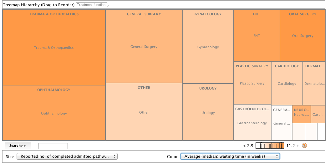
I chose to use a Treemap for Comparisons because it allows you to compare and contrast information and shows all data in proportion. In this case it means that I can demonstrate the amount of completed treatments for each type of illness alongside the average waiting time. Showing both of these ensures that the data is as informative and accurate as possible; a Treemap for Comparisons makes data comprehendible and allows the user to see the whole picture.
http://www-958.ibm.com/software/data/cognos/manyeyes/visualizations/new/treemap/dataabbbbbbb-3/1
My completed Treemap uses colour and boxes to show information. Each box is labelled as a certain type of hospital treatment. The darker the colour of the box the longer the waiting time and the larger the box the more completed treatments there have been. From this we can asertain that there has been more completed treatments for trauma and that it also has the longest waiting time.
The number of completed treatments and waiting time largely correlates, with longer waiting times for more widely used treatments, as expected. However this is not entirely the case, as neurosurgery, oral surgery and ear nose and throat surgery have few treatments but lengthy waiting times. This is interesting as neurosurgery is a serious category of treatment and there is no clear reason why it has a long waiting time. The data thus provokes further questions as to why some treatments have long waiting times even though few people are having them.
A Treemap for Comparisons is a good way of showing this as it enables the readers to see anomalies and thus the complete picture.
