This is what the best of data journalism looks like

This article was originally published on the Data Journalism Awards Medium Publication managed by the Global Editors Network. You can find the original version right here.

________________________________________________________________________________________________


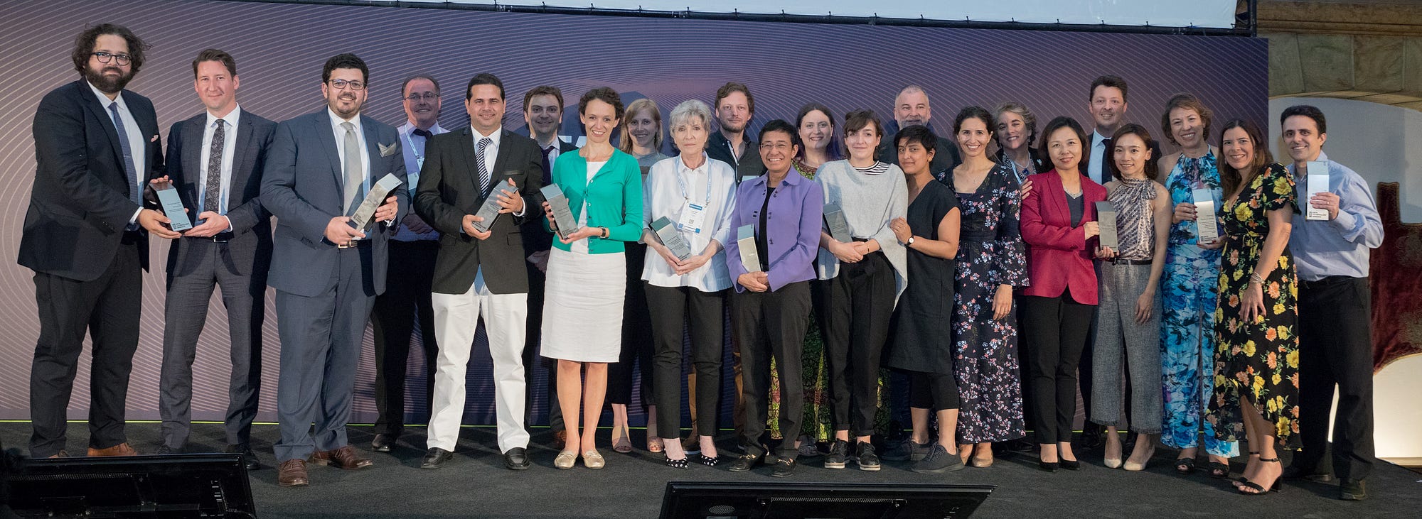
After a year of hard work, collecting and sifting through hundreds of data projects from around the world, the news is finally out. The thirteen winners (and one honourable mention) of the Data Journalism Awards 2018 competition were announced on 31 May in Lisbon. Together they are the best of what the world of data journalism had to offer in the past year. They also teach us a lot about the state of data journalism.


All of the work I have done over the past few months has given me a pretty good perspective of what’s going on in the world of data journalism. Managing the Data Journalism Awards competition is probably the greatest way to find out what everybody has been up to and to discover amazing projects from all over the world.

And today I want to share some of this with you! Most of the examples you will see in this article are projects that either won or got shortlisted for the Data Journalism Awards 2018 competition.

When a news organisation submits a project, they have to fill in a form asking them to describe their work, but also how they made it, what technology they used, what methodology… And all of this information is published on the website for everyone to see.

So if you‘re reading this article in the hope of finding some inspiration for your next project, as I am confident you are, then here is a good tip: on top of all of the examples I will show you here, you can take a look at all of the 630 projects from all over the world which were submitted this year, right on the competition website. You’re welcome.

So what have we learned this year by going through hundreds of data journalism projects from around the world? What are the trends we’ve spotted?


Data journalism is still spreading internationally

And this is great news. We see more and more projects from countries that have never applied before, and this is a great indicator of the way journalists worldwide, regardless of their background, regardless of how accessible data is in their country, regardless of how data literate they are, are trying to tell stories with data.


Some topics are more popular than others

One of the first things we look at when we get the list of projects each year, is what topics did people tackle? And what we’ve learned from that is that some topics are more attractive than others.

Whether that’s because it is just easier to find data on them, or it’s easier to visualise things related to those topics, or it’s just the kind of big stories that everyone expects to see data on each year, we can’t really know for all of them. It’s probably a good mixture of all of this.


The refugee crises

The first recurrent topic that we’ve seen this past year is the refugee crises. And a great example of that is this project by Reuters called ‘Life in the camps’, which won the award for Data visualisation of the year at the Data Journalism Awards 2018.

This graphic provided the first detailed look at the dire living conditions inside the Rohingya refugee camps in Cox’s Bazar. Using satellite imagery and data, the graphic documented the rapid expansion and lack of infrastructure in the largest camp cluster, Kutupalong. Makeshift toilets sit next to wells that are too shallow, contaminating water supply.

This project incorporates data-driven graphics, photo and video. Reuters gained access to data from a group of aid agencies working together to document the location of infrastructure throughout the Kutupalong camp by using handheld GPS devices on the ground. The graphics team recognised that parts of the data set could be used to analyse the accessibility of basic water and sanitation facilities. After some preliminary analysis, they were able to see that some areas had water pumps located too close to makeshift toilets, raising major health issues.

They displayed this information in a narrative graphic format with each water pump and temporary latrine marked by a dot and overlaid on a diagram of the camp footprint. They compared these locations to the U.N.’s basic guidelines to illustrate the potential health risks. Reuters photographers then used these coordinates to visit specific sites and document real examples of latrines and water pumps in close proximity to each other.

Technologies used for this project: HTML, CSS, Javascript, QGIS and Illustrator.


Elections/Politics

Next topic that came up a lot this year was politics, and more specifically, anything related to recent elections, not just in the US, but also in many other countries. One great example of that was the Data Journalism Awards 2018 ‘News data app of the year’ award winner, ‘The atlas of redistricting’, by FiveThirtyEight in the US.

There’s a lot of complaining about gerrymandering (the process of manipulating the boundaries of an electoral constituency so as to favour one party or class) and its effects on US politics. But a fundamental question is often missing from the conversation: What should political boundaries look like? There are a number of possible approaches to drawing districts, and each involves tradeoffs. For this project, the team at FiveThirtyEight looked at seven different redistricting schemes; and to quantify their tradeoffs and evaluate their political implications, they actually redrew every congressional district in the U.S. seven times. The Atlas of redistricting allows readers to explore each of these approaches — both for the nation as a whole and for their home state.

The scope of this project really makes it unique. No other news organization covering gerrymandering has taken on a project of this size before.

To make it happen, they took precinct-level presidential election results from 2012 and 2016 and reallocated them to 2010 Census voting districts. That enabled them to add more up-to-date political data to a free online redistricting tool called Dave’s Redistricting App. Once the data was in the app, they started the long process of drawing and redrawing all the districts in the country. Then, they downloaded their district boundaries from the app, analysed their political, racial and geometric characteristics, and ultimately evaluated the tradeoffs of the different redistricting approaches. Sources for data included Ryne Rohla/Decision Desk HQ, U.S. Census Bureau, and Brian Olson.

Technologies used for this project: Ruby, PostGIS, Dave’s Redistricting App, Node, D3


An other great example of how politics and elections were covered this year comes from the Financial Times. It is called ‘French election results: Macron’s victory in charts’ and was shortlisted for the Data Journalism Awards 2018 competition.

Let’s say it, elections are a must for all data news teams around the world. That’s probably the topic where the audience is the most used to seeing data combined with maps, graphics and analysis.

Throughout 2017 and 2018, the Financial Times became an expert in:

  • producing rapid-response overnight analyses of elections,
  • leveraging their data collection and visualisation skills to turn around insightful and visually striking reports on several elections across Europe,
  • responding faster than other news organisations both in the UK and even those based in the countries where these elections have taken place.

Over and above simply providing the top-line results, they have focused on adding insight by identifying and explaining voting patterns, highlighting significant associations between the characteristics of people and places, and the political causes they support.

To deliver this, the team developed highly versatile skills in data scraping and cleaning. They also have carried out ‘election rehearsals’ — practice runs of election night to make sure their workflows for obtaining, cleaning and visualising data were all polished, and robust to avoid any glitches that might come up on the night of the count.

The work has demonstrably paid off, with readers from continental Europe outnumbering those from Britain and the United States — typically far larger audiences for the FT — for the data team’s analyses of the French, German and Italian elections.

For each election, the team identified official data sources at the most granular possible level, with the guidance of local academic experts and the FT’s network of correspondents.

R scripts were written in advance to scrape the electoral results services in real time and attach them to the static, pre-sourced demographic data.

Scraping and analysis was primarily conducted in R, with most final projection graphics created in D3 — often adapting the Financial Times’ Visual Vocabulary library of data visualisation formats.

Technologies used for this project: R, D3.


Crime

The last topic that I wanted to mention that was also recurrent this past year is crime. And to illustrate this, I’ve picked a project called ‘Deaths in custody’ by Malaysiakini in Malaysia.

This is an analysis of how deaths in police custody are reported, something that various teams around the world have been looking at recently. The team at Malaysiakini compared 15 years of official police statistics with data collected by a human rights organisation, called Suaram. The latter is the sole and most comprehensive tracker of publicised deaths in police custody in the country.

The journalists behind this project found that overall, deaths in Malaysian police custody are underreported, with one in four deaths being reported to the media or to Suaram.

They also highlight the important role that families of victims play in holding the police accountable and pushing to investigate the deaths. They created an interactive news game and a guide on what to do if somebody is arrested, both of which accompany the main article, taking inspiration from The Uber game that the Financial Times developed in 2017.

The game puts players in the shoes of a friend who is entangled in a custodial dilemma between a victim and the police. Along the way, there are fact boxes that teach players about their rights in custody. The real-life case that the game is based on is revealed at the end of the game.

Technologies used for this project: Tabula, OpenRefine, Google Sheets, HTML, CSS, Javascript, UI-Kit Framework, Adobe Photoshop.


We’ve changed the way we do maps

Another thing that we’ve learned by looking at all these data journalism projects is that we have changed the way we do maps.

Some newsrooms are really getting better at it. Maps are more interactive, more granular, prettier too, and integrated as part of a narrative instead of standing on their own, making us think that more and more journalists don’t do maps for the sake of doing maps, but for good reasons.


An example of how data journalists have made use of maps this past year is this piece by the BBC called ‘Is anything left of Mosul?’

It is a visually-led piece on the devastation caused to Mosul, Iraq, as a result of the battle to rid the city of Islamic State (IS). The piece not only gives people a full picture of the devastating scale of destruction, it also connects them to the real people who live in the city — essential when trying to tell stories from places people may not instantly relate to.

It was also designed mobile-first, giving users on small screens the full, in-depth experience. The feature uses the latest data from Unosat, allowing the BBC team to map in detail which buildings had suffered damage over time, telling the narrative of the war through four maps.

The feature incorporates interactive sliders to show the contrast of life before the conflict and after — a way of giving the audience an element of control over the storytelling.

They also used the latest data from the UNHCR, which told them where and when displaced people in Iraq had fled to and from. They mapped this data using QGIS’ heatmapping software and visualised it using their in-house Google Maps Chrome extension. They produced three heatmaps of Mosul at different phases of the battle, again telling a narrative of how the fighting had shifted to residential targets as the war went on.

The project got nearly half a million page views over several days in English. They also translated the feature into 10 other languages for BBC World Service audiences around the world.

Technologies used for this project: QGIS mapping software, Microsoft Excel, Adobe Illustrator, HTML, CSS, Javascript, Planet satellite imagery, DigitalGlobe images


Another example of how the data journalism community has changed the way it does maps, is this interactive piece by the South China Morning Post called ‘China’s Belt and Road Initiative’.

The aim of this infographic is to provide context to the railway initiative linking China to the West.

They combined classic long-form storytelling with maps, graphs, diagrams of land elevations, infrastructure and risk-measurement charts, motion graphics, user interaction, and other media. The variety of techniques were selected to prevent the extensive data from appearing overwhelming. The split screen on the desktop version meant readers could refer to the route as they read the narrative.

We are not talking about boring static maps anymore. And this is an example of how new teams around the world, and not just in western countries, are aiming for more interactivity, and a better user journey through data stories, even when the topic is complex. It is thanks to the interactivity of the piece and the diversity of elements put together that the experience becomes enticing.

They used data from the Economist Intelligence Unit (EIU). Using Google Earth, they plotted and traced the path of each initiative to obtain height profiles and elevations to explain the extreme geographical environments and conditions.

Technologies used for this project: Adobe Creative Suite (Illustrator, Photoshop…), QGIS Brackets io Corel Painter, Microsoft Excel, Javascript, Canvas, JQuery, HTML, CSS — CSS3, Json, CSV, SVG.


New innovative data storytelling practices have arrived

Another thing we saw was that data teams around the world are finding new ways to tell stories. New innovative storytelling practices have arrived and are being used more and more.


Machine learning

It is probably the most used term in current conversations about news innovation. It has also been used recently to help create data-driven projects, such as ‘Hidden Spy Planes’ by BuzzFeed News in the US, the winner of the JSK Fellowships award for innovation in data journalism at this year’s Data Journalism Awards.

This project revealed the activities of aircrafts that their operators didn’t want to discuss, opening the lid on a black box of covert aerial surveillance by agencies of the US government, the military and its contractors, and local law enforcement agencies.

Some of these spy planes employed sophisticated surveillance technologies including devices to locate and track cell phones and satellite phones, or survey Wi-Fi networks.

Before these stories came out, most Americans would have been unaware of the extent and sophistication of these operations. Without employing machine learning to identify aircraft engaged in aerial surveillance, the activities of many of aircraft deploying these devices would have remained hidden.

In recent years, there has been much discussion about the potential of machine learning and artificial intelligence in journalism, largely centered on classifying and organising content with a CMS, on fact-checking for example.

There have been relatively few stories that have used machine learning as a core tool for reporting, which is why this project is an important landmark.

Technologies used for this project: R, RStudio, PostgreSQL, PostGIS, QGIS, PostGIS, OpenStreetMap



Drone journalism

Another innovative storytelling practice that we’ve noticed is drone journalism, and here is an example called ‘Roads to nowhere’ from The Guardian.

It is an investigation using drone technology, historical research and analysis, interviews, as well as photomosaic visualizations.

It was a project that specifically looked at infrastructure in the US and the root causes of how cities have been designed with segregation and separation as a fundamental principle. It shows through a variety of means how Redlining and the interstate highway system were in part tools to disenfranchise African-Americans.

People are still living with this segregation to this day.

Most of the photos and all of the videos were taken by drone in this project. This is innovative in that it is really the only way to truly appreciate some of the micro-scale planning decisions taken in urban communities throughout the US.

Technologies used for this project: DJI Mavic Pro drone, a Canon 5Diii camera to take the photos, Shorthand, Adobe Photoshop. Knightlab’s Juxtapos tool to make it come to life with the slide tool


AR

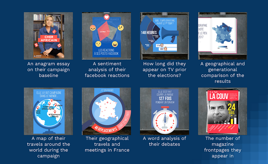
Another innovative technique that has a lot of people talking at the moment is Augmented Reality, and to illustrate this in the context of data journalism, I am bringing you this project called ExtraPol by WeDoData in France.

Extrapol is an augmented reality app (iOS and Android) that was launched a month before the French presidential campaign in April 2017. Everyday, official candidates posters could be turned into new live data visualisations to inform the audience on the candidates. This data journalism project treated 30 topics in data such as: their geographical travels in France during the campaign, the cumulated number of years they have ruled a political mandate, etc.

This is probably the first ephemeral daily data journalism news app which uses augmented reality. This was the first time that real life materials, the official candidates posters, were ‘hacked’ to fact news on the politicians.

Technologies used for this project: Python, Javascript, HTML, CSS, PHP, jsFeat, TrackingWorker, Vuforia, GL Matrix, Open CV, Three.js, Adobe Illustrator, After Effect and Photoshop


Newsgames

They aren’t a new trend, but more and more newsrooms are playing with this. And this example, called ‘The Uber Game’ by the Financial Times in the UK, has been a key player in the field this year, inspiring news teams around the world…

This game puts you into the shoes of a full-time Uber driver. Based on real reporting, including dozens of interviews with Uber drivers in San Francisco, it aims to convey an emotional understanding of what it is like to try to make a living in the gig economy.

It is an innovative attempt to present data reporting in a new, interactive format. It was the third-most read by pageviews throughout 2017.

Roughly two-thirds of people who started the game finished it — even though this takes around 10 minutes and an average of 67 clicks.

Technologies used for this project: Ink to script the game, inkjs, anime.js, CSS, SCSS, NodeJS, Postgres database, Zeit Micro, Heroku 1X dynos, Standard-0 size Heroku Postgres database, Framer, Affinity Designer


Collaborations are still a big thing

And many organisations worldwide have had a go at it, in many regions around the world.

Paradise Papers

Of course we have the Paradise Papers investigation (pictured above) coordinated by the ICIJ with 380 journalists worldwide.

Based on a massive leak, it exposes secret tax machinations of some of the world’s most powerful people and corporations. The project revealed offshore interests and activities of more than 120 politicians and world leaders, including Queen Elizabeth II, and 13 advisers, major donors and members of U.S. President Donald J. Trump’s administration. It exposed the tax engineering of more than 100 multinational corporations, including Apple, Nike, Glencore and Allergan, and much more.

If you want to know more about how this was done, go to the Data Journalism Awards 2018 website where that information is published.

The leak, at 13.4 million records, was even bigger in terms of the number of records than the Panama Papers, and technically even more complex to manage.

The record set came from an array of sources from 19 secrecy jurisdictions. It also contained more than 110,000 files in database or spreadsheet formats (excel, CSVs and SQL). ICIJ’s data unit used reverse-engineering techniques to reconstruct corporate databases. The team scraped the records in the files and created a database with information of companies and individuals behind them.

The team then used ‘fuzzy matching’ techniques and other algorithms to compare the names of the people and companies in all these databases to lists of individuals and companies of interest, including prominent politicians and America’s 500 largest publicly traded corporations.


Technologies used for this project:

  • For data extraction and analysis: Talend Open Studio for Big Data, SQL Server, PostgreSQL, Python (nltk, beautifulsoup, pandas, csvkit, fuzzywuzzy), Google Maps API, Open Street Maps API, Microsoft Excel, Tesseract, RapidMiner, Extract
  • For the collaborative platforms: Linkurious, Neo4j, Apache Solr, Apache Tika, Blacklight, Xemx, Oxwall, MySQL and Semaphor.
  • For the interactive products: JavaScript, Webpack, Node.js, D3.js, Vue.js, Leaflet.js and HTML.
  • For security and sources protection: GPG, VeraCrypt, Tor, Tails, Google Authenticator, SSL (client certificates) and OpenVPN.


Monitor da violencia

Now here is an other collaborative project that you may not know of but is also quite impressive. It is called ‘Monitor da Violencia’, and it won the Microsoft award for public choice at this year’s Data Journalism Awards. It was done by G1 in Brazil, in collaboration with the Center for the Study of Violence at University of São Paulo (the largest university in Brazil) and the Brazilian Forum of Public Security (one of the most respected public security NGOs in Brazil).

This project is an unprecedented partnership which tackles violence in Brazil. To make it possible, G1 staff reporters all over Brazil kept track of violent deaths through the course of one week. Most of these are crimes that generally become forgotten — cases of homicides, robberies, deaths by police intervention, and suicides. There were 1,195 deaths in this period — one every 8 minutes on average.

All these stories have been cleared and written by more than 230 journalists spread throughout Brazil. This is a small sample — compared to the 60,000 annual homicide rate — but it represents a picture of the violence in Brazil.

The project aims at showing the faces of the victims; trying to understand the causes of this epidemic of deaths. As a first step, a news piece was written for each one of the violent deaths. An interactive map, complete with search filters, showed the locations of the crimes as well as the victim’s photos.

The second step was a collective and collaborative effort to find the names of unidentified people. A campaign was launched, including online, on TV and social media, so that people could help identify many of the victims.

A database was assembled from scratch, containing information such as the victims’ name, age, race, and gender. Also, the day, time, weapon used, and the exact location of the crime, among others.

Technologies used for this project: HTML, CSS, Javascript, Google Sheets, CARTO


Onwards and upwards for data journalism in 2018

The jury of the Data Journalism Awards, presided over by Paul Steiger, selected 13 winners (and one honorable mention) out of the 86 finalists for this year’s competition, and you can find the entire list, accompanied by comments from jury members, on the Data Journalism Awards website.

The insights I’ve listed in this article today show us that not only is the field ever-growing, it is also more impactful than ever, with many winning projects bringing change in their country.

Congratulations again to all of the winners, shortlisted projects, but also to all the journalists, news programmers, and NGOs pushing boundaries so that hard-to-reach data becomes engaging and impactful projects for news audiences.


The competition, organised by the Global Editors Network, with support from the Google News Initiative, the John S. and James L. Knight Foundation, Microsoft, and in partnership with Chartbeat, received 630 submissions of the highest standards from 58 countries.

Now in its seventh year, the Data Journalism Awards was launched in 2012. In the first edition, it received close to 200 projects. Over the years it has grown to become the first international awards recognising outstanding work in the field of data journalism, receiving the highest amount of submissions in the history of the competition in 2018.



marianne-bouchart

Marianne Bouchart is the founder and director of HEI-DA, a nonprofit organisation promoting news innovation, the future of data journalism and open data. She runs data journalism programmes in various regions around the world as well as HEI-DA’s Sensor Journalism Toolkit project and manages the Data Journalism Awards competition.

Before launching HEI-DA, Marianne spent 10 years in London where she worked as a web producer, data journalism and graphics editor for Bloomberg News, amongst others. She created the Data Journalism Blog in 2011 and gives lectures at journalism schools, in the UK and in France.


From Asia and beyond: experts discuss data journalism challenges

This article was originally published on the Data Journalism Awards Medium Publication managed by the Global Editors Network. You can find the original version right here.

___________________________________________________________________________________________________________________


How easy (or difficult) is it to access data in China, Malaysia, Kenya, and other countries? Are there tested business models for data journalism in different parts of the world? How do you promote data literacy in newsrooms where innovation is not a priority? We’ve gathered international experts to tackle those questions, and discuss government interference, the pace of learning, and managerial issues.


Darren Long, head of graphics at South China Morning Post (Hong Kong), Kuek Ser Kuang Keng from Data N and former Google fellow at PRI (Malaysia), Eva Constantaras, Google Scholar from Internews and expert in data journalism for Africa, Asia and South America (originally from Greece), and Yolanda Ma from Data Journalism China, also jury member of the Data Journalism Awards competition (China), all joined us, as well as participants from other countries.


From left to right: Darren Long, Yolanda Ma, Eva Constantaras and Kuek Ser Kuang Keng


How widespread would you say data journalism is in your region?


Kuek Ser Kuang Keng: People like to see Southeast Asia as a ‘region’ but the fact is countries in this region are very diverse in terms of development stage, politics, and technology. So there’s no way to generalise them.

In Malaysia, my own country, data journalism is almost non-existent; there are only infographics. There is a strong interest among a small group of journalists, but they lack support from editors and management, who focus more on social media. Innovation in journalism is not prioritised. In neighbouring countries, such as Indonesia and the Philippines, things might be a little better, but they are still relatively far behind the West. In non-democratic countries where free press is always under siege like Cambodia, Vietnam, Laos, and Thailand, the landscape is totally different. There, the survival of independent journalism is above all other things like innovation.

Darren Long: It’s a good point. I was going to say Europe and America can feed off each other through the use of English language and a common Roman script whereas Asia is much more diverse. Press freedom is certainly an issue. Even in Hong Kong where we have a feisty and largely free press.

Visual journalism and the use of data is a good way to avoid government interference though. If you can use data to make your point from government sources, there is little they can criticise. The problem is getting public and government data. It is very hard to get consistent and reliable sources from Mainland China.


Yolanda Ma: In mainland China, since data journalism was introduced five years ago, it has been widely accepted and adopted by media organisations, from official newspapers to commercialised online portals. The development is limited due to the cost (both technical and human resources). It is more recognised by the industry than by the public.

Eva Constantaras: My specialty is introducing data journalism in countries where it basically doesn’t exist. General trends I see are: publishers get excited because it sounds digital and visual and sexy, mid-level editors and senior reporters are in denial about digital convergence and are afraid of it so don’t want to know anything about it, and early career journalists are excited about it for three reasons: 1. They want to still have a job once digital convergence happens 2. They think data visualisation looks fun and 3. (least common) they see how data can enrich their public interest reporting by making their stories more analytical.


How accessible is public data in your country? What advice do you have on how to access data (public or else)?


Darren Long: We have freedom of information but it’s a fine line.

Here are some useful websites: Open Data Hong Kong, Data.gov.hk and N3Con 2018.

Kuek Ser Kuang Keng: There’s no FOI in Malaysia, Singapore and other non-democractic Southeast Asian countries but it exists in Indonesia and the Philippines. While sensitive information is not available, Malaysia and Singapore governments do publish a lot of data online. Both countries have a dedicated open data portal and relevant policies.

However media in both countries don’t have a strong demand for government data nor the skill, knowledge, and habit to use data in their reporting. The main demand comes from the business/IT community which is adopting business analytics very fast. So before talking about accessing any data, there need to be awareness, skill, and knowledge within newsrooms on data journalism. It seems like this awareness is higher in Indonesia and the Philippines. There’s a specialised business data news startup in Indonesia called Katadata, that you may want to check out:


Eva Constantaras: The first excuse I get from journalists for not doing data journalism is that there isn’t enough data. In all the countries I have been in, I would not say that is among even the top 3 challenges. And partially that’s because nobody has ever used the little data there is, so they need to build up demand in order for more data to be released. The biggest challenge is finding journalists who are willing to abandon their jobs as stenographers and embrace their role as knowledge producers. This is not a problem data or technology can solve.

Darren Long: I agree with that. I find a lot of the problem is more about thinking how to visualise data in a creative manner than the non-existence of data.

Yolanda Ma: People usually have the impression that China doesn’t have much data but the reality is quite the opposite. There is tons of data, just not well published and usually unstructured. Sometimes the data is inaccurate and not reliable. There is a FOI regulation and media do use it for stories, but less for data.

But things are getting better, compared with five years ago. In China more data is released (effort has been made to convince government and also help them to get it right), the open data movement is still on and pushing for better data culture, especially collaboration between universities, companies, government, but also NGOs and citizens.


What are the main challenges data journalists face in your region?


Eva Constantaras: I think journalists underestimate the work that goes into a data story. It’s not enough to just use data to reveal the problem because of the ubiquity of corruption in so many countries. For a story to have an impact and get people’s attention, it has to measure the problem, the causes, the impact on citizens and potential solutions. That’s more work than journalists are used to. Many journalists just want to make visualisations. I tell them visualisations are the paint on the house. Their house can be a beautiful colour but if their analysis is bad, their structure is unsound, their pretty house will fall down.

Darren Long: Technology has been an issue for us. We have to create our infographics outside the company CMS and redirect the page. If we weren’t so stubborn we would have given up long ago

Kuek Ser Kuang Keng: Newsroom managers don’t have much awareness of data journalism and the digital disruption has put news companies in a tough position financially. The limited resources that news companies can allocate have been put into ‘hot’ fields like social media and video. A good number of journalists are eager to learn new skills but they don’t get much support to pick up new skills and put those skills into use. I wish technology was an issue in Malaysia. We don’t even have data or interactive team in newsrooms here. I’m the only data journalist in Malaysia.

Yolanda Ma: Talent is an issue everywhere, but the challenge beyond that is the cost — the cost to develop the skills and to maintain such a team in the newsroom. Many data stories in China are now going video or motion graphics as well to stay aligned with consumer trends.

Here is an example of data journalism on TV:


Parcels from Faraway Places (subtitles in English)


How do you overcome these challenges? What creative solutions could we find for them?


Kuek Ser Kuang Keng: How to overcome? I find the main hurdle lies with managers and editors, so I would approach them to provide them a better understanding of data journalism — the potential, impacts and costs, or talent needed. Another good way is to build networks among journalists who share the same interests, so they can support each other, and exchange ideas on how to convince their bosses.

Money is a huge problem in Malaysia. The digital disruption has put news companies in a tough position financially. They want something that can see quick returns, often financially

Eva Constantaras: I think we have to abandon the myth that learning data journalism is ‘fast’, something that can be picked up at a bootcamp. Someone should do a data study of how many data journalists come out of bootcamps. And how many statistically unsound stories came out by the few who did manage to produce a data story.

We want data journalism to be taken seriously so we need a serious approach to capacity building. I have a 200-hour training and production model bringing together journalists, civic hackers, and CSOs with data that has worked in a couple of countries but usually because we found committed journalists who were willing to be the lone data journalist in their newsroom. And we do a lot of outreach and convincing of editors and publishers.


Are there any tested business models (other than grants) for data journalism in developing countries?


Question from Stephen Edward (Astat Consulting, India)

Kuek Ser Kuang Keng: Unfortunately, not that I know of, but you can keep a watch on Katadata, a specialised data business news startup in Indonesia. They will increase their monetisation efforts soon.

Eva Constantaras: The only media outlet in a developing country that really sees a lot of revenuee coming from their data work is Nation Newsplex in Kenya, and part of that is because the Nation Media Group can repurpose the online data content for two different print publications and their television station. It’s still a very small team.


Donor support is also often not well structured. They want to give data reporting grants in countries without data reporters. Or they want to give funding for one-off projects that then die a slow death. It’s expensive to train and sustain a data team and most donors don’t make that investment.

Yolanda Ma: One business model that a newsroom is trying (not proved yet) is the think tank approach — they really specialised in urban data, so by digging into data and finding trends, they can actually provide the product for policy makers, urban design industry, etc.

When one data team do very well within the news organisations — another way to go is to spin off. Caixin’s former data head set up his own company last year and it provides service to other media organisations on data stories production now.

The good thing about spinning off is that you do not need to only do journalism projects — which are usually not that profitable. But by being independent you can do commercial projects as well.

Eva Constantaras: The nice thing about spinning off is also then data content can be distributed through a variety of popular media and reach a larger audience.


What can we do to get more high quality data journalism projects from the Global South? And, given that it is harder for the Global South to compete with the Global North, is there a way to build more recognition for the south?


Question from Ben Colmery (ICFJ Knigt Felllowships director, USA)

Yolanda Ma: There are some quite high quality data journalism projects in the South and they don’t have to compete with the North.

Kuek Ser Kuang Keng: As I mentioned earlier, there are far less reporting about the innovations including data journalism projects done by news organisation in Asia. We don’t have Nieman Lab or Poynter here (fortunately we still have djchina.org but it is in Chinese). There are good projects, often done in tough environment, but they don’t get much attention outside of their own country. I can see more and more projects from Latin America were featured in journalism portals but that kind of treatment has not reached Asia. However, language remains a challenge.

Eva Constantaras: I am not sure why they would need to compete since they have different audiences. Though one revenue model I am very interested in is encouraging Western media outlets to buy content from data journalists in the Global South instead of parachutting in their own expensive journalists who do superficial stories.

I think now the West has realized that it needs to do more data-driven reporting on the local level for rural and less educated audiences about issues they care about. I think that the value of data journalism in developing countries is exposing the roots of inequality and helping citizens make better decisions and push for a more accountable government on a local level. Those projects don’t have to be flashy. They just have to be effective and accurate.

Darren Long: I think what international news outlets do well is broad comparative visualisations based around strong concepts. I think we tend to over rely on charts and graphics in Asia.

What is interesting right now is how a market like China has incredibly deep reach through mobile phones. Massive markets do everything on their phone. The tier one cities are easily as sophisticated as the West in that area.

So if we can leverage consumption of dataviz on mobile there should be a massive appetite


Can you share one tip you wish you’d been given about data journalism in the region you work in?


Yolanda Ma: I’d say, in Asia, do start looking for opportunities for cross-border data stories.

Eva Constantaras: Identify questions that citizens need answered to improve their quality of life and build your data stories around answering those questions.

Kuek Ser Kuang Keng: Data journalism takes time and patience. Visualisation is usually the quickest and easiest part!

Yolanda Ma: To echo Eva’s point — yes, don’t just produce meaningless fancy visuals.


Examples of data journalism from around the world that you should go and check out:


Darren Long: The Singapore Reuters office is producing some stunning multimedia data visualisations.

Here’s one they did on the oil spill off China:


But they have international resources and can recruit from all over the world

Here’s an example of a story we did at South China Morning Post. The data was from the government, but they didn’t like the story. If you click on our source, the page opens with a great big disclaimer they added after we didnt take our page down:


The map itself is still up:


A few more that I like:


Kuek Ser Kuang Keng: Tempo is a highly respectable magazine in Indonesia that produces great investigative reports. But most of their data journalism projects are on print. Here’s a deck shared by their editor-in-chief that showcase some of their data stories.


Malaysiakini is also working hard in data journalism. I recently collaborated with them to produce the first newsgame in Malaysia. It explains the issue of malapportionment in Malaysian election system.


Yolanda Ma: Here is a deck I made on data journalism in China a year ago — it serves as a good overview for anyone who’s interested:


Other organisations from China you should check out: Caixin, the Paper/SixthTone, Yicai, DT.

I like IndiaSpend in India and Katadata in Indonesia too.

Eva Constantaras: Here’s an example of a story that might have been risky without government data:


Some of my favourites are IndiaSpend and Hindustan Times in India, Daily Nation Newsplex in Kenya, Ojo Publico in Peru and both La Nacion Argentia and Costa Rica.

Kuek Ser Kuang Keng: I agree with Yolanda and Eva, at the reporter level, a good number of journalists are eager to learn a new skill but they don’t get much support from editors or managers to pick up new skills and put those skills into use.

I would recommend Rappler in the Philippines, Katadata and Tempo in Indonesia. But only Katadata has a dedicated vertical for data stories


To see the full discussion, check out previous ones and take part in future ones, join the Data Journalism Awards community on Slack!

Over the past six years, the Global Editors Network has organised the Data Journalism Awards competition to celebrate and credit outstanding work in the field of data-driven journalism worldwide. To see the full list of winners, read about the categories, join the competition yourself, go to our website.


marianne-bouchart

Marianne Bouchart is the founder and director of HEI-DA, a nonprofit organisation promoting news innovation, the future of data journalism and open data. She runs data journalism programmes in various regions around the world as well as HEI-DA’s Sensor Journalism Toolkit project and manages the Data Journalism Awards competition.

Before launching HEI-DA, Marianne spent 10 years in London where she worked as a web producer, data journalism and graphics editor for Bloomberg News, amongst others. She created the Data Journalism Blog in 2011 and gives lectures at journalism schools, in the UK and in France.

Discussing the ethics, challenges, and best practices of machine learning in journalism

This article was originally published on the Data Journalism Awards Medium Publication managed by the Global Editors Network. You can find the original version right here.

___________________________________________________________________________________________________________________


Peter Aldhous of BuzzFeed News and Simon Rogers of the Google News Initiative discuss the power of machine learning in journalism, and tell us more about the groundbreaking work they’ve done in the field, dispensing some tips along the way.


Machine learning is a subset of AI and one of the biggest technology revolutions hitting the news industry right now. Many journalists are getting excited about it because of the amount of work they could get done using machine learning algorithms (to scrape, analyse or track data for example). They enable them to do tasks they couldn’t before, but it also raises a lot of questions about ethics and the ‘reliance on robots’.


BuzzFeed’s ‘Hidden Spy Planes


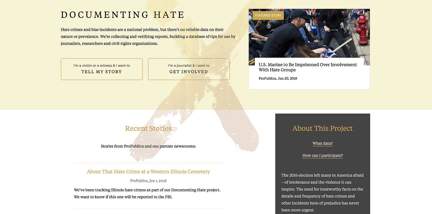
Peter Aldhous is the brain behind BuzzFeed News’s machine learning project ‘Hidden Spy Planes’. The investigation revealed how US airspace is buzzing with surveillance aircraft operated for law enforcement and the military, from planes tracking drug traffickers to those testing new spying technology. Simon Rogers is data editor for Google (who’s also been contributing to some great work on machine learning, including ProPublica’s Documenting Hate project which provides trustworthy facts on the details and frequency of hate crimes).

We asked both of them to sit down for a chat on the Data Journalism Awards Slack team.


What is it about AI that gets journalists so interested? How can it be used in data journalism?

Peter Aldhous: I think the term AI is used way too widely, and is mostly used because it sounds very impressive. When you say ‘intelligence’, mostly people think of higher human cognitive functions like holding a conversation, and sci-fi style androids.

But as reporters, we’re often interested in finding the interesting things from a mass of data, text, or images that’s too big to go through manually. That’s something that computers, trained in the right way, can do well.

And I think machine learning is a much more descriptive and less pretentious label for that than AI.

Simon Rogers: There is a big gap between what we’ve been doing and the common perception of self aware machines. I look at it as getting algorithms to do some of the more tedious work.


Why and when should journalists use machine learning?

P.A.: As a reporter, only when it’s the right tool for the job — which likely means not very often. Rachel Shorey of The New York Times was really good on this in our panel on machine learning at the NICAR conference in Chicago in March 2018.

She said things that have solved some problems almost as well as machine learning in a fraction of the time:

– Making a collection of text easily searchable;

– Asking a subject area expert what they actually care about and building a simple filter or keyword alert;

– Using standard statistical sampling techniques.


What kind of ethical/security issues does the use of machine learning in journalism rise?

P.A.: I’m very wary of using machine learning for predictions of future events. I think data journalism got its fingers burned in the 2016 election, failing to stress the uncertainty around the predictions being made.

There’s maybe also a danger that we get dazzled by machine learning, and want to use it because it seems cool, and forget our role as watchdogs reporting on how companies and government agencies are using these tools.

I see much more need for reporting on algorithmic accountability than for reporters using machine learning themselves (although being able to do something makes it easier to understand, and possible to reverse engineer.)

If you can’t explain how your algorithm works to an editor or to your audience, then I think there’s a fundamental problem with transparency.

I’m also wary of the black box aspect of some machine learning approaches, especially neural nets. If you can’t explain how your algorithm works to an editor or to your audience, then I think there’s a fundamental problem with transparency.

S.R.: I agree with this — we’re playing in quite an interesting minefield at the moment. It has lots of attractions but we are only really scratching the surface of what’s possible.

But I do think the ethics of what we’re doing at this level are different to, say, developing a machine that can make a phone call to someone.


‘This Shadowy Company Is Flying Spy Planes Over US Cities’ by BuzzFeed News


What tools out there you would recommend in order to run a machine learning project?

P.A.: I work in R. Also good libraries in Python, if that’s your religion. But the more difficult part was processing the data, thinking about how to process the data to give the algorithm more to work with. This was key for my planes project. I calculated variables including turning rates, area of bounding box around flights, and then worked with the distribution of these for each planes, broken into bins. So I actually had 8 ‘steer’ variables.

This ‘feature engineering’ is often the difference between something that works, and something that fails, according to real experts (I don’t claim to be one of those). More explanation of what I did can be found on Github.


There is simply no reliable national data on hate crimes in the US. So ProPublica created the Documenting Hate project.


S.R.: This is the big change in AI — the way it has become so much easier to use. So, Google hat on, we have some tools. And you can get journalist credits for them.

This is what we used for the Documenting Hate project:


It also supports a tonne of languages:


With Documenting Hate, we were concerned about having too much confidence in machine learning ie restricting what we were looking for to make sure it was correct.

ProPublica’s Scott Klein referred to it as an ‘over eager student’, selecting things that weren’t right. That’s why our focus is on locations and names. Even though we could potentially widen that out significantly

P.A.: I don’t think I would ever want to rely on machine learning for reporting. To my mind, its classifications need to be ground-truthed. I saw the random forest model used in the ‘Hidden Spy Planes’ story as a quick screen for interesting planes, which then required extensive reporting with public records and interviews.


What advice do you have for people who’d like to use machine learning in their upcoming data journalism projects?

P.A.: Make sure that it is the right tool for the job. Put time into the feature engineering, and consult with experts.

You may or may not need subject matter expert; at this point, I probably know more about spy planes than most people who will talk about them, so I didn’t need that. I meant an expert in processing data to give an algorithm more to work with.

Don’t do machine learning because it seems cool.

Use an algorithm that you understand, and that you can explain to your editors and audience.

Right tool for the job? Much of the time, it isn’t.

Don’t do this because it seems cool. Chase Davis was really good in the NICAR 2018 panel on when machine learning is the right tool:

  • Is our task repetitive and boring?
  • Could an intern do it?
  • If you actually asked an intern to do it, would you feel an overwhelming sense of guilt and shame?
  • If so, you might have a classification problem. And many hard problems in data journalism are classification problems in disguise.

We need to do algorithmic accountability reporting on ourselves! Propublica has been great on this:


But as we use the same techniques, we need to hold ourselves to account

S.R.: Yep — this is the thing that could become the biggest issue in working with machine learning.


What would you say is the biggest challenge when working on a machine learning project: the building of the algorithm, or the checking of the results to make sure it’s correct, the reporting around it or something else?


P.A.: Definitely not building the algorithm. But all of the other stuff, plus feature engineering.

S.R.: We made a list:

  • We wanted to be sure, so we cut stuff out.
  • We still need to manually delete things that don’t fit.
  • Critical when thinking about projects like this — the map is not the territory! Easy to conflate amount of coverage with amount of hate crimes. Be careful.
  • Always important to have stop words. Entity extractors are like overeager A students and grab things like ‘person: Man’ and ‘thing: Hate Crime’ which might be true but aren’t useful for readers.
  • Positive thing: it isn’t just examples of hate crimes it also pulls in news about groups that combat hate crimes and support vandalized mosques, etc.

It’s just a start: more potential around say, types of crimes.

I fear we may see media companies use it as a tool to cut costs by replacing reporters with computers that will do some, but not all, of what a good reporter can do, and to further enforce the filter bubbles in which consumers of news find themselves.


Hopes & wishes for the future of machine learning in news?

P.A.: I hope we’re going to see great examples of algorithmic accountability reporting, working out how big tech and government are using AI to influence us by reverse engineering what they’re doing.

Julia Angwin and Jeff Larson’s new startup will be one to watch on this:


I fear we may see media companies use it as a tool to cut costs by replacing reporters with computers that will do some, but not all, of what a good reporter can do, and to further enforce the filter bubbles in which consumers of news find themselves.

Here’s a provocative article on subject matter experts versus dumb algorithms:


Peter Aldhous tells us the story behind his project ‘Hidden Spy Planes’:

‘Back in 2016 we published a story documenting four months of flights by surveillance planes operated by FBI and Dept of Homeland Security.

I wondered what else was out there, looking down on us. And I realised that I could use aspects of flight patterns to train an algorithm on the known FBI and DHS planes to look for others. It found a lot of interesting stuff, a grab bag of which mentioned in this story.

But also, US Marshals hunting drug cartel kingpins in Mexico, and a military contractor flying an NSA-built cell phone tracker.’


Should all this data be made public?

Interestingly, the military were pretty responsive to us, and made no arguments that we should not publish. Certain parts of the Department of Justice were less pleased. But the information I used was all in the public, and could have been masked from flight the main flight tracking sites. (Actually DEA does this.)

US Marshals operations in Mexico are very controversial. We strongly feel that highlighting this was in the public interest.


About the random forest model used in BuzzFeed’s project:

Random forest is basically a consensus of decision tree statistical classifiers. The data journalism team was me, all of the software was free and open source. So it was just my time.

The machine learning part is trivial. Just a few lines of code.


If you had had a team to help with this, what kinds of people would you have included?

Get someone with experience to advise. I had excellent advice from an academic data scientist who preferred not to be acknowledged. I did all the analysis, but his insights into how to go about feature engineering were crucial.


marianne-bouchart

Marianne Bouchart is the founder and director of HEI-DA, a nonprofit organisation promoting news innovation, the future of data journalism and open data. She runs data journalism programmes in various regions around the world as well as HEI-DA’s Sensor Journalism Toolkit project and manages the Data Journalism Awards competition.

Before launching HEI-DA, Marianne spent 10 years in London where she worked as a web producer, data journalism and graphics editor for Bloomberg News, amongst others. She created the Data Journalism Blog in 2011 and gives lectures at journalism schools, in the UK and in France.

A data journalist’s guide to sports data

The Winter Olympics 2018 in PyeongChang, South Korea, are just a few weeks away, and the football world cup 2018 is not far off either. While many journalists around the world are preparing their coverage, we wonder: how do you get ready for these big sporting events? What’s the difference between a sports data journalism project and any other data project? Where do you find data and analytics on this topic?


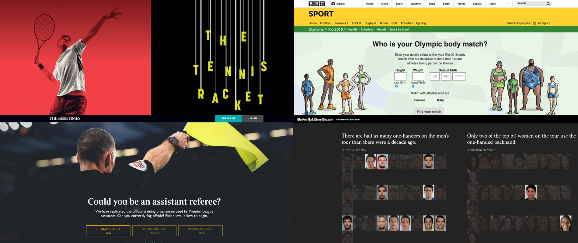
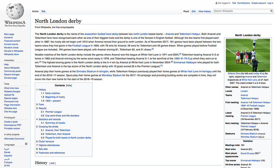
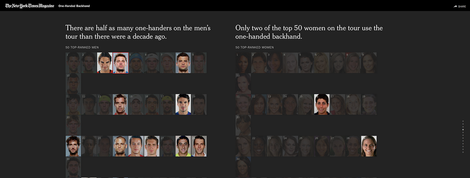
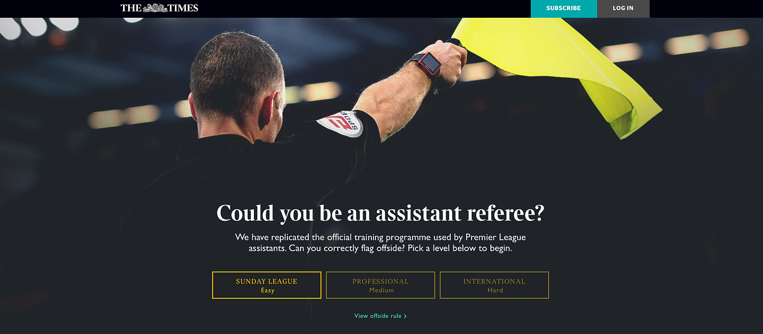
From top left, clockwise: ‘The Tennis Racket’ project by BuzzFeed News, ‘Who is your Olympic body match?’ by the BBC, the ‘One-handed backhand’ project by The New York Times, and ‘Could you be an assistant referee?’ by The Times.


We’ve gathered four experts from both sides of the pond to answer these questions and share tips on how to best work with sports data in the newsroom.

Steve Doig from ASU’s Cronkite School of Journalism (US), Paula Lavigne from ESPN (US), Nassos Stylianou from the BBC (UK), and Malcolm Coles, digital publishing strategy consultant, formerly with the Telegraph and the Trinity Mirror (UK), all joined the conversation. Here is a compilation of what we’ve learned.


The main differences between sports data and other types of data

All our experts agreed that working with sports data is a little different from working with any other types of data.

Here are the four main differences they pointed out during our discussion:

  • You don’t have to have a public records fight to get it
  • The problem with sports data is that there’s such a flood of it that people are still trying to find ways to get good signal out of all the noise
  • The data is often very granular (up-to-the-minute data, or even up-to-the-second data, is quite common)
  • Fans have a huge interest in it

“Sports is the one part of a news organisation where the consumers really care about numbers. It’s a lot harder to sell a data story in other news contexts,” Steve Doig (ASU’s Cronkite School of Journalism, US).

The fastest 100m times ever. Those caught doping struck out in red.

— @jonbir90


As the example above shows, there’s a whole data ecosystem of what you can call the ‘obsessed fans’, some of whom ‘have gone on to create viable business models of gathering and adding value to the raw data’, Doig argued.


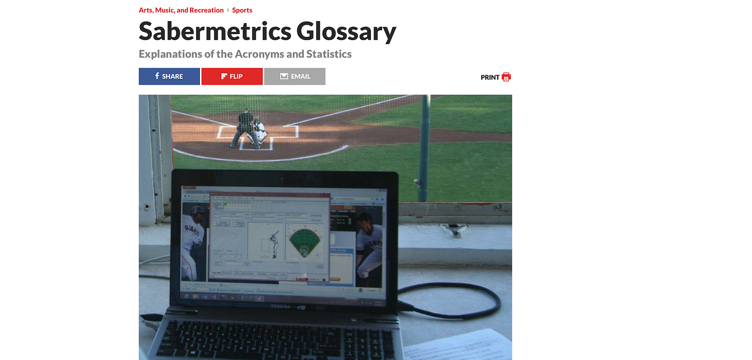
Steve Doig shared with us this glossary of some “moneyball” metrics that have been created, often by fans rather than the pros themselves


Where do you find sports data?

“In the US, certainly, the major pro sports leagues have opened up their data streams to just about anyone…and much of it can be played with using simple computer tools like Excel,” Steve Doig (ASU’s Cronkite School of Journalism, US).


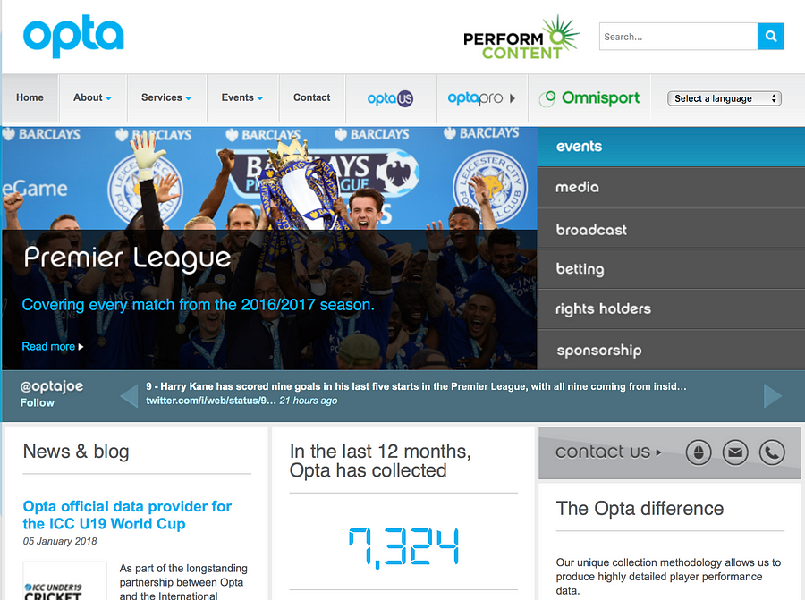
Opta

Opta is the world’s leading live, detailed sports data provider. A lot of their stats are proprietary, but a lot of news organisations in the world have agreements with them.


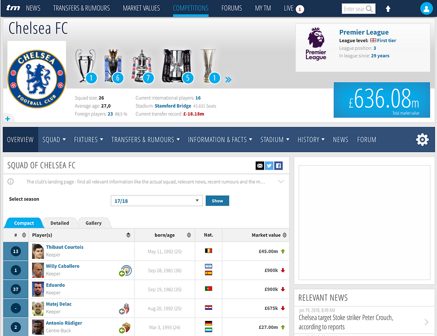
Transfermarkt

Transfermarkt is a German-based website owned by Axel Springer that has footballing information, such as scores, results, statistics, transfer news, and fixtures.


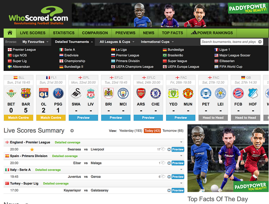
WhoScored

WhoScored brings you live scores, match results and player ratings from the top football leagues and competitions.


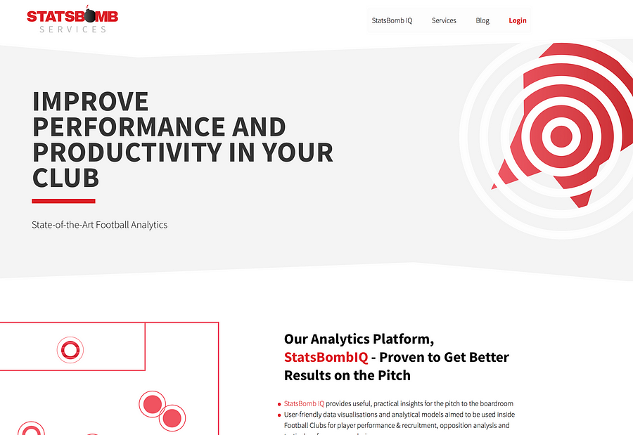
Statsbomb Services

Many clubs are interested in incorporating statistics into their workflow, but few have the staff who know where to start. StatsBomb Services organises and parses all the data, delivers cutting edge visualisations and analysis, and is totally useful to journalists too.


Sport-reference websites (US)

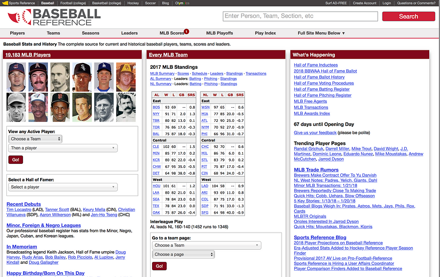
In the US, a good source of data are the various *-Reference.com sites, with the asterisk filled in with the name of the sport, like baseball and pro football (American style).


CIES Football Observatory

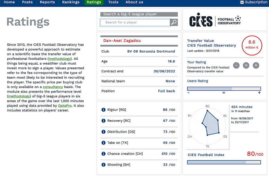
Since 2013, the CIES Football Observatory has developed a powerful approach to estimate the transfer value of professional footballers on a scientific basis.


NBA Stats

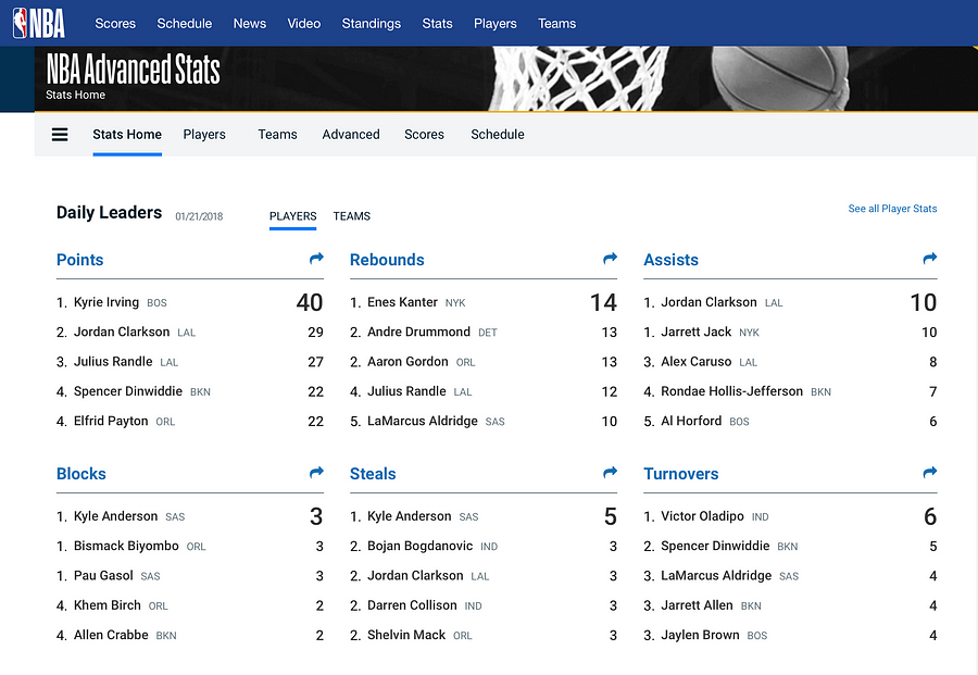
The leagues themselves, such as the NBA, supply data on players, teams, scores, lineups, and more.


ESPN Cricinfo

For cricket data, ESPN cricinfo is fantastic. It gathers very granular information on all matches and series from the past few years, ordered by country or by team.


Wikipedia

Scroll down Wikipedia pages and they often have tables of data that you can grab.


Where do you find olympics data?

When it comes to the Olympic Games it is usually the Olympics Data Feed that has all the data:


The Olympic Data Feed is used by many news organisations worldwide


Alternatively, you can always look at Wikipedia, where a lot of data tables are available. For example, here is a table about the 100 metres at the Olympics:


Wikipedia offers a lot of historical data related to the olympics

“What is fantastic with Olympic Games is the very different attributes of the athletes (age, height, weight) which you do not really get with other sports,” Nassos Stylianou from the BBC (UK).

Here is a project the BBC ended up doing for the Rio Olympics:


Over 10,500 athletes out of some 11,500 in the official Olympic Data Feed (ODF) have been used in this project.


Is verification a big issue in sports data?

“Verification is tricky, but not in the same way as data verification for other topics. It could be tricky when different data organisations or websites have different methodologies in their data collection,” Nassos Stylianou from the BBC (UK).

How do you choose which data to go after?

Nassos Stylianou: From our point of view, presenting data in a way that the audience understands is key. So wherever possible really, ‘industry standards’ are great, if they are meaningful and can provide interesting stories. But sometimes, it is the analysis of that data in a slightly different way that could provide a new and interesting angle. I don’t think that is different to any other type of data journalism really. Ask the right questions of your data, ask why certain things could be happening, try to visualise them in a way that answers all these questions.


The “One race, every medalist ever” project by The New York Times


Malcolm Coles: It depends what you’re trying to achieve. Are you looking to illuminate a specific event or match? Or trying to tell a story? Even for the latter, I think something like the project ‘One race, every medalist ever’ by The New York Times is doable with just Wikipedia data. But if you wanted to tell the story of how Bolt dominates, you would need split times for every 10m and you can’t get that from Wikipedia.


Interesting examples to look at

This project below, which is video-led, is a good example of where analysis of techniques worked really well with some data.


The “One-handed backhand project” by The New York Times


And this one, is an example where the Times newspaper worked with the Football Association to build a game for their audience to show how difficult or easy it is to referee (The Wall Street Journal did a similar one with being a tennis line judge). So working with analysts really does help.


What makes a good sports data story?

Steve Doig: Much of my career has been in investigative work, so I lean towards stories that investigate problems. A good example is the ‘Tennis Racket’ investigation by Buzzfeed’s John Templon and Heidi Blake.


The Tennis Racket investigation by BuzzFeed News


I also like fun stories, which can be created out of novel use of data. I’ve always argued that data journalism in general adds evidence to stories that otherwise would be collections of anecdotes. So sports data can do the same, I think. The data at least adds weight to the arguments being made about strategies or player choices, etc.

Nassos Stylianou: I don’t think this is different from any news story really –although it can be a lot more fun! So as with data journalism in general, a [good sports data story is a] story that tells you something new in a visually engaging way.

Malcolm Coles: A good sports data story is the same as any other good story really. I’ve tended to be more interested in how you can use data to visualise a story that you would otherwise tell in lots of complicated words.

Tips on visualising sports data

Nassos Stylianou: Always think of who your audience is. Many sports fans could be used to a certain type of visualisation that makes sense to them but makes no sense to other people. If you are aiming your story in their direction, you can work with that in mind but if you want this to go beyond the sport obsessive, that’s not always the best strategy.


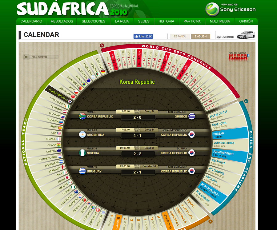
Malcolm Coles: I think a good visualisation is one that works on a mobile phone … I get shown this visualisation (pictured left) on the 2010 World Cup every year. It’s just fixtures data visualised — was great for its time. I get asked to build one like it every year, yet it won’t work on a mobile.

Steve Doig: Be aware of the growing number of sports analytics conferences being organized. The original, I believe, is the MIT Sloan Sports Analytics Conference held each year in Boston. About 1,800 young MBA students from all over the country (and now the world) show up trying to get hired as data analysts by sports leagues.


How do you get ready for big sports events like the Olympics, the Superbowl, or the Football World Cup?

Steve Doig: I’d say, do the same thing the on-air commentators do: gather all the relevant historical stats and be ready to use them in your stories. It’s also good to have stable of data analytics experts whose voices you can add to your stories.

Nassos Stylianou: Yep, prep well in advance. The great thing with these big events is also to build things that will work throughout the tournament.

Malcolm Coles: Try and build stuff outside of one off stories or investigations that you can reuse when the big tournament is over.


To see the full discussion, check out previous ones and take part in future ones, join the Data Journalism Awards community on Slack!

Over the past six years, the Global Editors Network has organised the Data Journalism Awards competition to celebrate and credit outstanding work in the field of data-driven journalism worldwide. To see the full list of winners, read about the categories, join the competition yourself, go to our website.


marianne-bouchart

Marianne Bouchart is the founder and director of HEI-DA, a nonprofit organisation promoting news innovation, the future of data journalism and open data. She runs data journalism programmes in various regions around the world as well as HEI-DA’s Sensor Journalism Toolkit project and manages the Data Journalism Awards competition.

Before launching HEI-DA, Marianne spent 10 years in London where she worked as a web producer, data journalism and graphics editor for Bloomberg News, amongst others. She created the Data Journalism Blog in 2011 and gives lectures at journalism schools, in the UK and in France.


Counting crime: How journalists make sense of police data

This article was originally published on the Data Journalism Awards Medium Publication managed by the Global Editors Network. You can find the original version right here.

___________________________________________________________________________________________________________________


Takeaways from a discussion with experts behind two of the most compelling data projects tackling crime in the US


As a journalist, how do you go about accessing, verifying and visualising datasets on crime and police?


Accessing crime and police data is crucial given the amount of shootings and police violence brought into the headlines through cases like Freddy Gray and Philando Castile.

As a journalist, how do you go about accessing, verifying, and visualising datasets on this topic? What kind of ethical questions does that raise? How do you protect the victims? We gathered experts to find out.


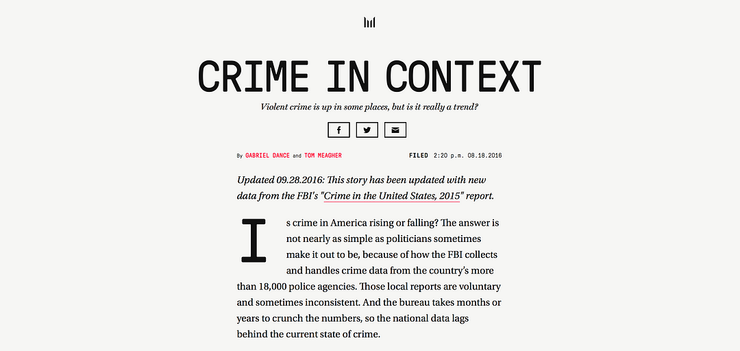
Is crime in America rising or falling? The answer is not nearly as simple as politicians sometimes make it out to be.


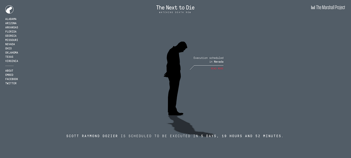
Tom Meagher is deputy managing editor for The Marshall Project which has been publishing some of the most compelling crime data journalism of the past few years. Their project Crime in Context won a Data Journalism Awards 2017 prize for its analysis of 40 years worth of national and local crime data. The Next to Die has been tracking every execution in the US for the last two years in close to real time.

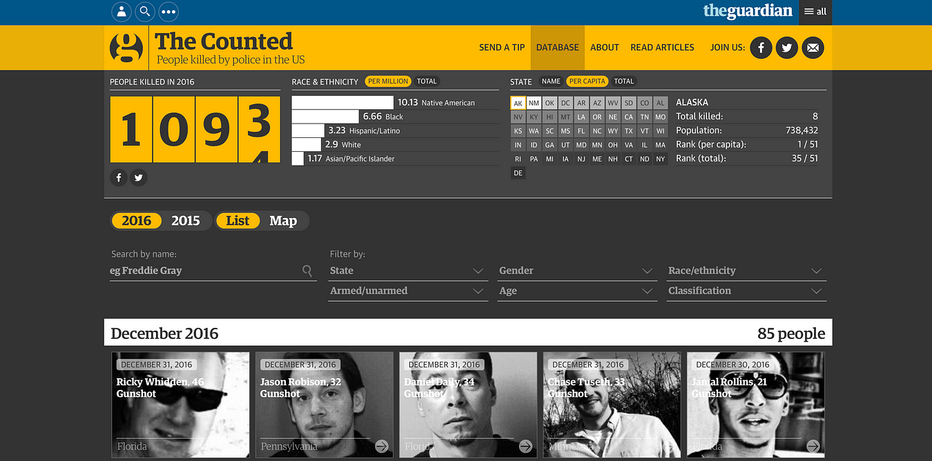
Ciara McCarthy is a journalist who worked on Guardian US’s The Counted project, often referred to as an industry benchmark. It counts the number of people killed by police and other law enforcement agencies in the US throughout 2015 and 2016 to monitor their demographics and to tell the stories of how they died.

Both of them joined us during a Slack discussion dedicated to crime and police data at the beginning of November. This article gathers the best tips and advice they dared to share.


The Counted is the most thorough public accounting for deadly use of force in the US


What makes working with crime or police data different from working with any other type of data?


Tom Meagher: Oh, where to begin? In the US, there are a few things that make criminal justice data a little more complicated than in most other beats. First, there’s a presumption of innocence for people accused of crimes until their case works its way through the court systems. So we want to be mindful of how the people our data represents are considered. Not everyone arrested is guilty, but with data it can be easy to overlook that key fact sometimes.

And more practically, in the US the data is so, so fragmented. There are 18,000+ police agencies and thousands of courts that all seem to keep their data in their own way (if they keep it at all). It makes it really challenging to carry out national analyses of how parts of the criminal justice system are operating. There are very few one-stop-shops for data.

Ciara McCarthy: I think, for us at The Counted at least, the main issue we set out to fix was that the data we wanted to analyse and investigate simply didn’t exist. There was no comprehensive or reliable information about how many people died in police custody in the US (although there is lots of available data, of varying reliability, about other pieces of the criminal justice system).

I think that a lot of criminal justice data […] might not be complete or accurate if it’s even been collected. And to echo Tom, that’s the other main issue: With no central body keeping track of the data we were looking at, it was hard to monitor thousands of different law enforcement agencies, all of which follow slightly different policies and standards for releasing information and communicating with reporters.

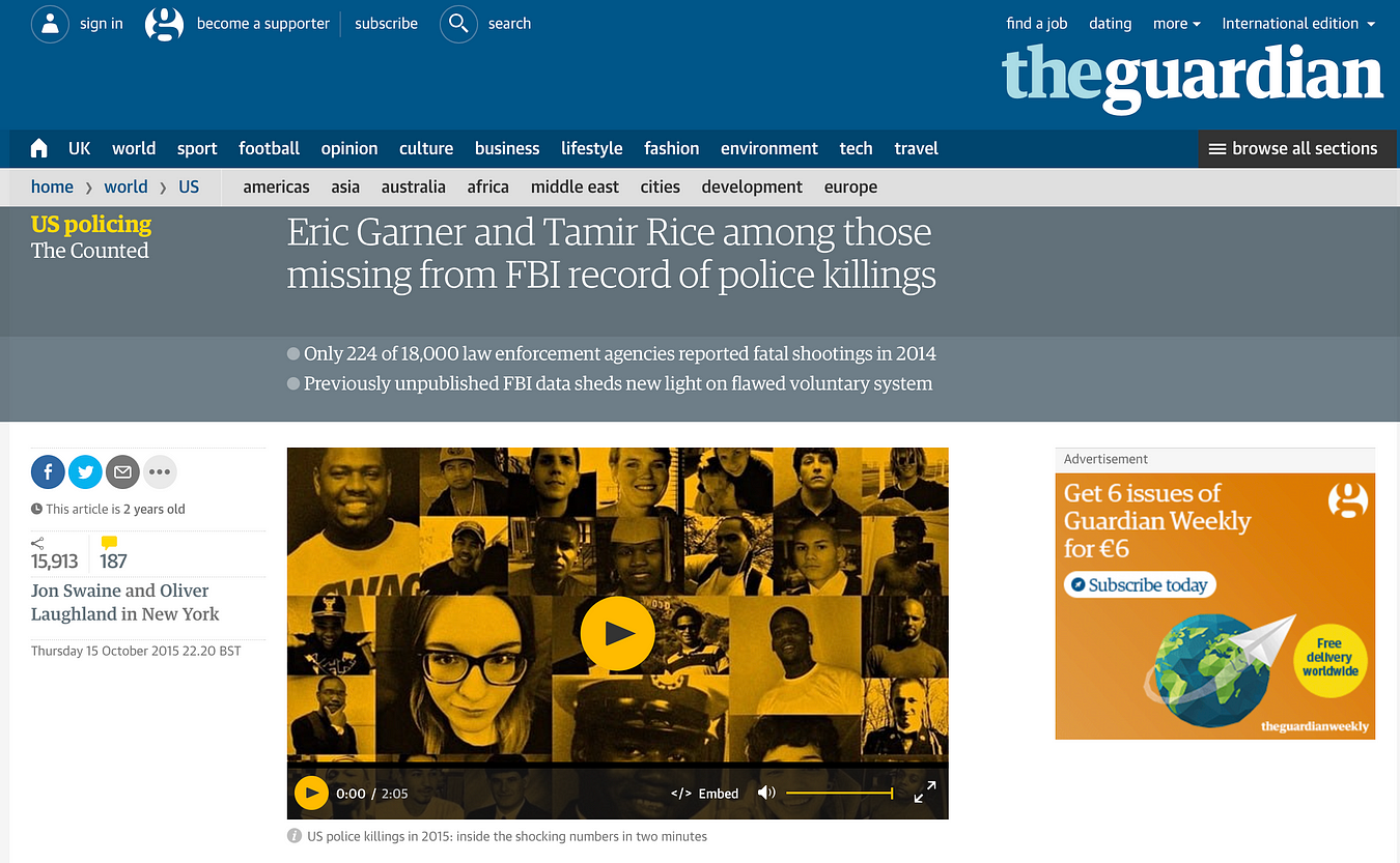
Although the FBI ‘collects’ this data, it’s wildly inaccurate, and underestimates the true number of people who die in police custody at least by half. It’s optional for police departments to submit their information to the FBI, meaning that most don’t end up doing it.


Previously unpublished data revealed only 224 of 18,000 US law enforcement agencies reported fatal shootings in 2014 sheds new light on flawed system


So would your advice be to ‘build your own data’?


Ciara McCarthy: I think it depends! Once our team started reporting on this issue in particular, it was clear that, at least for deaths in custody, the information the federal government had would have resulted in deeply flawed analyses. But in other areas of the US criminal justice system, the data collected by the government is usable — I think it’s a matter of asking a lot of questions of an available data set before you get started and seeing whether you can make reliable analyses. And if you can’t, then yes! Build your own data.

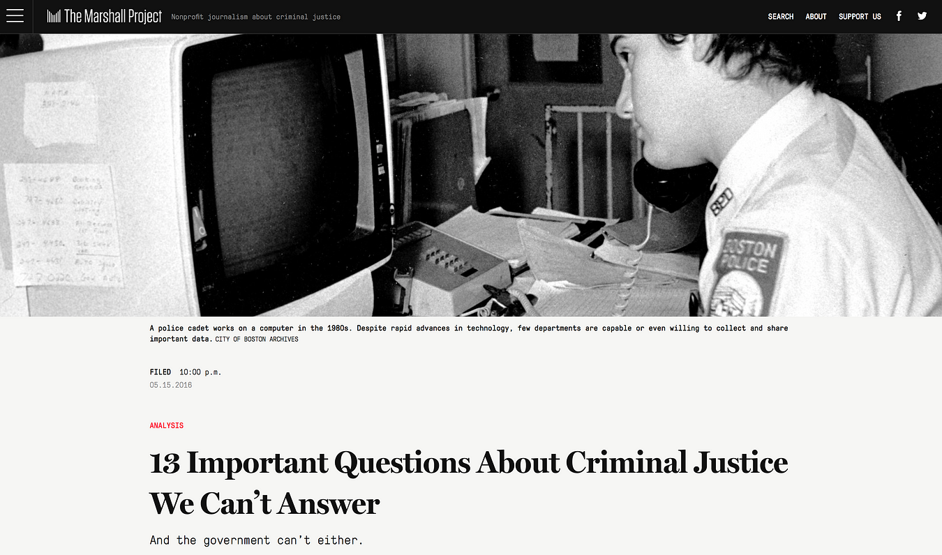
Tom Meagher: It seems like at The Marshall Project, for nearly every significant investigative story we do, the data doesn’t exist. We have to build it ourselves. As an example, here’s a story I wrote about just a few of the really key criminal justice questions we can’t answer in the US because the data doesn’t exist.


After the deaths of Freddie Gray and Laquan McDonald and others — in an age when police in many cities are under greater scrutiny than they’ve been in decades — how is it that we know so little about how officers employ force to subdue suspects?


As data is tough to get hold of, do you have tips on how or WHERE to find crime and police data?


Tom Meagher: When we’re approaching a story, we have to craft a new strategy every time. For Crime in Context, we had a trove of 40+ years of the federal Uniform Crime Reporting data, but then we had to go back and contact individual police agencies to fill in dozens and dozens of holes we identified.

Then we had to call 70+ police agencies to get them to release the previous year’s data (this was in August) because the FBI didn’t have it yet. We could flag missing records in the data or reports that were suspicious (how could they have -30 assaults in a month?) and had to report each of those out. My friend Steven Rich at the Washington Post likes to say ‘the phone is the most important tool for data journalism’.

Ciara McCarthy: For us at The Counted we basically went from agency to agency to request and ask for the data. Sometimes we had to request the information under public records law, and sometimes the information (or the basics, at least) were easily distributed. The Counted was a little different from some data analysis projects in that it was live: We added new cases of people killed by police to the database each day.


How do you verify data related to crime and the police, especially when victims come forward to denounce wrongdoing? Any tips or best practice on crowdsourcing for such projects, and establishing trust with sources?


Tom Meagher: We tend to rely on official court records — lawsuit filings, courtroom testimony, decisions — and on other journalists to help us vet information. Our executions project, The Next to Die, is a sort of journalistic crowdsourcing, where we work with reporters and editors in eight other news organisations to help us amass the information that goes into our database.


The Next to Die aims to bring attention, and thus accountability, to upcoming executions.


Ciara McCarthy: A few things I’d point out from our project: First, for us, when we couldn’t give a definitive answer, we noted it (see an example right here). I think part of the genius behind our very brilliant interactive journalists who built the database was they created one that could adapt to our reporting needs as we added to the database.

So if police said someone was armed with a knife, but witnesses said the person had dropped the knife before the shooting, we usually label that ‘disputed’ in our database, and then pursue additional information to try and get a clear answer. In cases of people killed by police, the first piece of information almost always comes from authorities, and that information may or may not be true. So if there are witnesses (often there aren’t) we’ll talk to them to see if they saw something different.

Secondly, we considered The Counted to be a crowdsourced database, meaning that our readers could reach out and contact us with tips at any time. We had a ‘tip line’ of sorts on our website and we also got information from readers via Facebook, Twitter, and email. Most of the time, the people reaching out to us weren’t sources with sensitive or story-cracking information, but readers with questions about the project or people alerting us to new cases. Sometimes, though, family members of the deceased would reach out to dispute law enforcement’s characterisation of the incident, and when that happened we’d follow up on whatever information they gave us.


The Guardian US had a “tip line” on their website and also got information from readers via Facebook, Twitter and via email


Have you ever been worried of the backlash or bad impact your projects could have?


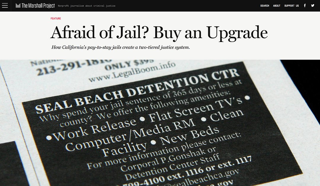
Tom Meagher: We try to operate in a ‘no surprises’ manner. We go to great lengths to let our subjects know what’s coming out and to give them an opportunity to respond ahead of time. A big story my colleagues undertook on these programmes where you can pay money to stay in safer or nicer jails relied heavily on freedom of information requests and data compiled from more than 25 different police jurisdictions (screenshot below). If you look at the methodology, they describe how they did the analysis and how they took it to each of those police agencies a few weeks before publication to give them a chance to dispute or comment on the analysis.


In what is commonly called “pay-to-stay” or “private jail,” a constellation of small city jails — at least 26 of them in Los Angeles and Orange counties — open their doors to defendants who can afford the option


As far as protecting sources from legal or physical harm, we’re very mindful of that. We go to great lengths to get our sources to go on the record, but if we think they’re potentially in jeopardy, we will allow them to be anonymous, provided we can vet their story independently. We don’t want to put anyone at risk of losing their jobs or of physical harm.

Ciara McCarthy: No one on our team personally encountered any threats or danger as a result of The Counted project as far as I know; I’d say the worst I personally encountered was a few mean tweets and a few terse phone calls with law enforcement officials who weren’t happy about the project. We also didn’t have a ton of anonymous sources whose identity we needed to protect (which I don’t think is something we expected starting out).

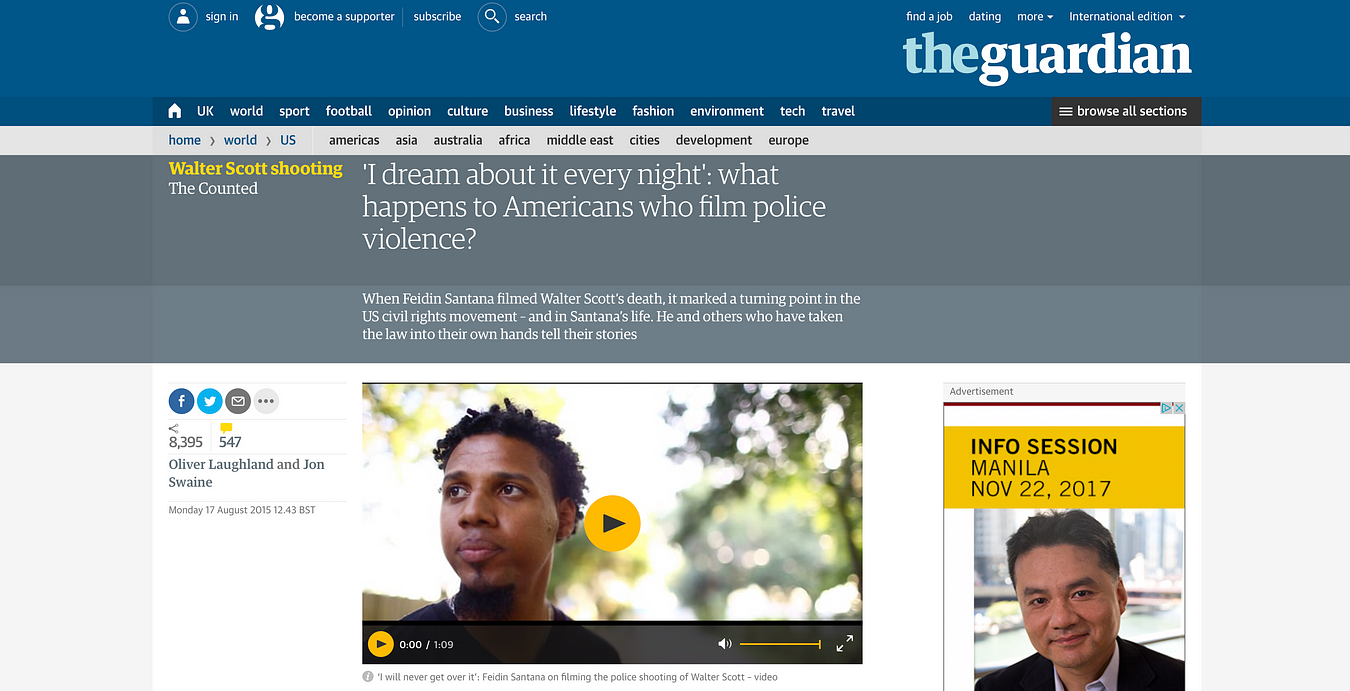
Most of the time, if witnesses or family members contradicted the police account, these (very brave) people did so pretty publicly. See, for example this article (screenshot below) telling the story of an American who filmed police violence. If there were cases where our reporters were working with anonymous sources, they were very cautious and made sure those who were providing information knew what publishing their accounts entailed.


When Feidin Santana filmed Walter Scott’s death, it marked a turning point in the US civil rights movement — and in Santana’s life. He and others who have taken the law into their own hands tell their stories


Do you encounter difficulties in streamlining key definitions (for example ‘armed’ vs ‘unarmed’, or ‘Police custody’), especially when gathering data from multiple sources? How do you resolve these differences?


Tom Meagher: Oh yes, all the time. We find that different agencies or different states will often use the same words but have completely different meanings. In one state, for example, they may have a crime called ‘battery’ that in a different state would be labelled ‘assault’. We first try to make sure that we understand exactly what each term means to each source. We start with getting their data dictionary (or record layout or user’s manual) to see how they define it in print. Then we’ll follow up with interviews with agency personnel to confirm our understanding of the terms. Ultimately, we’ll often create our own categorization scheme that is hopefully more accessible to readers to describe each class of records we see in the data.

In the Pay to Stay story, we had 25+ agencies all using different terms to refer to a fairly arcane set of state statutes that you really needed a law degree to understand. With lots of reporting work, we were able to generally class them as types of crimes with colloquial names (Drugs, Driving Violations) that were still accurate to the legal definitions, muddled as they were. It ultimately made it easier for our readers to grasp the importance of the different types of crimes being reported on.

“Often in data reporting, it’s tempting to be lulled into thinking that the ‘official data’ that is provided to you is rational and sensible and ready to be analyzed or visualized. In reality, we find most of the time that it’s a complete mess that requires a lot of reporting before we can even think about analyzing it to inform our reporting.” Tom Meagher (The Marshall Project)

Pay-to-stay is a curated collection of links by The Marshall Project, part of their Records project


Ciara McCarthy: We ran into this issue A LOT while working on The Counted project, particularly when it came to defining whether the deceased was armed or unarmed, as you noted. As you can imagine, the law enforcement definition of someone who is armed might differ from what others would consider armed, or the police account might change over time. We ran into this a lot when police shot and killed someone who was driving a car; often, they would say, they opened fire because the person in question was using the car as a weapon. (We did a bigger piece on this here).

That’s obviously super tricky, because it’s difficult to corroborate without video or a witness. A good example of this issue is the case of Zachary Hammond, a teenager who was shot and killed in South Carolina in 2015. Police initially said he drove the car toward the officers, which is why one opened fire. Surveillance footage released later showed that Hammond was driving past the officer, and not directly at him.

So I don’t have an easy answer! Sometimes the only available info we had was from police, but we’d do our best to find other sources when the police account seemed questionable. Basically, it meant a lot of extra reporting and a lot of discussions among our team members.


What tips do you have on visualising crime and police data? How and why do you decide whether or not to show people’s name, photo, or personal information?


Ciara McCarthy: With The Counted, we had built this big database, and wanted people to be able to use it and explore it and learn from it. That’s a main reason why the database included photos, whenever possible: We really wanted to put a face on each person who had died, so we weren’t only focusing on the overall number of people who died.

As for personal information, we would include what was relevant; so, for example, if a person’s medical or mental health history might have impacted their interaction with authorities, we’d be sure to note that.


For regular updates from The Next to Die, follow @thenexttodie on Twitter


Tom Meagher’s tips:

  • You want to give your data context.
  • Avoid one-year comparisons.
  • Set it against historical data as much as possible.
  • As you visualize it, try to remember that every record in that database represents a person — someone who was injured or victimized or killed, or someone who has committed crimes.
  • Try to use your visualization to emphasize their humanity as much as you can. Dots or jagged lines sometimes obscure the people they represent


Is there one thing you wish someone had told you before you took on The Counted and the Next To Die projects?


Tom Meagher: Building your own databases for open-ended projects can be very fulfilling as a journalist. You’re filling a gap in the public’s understanding of an issue. It’s very worthy. But also keep in mind that you’re committing your news organization to an endless project.

Does the story merit your time and your colleagues’ time for the indefinite future? I’d argue that The Counted and the Next to Die do. But you don’t want to make the decision without understanding the costs and all the other reporting you won’t be able to do for the next few years because you’ll have to be updating your database.

Also, these can be very emotionally taxing subjects to report on. You’re spending your entire professional life (and much of your personal life) immersed in stories of violence, and trauma, and misery. Be sure to take care of yourself and give yourself emotional outlets.


What do you think could be done to improve things? Do we just need more comprehensive data from authorities compiled in a standardised way?


Tom Meagher: The division of powers between local and state and federal governments in the US makes it complicated. There’s realistically not going to ever be a single source for reliable data. What would be a vast improvement would be if more politicians and policymakers embraced the ideas of transparency and accountability, that better, smarter data will help them and the public understand our justice systems, and to make better decisions.

As journalists, we’d certainly benefit from that change in mindset, which is still too rare here.

Ciara McCarthy: It would be lovely to get more comprehensive data, but perhaps that’s just wishful thinking. I think getting data from a variety of sources and different types of data will help — comparing a database of media reports vs. official data, for example. That’s what my team is doing with our project, anyway.

More comprehensive data from authorities would be amazing, of course, but when that’s not an option I think building your project is a great public service for newsrooms to undertake. One of my favourite things about The Counted was that, on the surface, it’s mission and premise was pretty simple: The US government should know how many people are killed by police each year. We don’t, so let’s change that.

There’s obviously a ton of different reporting that can (and should!) be done on issues related to police violence, but one thing I really liked about our project was that, at the heart of it, we were saying that we can’t have this public policy discussion without reliable data. I think having this specific, and sometimes narrow, aim for big journalism projects can be really clarifying, and help you achieve impact.


How does it compare in other parts of the world?


Aun Qi Koh of Malaysiakini (Malaysia): I feel like it’s the opposite problem in Malaysia as the official data comes from just one source, the Interior Ministry/Royal Malaysian Police, but it’s not very detailed, and unfortunately we don’t have many other sources of data because there aren’t many checks and balances on the police.


Shree D N of Citizen Matters (India): India has the problem of under-reporting crime data. The National Crime Records Bureau is the official data source, but underreporting usually happens. This article has some insights on the issue. The methodology used to record offences leads to under-reporting of rape, abduction and stalking.


Eva Constantaras is a data journalist and trainer who recently wrote the Data Journalism Manual for the UN Development Program.


During our November Slack discussion she shared with us great examples from Kenya, Afghanistan and Turkey:

“I think The Counted inspired so many other media outlets because they realized they could build their own databases using similar data collection techniques but getting away from official sources. The Kenya Nation Newsplex team used mostly media reports to compile its Deadly Force Database.

Pajhwok Afghan News maintains a database of terrorist attacks that is much more detailed than anything the government or international bodies maintain. It’s not too much work because they cover all terrorist attacks anyway so they just have to enter them into the database. And then they can generate monthly stories on trends in terrorism in Kabul and across Afghanistan without too much effort.

This paper on collaboration between civic tech and data journalists I think is also relevant. In Turkey, Dag Media works with a domestic violence NGO to track violence against women. The NGO builds the database and the journalists do the stories.”


To see the full discussion, check out previous ones and take part in future ones, join the Data Journalism Awards community on Slack!

Over the past six years, the Global Editors Network has organised the Data Journalism Awards competition to celebrate and credit outstanding work in the field of data-driven journalism worldwide. To see the full list of winners, read about the categories, join the competition yourself, go to our website.


The future of news is not what you think and no, you might not be getting ready for it the right way

This article was originally published on the Data Journalism Awards Medium Publication managed by the Global Editors Network. You can find the original version right here.

_______________________________________________________________________________________________________________________


Editors, reporters and, anyone in news today: how prepared are you for what is coming? Really. There is a lot of talk right now on new practices and new technologies that may or may not shape the future of journalism but are we all really properly getting ready? Esra Dogramaci, member of the Data Journalism Awards 2017 jury and now working as Senior Editor on Digital Initiatives at DW in Berlin, Germany, thinks we are not. The Data Journalism Awards 2017 submission deadline is on 10 April.


Esra Dogramaci, Senior Editor on Digital Initiatives at DW, Photo: Krisztian Juhasz


Before joining DW, Esra Dogramaci worked at the BBC in London and Al Jazeera English, amongst others. She discusses here the preconceived ideas people have about the future of journalism and how we might be getting it all wrong. She also shares some good tips on how to better prepare for the journalism practices of the future as well as share with us her vision of how the world of news could learn from the realm of television entertainment.


What do you think most people get wrong when describing the future of journalism?


There are plenty of people happy to ruminate on the future of journalism — some highly qualified such as the Reuters Institute and the Tow Center who make annual predictions and reports based on data and patterns while others go with much less than that. Inevitably, people get giddy about technology — what can we do with virtual reality (VR), augmented reality (AR), artificial intelligence (AI), personalisation (not being talked about so much anymore), chatbots, the future of mobile and so on. However with all this looking forward to where journalism is headed (or rather how technology is evolving and, how can journalism keep pace with it), are we actually setting ourselves and journalism students up with all that is needed for this digital future? I think the answer is no.


What is, according to you, a more adequate description (or prediction) of the future of news?


If we’re talking about a digital future, the journalists of tomorrow are not equipped with the digital currency they will need.

Technology definitely matters but it’s not so useful when you don’t have people who understand it or can build and implement appropriate strategy to bridge journalism in a digital age. Middle or senior management types for instance, are less likely to know how to approach Snapchat, which they would be less likely to use, than a high school teenager who is using it as a social sharing tool or their primary source of news.

So if we aren’t actually:

1. Listening to our audience and knowing who they are and how they use these technologies, and

2. Bringing in people who know how to use these tools that speak to and with the audience,

…the efforts are going to be laughable at worst and dismissed at best.

In essence, technology and those who know how to use, develop and iterate it go together. That’s the future of news. We should be looking forward with technology, but we’ve also got to look back at the people coming through the system that will inherit and step into the – hopefully relevant – foundations we’re building now.


“Are we actually setting ourselves and journalism students up with all that is needed for this digital future?”


When looking at the evolution of journalism practices over the past few years, which ones fascinate you the most?


There are two things that stand out. The first is analytics and the second is the devolution of power, both points are interrelated.

Data analytics have really transformed non-linear journalism. Its instantly measurable, helping people make editorial decisions but also question and understand why content you thought would perform doesn’t. Data allows us to really understand our audience, and come up with content that not just resonates with them but how to package content that they will engage with. For instance a website audience is not going to be the same as your TV audience (TV is typically older and watches longer content but again the data will tell specifics), so clipping a TV package and sticking it on Facebook or YouTube isn’t optimal and suggests to your audience that you don’t understand these platforms and more importantly, them. They will go to another news provider that does.

An example of this was a project where it was traditionally assumed [in one of my previous teams] that the audience was very interested in Palestinian-Israeli conflict and so a lot of stories were delivered about it. However, we discovered through the numbers, on a consistent basis, that the audience wasn’t as interested as assumed, rather people were more into the conflicts in Syria, Yemen as well as Morocco and Algeria stories. These stories and audiences may not have traditionally registered on top of the editorial agenda because of what was historically thought to be in the audiences interest, but our data was suggesting we needed to pay more attention to the coverage in these areas.

Now, that being said, it’s still stunning to see how little analytics are used day to day. There still seems to be a monopoly on the numbers rather than integration into newsrooms. There are a plethora of tools available in making informed editorial or data decisions but generally editors don’t understand them or follow metrics that are not useful because they don’t know how to interrogate the data, or we hear things like ‘I’m an editor, I’ve been doing this for x years, I know better.’

Fortunately though, about 80–90% of editors I find are keen to understand this data-driven decision-making world and once you sit down and explain things, they become great advocates. Ian Katz at BBC Newsnight, Carey Clark at BBC HardTalk are two editors who embody this.

The second area is devolving power. The best performing digital teams are when not all decision-making is consolidated at the top, and you really give people time and space to figure out problems, test new ideas without the pressure always to publish. That’s a very different model to traditional hierarchical or vertical journalism structures. Its an area of change and letting go of power. But empowering the team empowers leaders as well.

An example of this is a team I worked with where all decisions and initiatives went through a social media editor. As a result, there was a bottleneck, and frustration for things not being done and generally being late to the mark on delivering stories and being relevant on platform as competitors were overtaking. What we did is decentralise control — we asked the team what platforms they’d like to take responsibility for (in addition to day to day tasks) and together came up with objectives and a proposition to deliver on those. The result? Significant growth across the board, increase in engagement but perhaps most importantly, a happier team. That’s what most people are looking for: recognition, responsibility, autonomy. If you can keep your team happy, they are going to be motivated and the results will follow.


Global Headaches: the 10 biggest issues facing Donald Trump, by CNN


Do you have any stories in mind that represent best what you think the future of newsmaking will look like?


CNN digital did this great Global Headaches project ahead of the US elections last year.

The project was on site (meaning that traffic was coming to the site and not a third party platform), made for mobile which would presumably reflect an audience coming mainly from mobile, used broadcast journalists and personalities as well as regular newsgathering, with an element of gamification. Each scenario had an onward journey which then takes your reader out of the game element and into the story.


Example from the “onward journey” with the CNN “Global Headaches” project


This isn’t a crazy high tech innovation but it is something that would have been much harder to pull off say 5 years ago. This example is multifaceted and making use of the tools we have available today in a smart way. It demonstrates that CNN can speak to the way their audience is consuming content while fulfilling its journalistic remit.

Examples like this doesn’t mean we should be abandoning long form text for instance and going purely for video driven or interactive stories. The Reuters Institute found last year (in their report The Future of Online News Video) that there is oversaturation of video in publishing and that text is still relevant. So, I would caution against throwing the text baby out with the bathwater, which then comes down to two things:

  1. Know your audience and do so by bringing analytics into the newsroom (it’s still slightly mind boggling the number of newsrooms who do not have any analytics in the editorial process)
  2. Come up with a product that you love and that works. The best of these innovations are multidisciplinary and do something simple using the relevant tools we have, that are accessible today. There’s no use investing in a VR project if the majority of your audiences lack the headsets to experience it.


Do you think news organisations are well equipped for this digital future?


Yes and no. There are the speedboats like Quartz, AJ+, NowThis, Vox, who can pivot quickly and innovate versus the bigger media tankers that turn very slowly. One question I get asked quite a bit is “what’s the most important element in digital change”. The answer is leadership. There needs to be someone(s) who understands, supports and pushes change, otherwise everyone down the ranks will continue to struggle and face resistance.

I truly believe in looking at the people who are on the ground, rolling up their sleeves and getting the work done, trying, failing, succeeding, and who keep persevering — versus always deferring to editors who have been in place for say 10 years to lead the way. Those people in the trenches are the ones we should be shining the light on and listening to. They are much closer to the audience and can give you usable insights that also go beyond numbers.

If I could name a few, people like Carol Olona, Maryam Ghanbarzadeh at the BBC, Alaa Batayneh or Fatma Naib, at Al Jazeera, Jacqui Maher at Conde Nast, need to be paid attention to. You may not see them at conferences or showcased much but by having people like them in place, news organisations are well equipped for a digital future.


Do you see some places in the world (some specific organisations maybe?) that are actually doing better than others on that front?


The World Economic Forum wouldn’t traditionally be associated as being a digital media organisation, but a few years ago they started to invest in social media and develop an audience that normally would not be interested in them. They take data and make it relevant and accessible for low cost, bite size social consumption.

Take this recent video for example:


Your brain without exercise, a video by the World Economic Forum
And also this related one:


Best of 2016 social video by the World Economic Forum


There is also this NYT video of Simone Biles made ahead of the 2016 summer Olympics which then has the option of taking you to an onward site journey.

The Financial Times hasn’t been afraid of digital either. You see them taking interesting risks which might go over a lot of people’s heads but the point is they’re trying. Like in their project “Build your own Kraft Heinz takeover”.


Then there are the regular suspects — AJ+ isn’t trying to do everything, they’re trying to be relevant for a defined audience on the platforms that audience uses. Similarly, Channel 4 News isn’t pumping out every story they do on social, but deliberately going for emotionally charged stories rather than straight reporting as well as some play with visualising data.


What would you like to see more of in newsrooms today which would actually prepare staff better for what’s coming?


When you’re hiring new staff, assign them digital functions and projects rather than putting them on the traditional newsroom treadmill. A lot of organisations have entry level schemes and this could easily be incorporated into that model. That demonstrates that digital is a priority from the outset. You could also create in house lightning attachments, say a six-week rotation at the end of which you’re expected to deliver something ready for publishing, driven by digital. My City University students were able to come up with a data visualization in less than an hour, and put together a social video made on mobile in 45 minutes (social or mobile video wasn’t even on the course but I snuck it in). Six weeks in a newsroom is plenty of time for something substantial.

Also, have the right tools in place and ensure that everyone is educated on the numbers. Reach and views for instance get thrown around a lot- they are big easy numbers to capture and comprehend, but we need to make a distinction between what is good for PR versus actionable metrics in the newsroom. As more people clue into what matters, I do think (and we see in certain places like Newswhip for instance) where success is based on engagement, interactions and watchtime rather than views, impressions or reach.

Finally and obviously, its devolution of power and more risk taking. Make people better by empowering them — that means carve out the time and space to experiment without the pressure to deliver or publish. When you are continually driving staff against deadlines, creativity suffers. Fortunately there are so many third party tools and analytics that will very quickly tell you what’s working and what’s not, contributing to a much more efficient newsroom freeing up valuable time to think and experiment. Building multi disciplinary teams is a good step in this direction. DW is experimenting with a “lab like” concept bringing together editorial, technical and digital folks in an effort to bring the best of all worlds together and see what magic they come up with.


From your experience teaching social and digital journalism at City University London, what can you say about the way the younger generation of journalists is being trained for the future? Do they realise what’s at stake?


At the beginning of term, I heard quite a few students say that digital didn’t matter, it wasn’t “real journalism” and that they were taking the class merely because it was perceived as an “easy pass”. That’s because the overall coursework, emphasized magazine and newspaper journalism. At the end of the term, and almost on a weekly basis since, my former students write to me about either digital projects they have done, digital jobs they are going for or how something we went over in the class has led to another opportunity.

There remains a major emphasis on traditional broadcast journalism — TV, radio, print, but very little for digital. That’s not something to fault students on. Digital is changing constantly but teaching staff mainly reflect the expertise of the industry, and that expertise is traditional. While there are a lot of digital professionals, it does not come close to the level of expertise and experience currently on offer at institutions training the next journalist generation. That being said organisations like Axel Springer have journalism academies where all of their instructors, are working full time in media and can translate the day to day relevance into the classroom. That’s more of the kind of thing we need to have.

The students I think do realise what’s at stake because a lot of those journalism jobs they’re applying for all require some level of digital literacy. Sure everyone might watch a YouTube video but what happens when an Editor asks you why a news video has been uploaded and monetised by other users elsewhere. Would you know what to do?


What could be done to improve the educational system in the UK and beyond? Simply make journalism courses more digitally focussed?


There is nothing that will compel places to change but reputation. If students are leaving institutions because what they are learning is not preparing them to meet the demands of the industry they’re choosing to go into, word will spread sooner than later. There will surely be visionary institutions who ‘get it’ and adapt, some are there already.

‘Smart’ places will build in digital basics so students can have the confidence to hit the ground running. I see this in a lot of digital job requirements. It’s a given that anyone starting in journalism in 2017 has basic social media literacy. Beyond that everything is a bonus — how can you file from a mobile phone, can you interpret complex data and tell a story with it. Then, are you paying attention to analytics?

As Chris Moran (Guardian) had pointed out:


“staff blame the stupid internet for low page views on a piece…but credit the quality of the journalism when one hits the jackpot.”

We need a much more sophisticated understanding beyond yes/no answers to points like these.

A lot of media houses have academies or training centres expected also to bridge digital gaps. The caution there is that the trainings they offer when it comes to things beyond CMS, uploading video, etc., is that other digital knowledge seem to fall in the “nice to know” rather than “you need this” category. The best thing is to find the in-house talents who know what they’re talking about and get them to lead the way.


Another recurrent question when talking about our digital future is the question of business models for news organisations. As the latter are under continual financial strain, you actually think we should get inspiration from the entertainment industry. Can you elaborate on this idea?


Yes. The entertainment industry always has a much larger creative capacity and funding so they are able to take more risks with less at stake. That’s where we should be looking and seeing what the obvious news applications could be rather than trying to build our own innovations all the time. Most news houses just cannot compete with entertainment budgets. Jimmy Fallon showcased Google Tilt brush in January 2016:


https://www.youtube.com/watch?time_continue=2&v=Dzy7ydbEyIk


I then saw it in November 2016 at a Google News event but have yet to see anyone use it in a meaningful news application. It doesn’t necessarily mean that all these things will be picked up on, but it does mean we should keep a finger on the pulse of what’s possible. Matt Danzico, now setting up a Digital News Studio at NBC is in a unique position. He’s in the same building as Late Night, SNL, and others. That means he has access to all the funky things entertainment is coming up with and can think about news applications for it.

Similarly, how can news organisations think about teaming up with Amazon or Netflix for instance and start to make their content more accessible? These media giants have the capacity to push creative boundaries and invest, and news organisations have their journalistic expertise to offer in that relationship. That’s very relevant in this time of “fake news”.


You have recently been appointed Senior Editor of Digital at DW in Berlin. Can you tell us more about what this position entails and the type of projects you’ll be doing? How different is it from what you’ve done in the past at the BBC and Al Jazeera for example?


DW is in a position familiar to many broadcasters, and that is a slight shift away from linear broadcasting to a considerable foray into digital. The difference is that DW is not starting from zero, with plenty of good (and bad) examples around to learn from. The first thing is to set a good digital foundation — getting the right tools in house and bringing people along on the digital journey — in a nutshell increasing literacy and comfort with digital. Once that is done I think you’ll see a very sharp learning curve and a lot more ambitious digital projects and initiatives coming from DW.

We’re very lucky that we have a new Editor in Chief, Ines Pohl and new head of news, Richard Walker, both infused with ideas and energy of making a great digital leap. Complementary to that we have a new digital strategy coming from the DG’s office which I’ve been involved with in addition to a new DW “lab like” concept, as I mentioned before. A lot of people might not know how big DW is — there are 30 language services and English is the largest of those, so getting all systems firing digitally is no small task.

Compared to BBC or AJ, the scope and scale of the task is of course much bigger. At AJ we had a lot of free range in the beginning because no one was doing what we did, at the BBC, there was much more process involved, less risk taking. Based on those experiences, DW is somewhere in the middle, a good balance. 2017 could be the year where stars align for DW. There are approximately 12 parliamentary or national elections in Europe and DW knows this landscape well. So bringing together the news opportunities, a willingness to evolve and invest in something new along with leadership that can really drive it, I think DW will be turning heads soon.


marianne-bouchart

Marianne Bouchart is the founder and director of HEI-DA, a nonprofit organisation promoting news innovation, the future of data journalism and open data. She runs data journalism programmes in various regions around the world as well as HEI-DA’s Sensor Journalism Toolkit project and manages the Data Journalism Awards competition.

Before launching HEI-DA, Marianne spent 10 years in London where she worked as a web producer, data journalism and graphics editor for Bloomberg News, amongst others. She created the Data Journalism Blog in 2011 and gives lectures at journalism schools, in the UK and in France.


A data journalist’s microguide to environmental data

This article was originally published on the Data Journalism Awards Medium Publication managed by the Global Editors Network. You can find the original version right here.

_______________________________________________________________________________________________________________________


Lessons learned from an online discussion with experts

The COP23 conference is right round the corner (do I hear “climate change”?) and many data journalists around the world may wonder: How do you go about reporting on environmental data?


With the recent onslaught of hurricanes, such as Harvey, Irma, and Maria, and wildfires in Spain, Portugal and California, data journalists have been working hard to interpret scientific data, as well as getting creative to make it reader friendly.

The COP23 (do I hear climate change?) also serves as a great opportunity for data journalists to take a step back and ask:

What is the best way of reporting on data related to the environment? Where do you find the data in the first place? How do you make it relatable to the public and which challenges do you face along the way?

From top left to bottom right: Kate Marvel of NASA GISS (USA), James Anderson of Global Forest Watch (USA), Rina Tsubaki of European Forest Institute (Spain), Gustavo Faleiros of InfoAmazonia (Brazil), Elisabetta Tola of Formicablu (Italy), and Tim Meko of The Washington Post (USA)


We gathered seven amazing experts on the Data Journalism Awards Slack team on 5 October 2017 to tackle these questions. Tim Meko of The Washington Post (USA), Gustavo Faleiros of InfoAmazonia (Brazil), Rina Tsubaki of European Forest Institute (Spain), Kate Marvel of NASA GISS (USA), Elisabetta Tola of Formicablu (Italy), Octavia Payne and James Anderson of Global Forest Watch (USA), all took part in the discussion.

Here is a recap of what we’ve learned including tips and useful links.


Environmental data comes in many formats…only known by scientists


When it comes to working with environmental data, both journalists and scientists seem to be facing challenges. The main issue seems not to come from scarcity of data but rather from what journalists can do with it, as Elisabetta Tola of Formicablu (Italy) explained:

‘Things are still quite complicated because we have more data available than before but it is often difficult to interpret and to use with journalistic tools’, she said.

There also seems to be a gap between the speed at which data formats evolve in that area and how fast journalists learn how to work with these formats.

‘I think we are still in a moment where we know just a little about data formats. We know about spreadsheets and geodata, but then there are all these other formats, used only by scientists. And I am not really sure how we could use those’, said Gustavo Faleiros of InfoAmazonia (Brazil).

Environmental data should be more accessible and easy to interpret and scientists and journalists should be encouraged to work hand-in-hand more often. The existing incentive structure makes that hard: ‘Scientists don’t get paid or promoted for talking to journalists, let alone helping process data’, said Kate Marvel of NASA GISS (USA).


So what could be done to make things better?


“We need to open up more channels between journalists and scientists: find more effective ways of communicating’, said Elisabetta Tola of Formicablu.

We also need more collaboration not just among data journalism folks, but with larger communities.

‘Really, it is a question of rebuilding trust in media and journalism’, said Rina Tsubaki of European Forest Institute.

‘I think personalising stories, making them hyper-local and relevant, and keeping the whole process very transparent and open are key’, said James Anderson of Global Forest Watch.

Indeed, there seems to be a need to go further than just showing the data: ‘People feel powerless when presented with giant complex environmental or health problems. It would be great if reporting could go one step further and start to indicate ‘what’s the call to action’. That may involve protecting themselves, engaging government, responding to businesses’, said James Anderson of Global Forest Watch.

Top idea raised during the discussion: “It would be great to have something like Hacks&Hackers where scientists and journalists could work together. Building trust between these communities would improve the quality of environmental reporting but also the reward, at least in terms of public recognition, of scientists work.” Suggested by Elisabetta Tola of Formicablu.


To make environmental data more ‘relatable’, add a human angle to your story


As the use of environmental data has become much more mainstream, at least in American media markets, audiences can interact more directly with the data than ever before.

‘But we will have to find ways to keep innovating, to keep people’s attention, possibly with much more personalised data stories (what does the data say about your city, your life in particular, for example)’, said James Anderson of Global Forest Watch.

‘Characters! People respond to narratives, not data. Even abstract climate change concepts can be made engaging if they’re embedded in a story’, said Kate Marvel of NASA GISS.

For example, this project by Datasketch, shows how Bogotá has changed radically in the last 30 years. ‘One of the main transformations’, the website says ‘is in the forestation of the city as many of the trees with which the citizens grew have disappeared’.

This project by Datasketch, shows how Bogotá has changed radically in the last 30 years and include citizen’s stories of trees


With this project, Juan Pablo Marín and his team attached citizen stories to specific trees in their city. They mapped 1.2 million trees and enabled users to explore narrated stories by other citizens on a web app.

‘I like any citizen science efforts, because that gets a community of passionate people involved in actually collecting the data. They have a stake in it’, James Anderson of Global Forest Watch argued.

He pointed out to this citizen science project where scientists are tracking forest pests through people’s social media posts.

One more idea for engaging storytelling on climate change: Using art to create a beautiful and visual interactive:
Illustrated Graphs: Using Art to Enliven Scientific Data by Science Friday
Shared by Rina Tsubaki of European Forest Institute


Tips on how to deal with climate change sceptics


‘Climate denial isn’t about science — we can’t just assume that more information will change minds’, said Kate Marvel of NASA GISS.

Most experts seem to agree. ‘It often is more of a tribal or cultural reaction, so more information might not stick. I personally think using language other than ‘climate change’, but keeping the message (and call to action to regulate emissions) can work’, said James Anderson of Global Forest Watch.

A great article about that, by Hiroko Tabuchi, and published by The New York Times earlier this year can be found here: In America’s Heartland, Discussing Climate Change Without Saying ‘Climate Change’

‘Keeping a high quality and a very transparent process can help people who look for information with an open mind or at least a critical attitude’, Elisabetta Tola of Formicablu added.

A great initiative where scientists are verifying media’s accuracy:
Climate Feedback
Shared by Rina Tsubaki of European Forest Institute


Places to find data on the environment

The Planet OS Datahub makes it easy to build data-driven applications and analyses by providing consistent, programmatic access to high-quality datasets from the world’s leading providers.

AQICN looks at air pollution in the world with a real-time air quality index.

Aqueduct by the World Resources Institute, for mapping water risk and floods around the world.

The Earth Observing System Data and Information System (EOSDIS) by NASA provides data from various sources — satellites, aircraft, field measurements, and various other programs.

FAOSTAT provides free access to food and agriculture data for over 245 countries and territories and covers all FAO regional groupings from 1961 to the most recent year available.

Global Forest Watch offers the latest data, technology and tools that empower people everywhere to better protect forests.

The Global Land Cover Facility (GLCF) provides earth science data and products to help everyone to better understand global environmental systems. In particular, the GLCF develops and distributes remotely sensed satellite data and products that explain land cover from the local to global scales.

Google Earth Engine’s timelapse tool is useful for satellite imagery, enables you to map changes over time.

Planet Labs is also great for local imagery and monitoring. Their website feature practical examples of where their maps and satellite images were used by news organisations.


News from our community: In a few months, James Anderson and the team at Global Forest Watch will launch an initiative called Resource Watch which will work as an aggregator and tackle a broader set of environmental issues.

“It was inspired by the idea that environmental issues intersect — for example forests affect water supply, and fires affect air quality. We wanted people to be able to see how interconnected these things are,” said Anderson.


What to do if there is no reliable data: the case of non-transparent government


It is not always easy or straightforward to get data on the environment, and the example of Nigeria was brought about during our discussion by a member of the DJA Slack team.

‘This is because of hypocrisy in governance’, a member argued.

‘I wish to say that press freedom is guaranteed in Nigeria on paper but not in reality.

You find that those in charge of information or data management are the first line of gatekeepers that will make it practically impossible for journalists to access such data.

I can tell you that, in Nigeria, there is no accurate data on forestry, population figure and so on’.

So what is the way out? Here are some tips from our experts:

‘I would try using some external, no official sources. You can try satellite imagery by NASA or Planet Labs or even Google, then distribute via Google Earth or their Google News Lab. Also you can download deforestation, forest fires and other datasets from sites of University of Maryland or the CGIAR Terra-i initiative’, Gustavo Faleiros of InfoAmazonia suggested.

Here is an example:

Nigeria DMSP Visible Data By NOAA/NGDC Earth Observation Group

‘I think with non-transparent governments, it is sometimes useful to play both an “inside game” (work with the government to slowly [publish] more and more data under their own banner) and an “outside game” (start providing competing data that is better, and it will raise the bar for what people [should] expect)’, said James Anderson of Global Forest Watch.

‘It’s a really tough question. We’ve worked with six countries in the Congo Basin to have them improve their data collection, quality-control, and sharing. They now have key land data in a publicly-available portal. But it took two decades of hard work to build that partnership’, he added.

‘I think this is exactly the case when a good connection with local scientists can help’, said Elisabetta Tola of Formicablu. ‘There are often passionate scientists who really wish to see their data out. Especially if they feel it could be of use to the community. I started working on data about seismic safety over five years ago. I am still struggling to get the data that is hidden in tons of drawers and offices. I know it’s there’, she added.

‘For non-transparent governments, connect with people who are behind facilitating negotiations for programmes like REDD to get insider view’, added Rina Tsubaki of European Forest Institute.

CARTO is the platform for turning location data into business outcomes.


What tools do you use when reporting on environmental data?


Here is what our data journalism community said they played with on a regular basis:

CARTO enriches your location data with versatile, relevant datasets, such as demographics and census, and advanced algorithms, all drawn from CARTO’s own Data Observatory and offered as Data as a Service.

QGIS is a free and open source geographic information system. It enables you to create, edit, visualise, analyse and publish geospatial information.

OpenStreetMap is a map of the world, created by members of the public and free to use under an open licence.

Google Earth Pro and Google Earth Engine help you create maps with advanced tools on PC, Mac, or Linux.

Datawrapper, an open source tool helping everyone to create simple, correct and embeddable charts in minutes.

R, Shiny and Leaflet with plugins were used to make these heatmaps of distribution of tree species in Bogotá.

D3js, a JavaScript library for visualizing data with HTML, SVG, and CSS.

Flourish makes it easy to turn your spreadsheets into world-class responsive visualisations, maps, interactives and presentations. It is also free for journalists.


Great examples of data journalism about the environment we’ve come across lately


How Much Warmer Was Your City in 2015?
By K.K. Rebecca Lai for The New York Times
Interactive chart showing high and low temperatures and precipitation for 3,116 cities around the world.
(shared by Gustavo Faleiros of InfoAmazonia)


What temperature in Bengaluru tells about global warming
By Shree DN for Citizen Matters
Temperature in Bengaluru was the highest ever in 2015. And February was the hottest. Do we need more proof of global warming?
(shared by Shree DN of Citizen Matters in India)


Data Science and Climate Change: An Audience Visualization
By Hannah Chapple for Affinio Blog
Climate change has already been a huge scientific and political topic in 2017. In 2016, one major win for climate change supporters was the ratifying of the Paris Agreement, an international landmark agreement to limit global warming.
(shared by Rina Tsubaki of European Forest Institute)


Google’s Street View cars can collect air pollution data, too
By Maria Gallucci for Mashable
“On the question of compelling environmental stories to prioritize, (this was a bit earlier in the thread) I feel like hyper-local air quality (what is happening on your street?) is powerful stuff. People care about what their family breathes in, and its an urgent health crisis. Google StreetView cars are now mapping this type of pollution in some places.”
(shared by James Anderson of Global Forest Watch)


This Is How Climate Change Will Shift the World’s Cities
By Brian Kahn for Climate Central
Billions of people call cities home, and those cities are going to get a lot hotter because of climate change.
(shared by Rina Tsubaki of European Forest Institute)


Treepedia :: MIT Senseable City Lab
Exploring the Green Canopy in cities around the world
(shared by Rina Tsubaki of European Forest Institute)


Losing Ground
By ProPublica and The Lens
Scientists say one of the greatest environmental and economic disasters in the nation’s history — the rapid land loss occurring in the Mississippi Delta — is rushing toward a catastrophic conclusion. ProPublica and The Lens explore why it’s happening and what we’ll all lose if nothing is done to stop it.
(shared by Elisabetta Tola of Formicablu)


Watergrabbing
A Story of Water, looks into the water-hoarding phenomenon. Every story explains a specific theme (transboundary waters, dams, hoarding for political and economic purposes), and shows the players involved, country-by-country. Take time to read and discover what water grabbing means. So that water can become a right for each country and every person.
(shared by Elisabetta Tola of Formicablu)


Ice and sky
By Wild-Touch
Discover the history and learn about climate changes — the interactive documentary
(shared by Gustavo Faleiros of InfoAmazonia)


Extreme Weather
By Vischange.org
The resources in this toolkit will allow communicators to effectively communicate extreme weather using strategically framed visuals and narratives. Watch the video to see it in action!
(shared by Rina Tsubaki of European Forest Institute)

Plus, there is a new version of Bear 71 available for all browsers:
Bear 71 VR
Explore the intersection of humans, nature and technology in the interactive documentary. Questioning how we see the world through the lens of technology, this story blurs the lines between the wild world, and the wired one.
(shared by Gustavo Faleiros of InfoAmazonia)


To see the full discussion, check out previous ones and take part in future ones, join the Data Journalism Awards community on Slack!


marianne-bouchart

Marianne Bouchart is the founder and director of HEI-DA, a nonprofit organisation promoting news innovation, the future of data journalism and open data. She runs data journalism programmes in various regions around the world as well as HEI-DA’s Sensor Journalism Toolkit project and manages the Data Journalism Awards competition.

Before launching HEI-DA, Marianne spent 10 years in London where she worked as a web producer, data journalism and graphics editor for Bloomberg News, amongst others. She created the Data Journalism Blog in 2011 and gives lectures at journalism schools, in the UK and in France.


How three women are influencing data journalism and what you can learn from them

This article was originally published on the Data Journalism Awards Medium Publication managed by the Global Editors Network. You can find the original version right here.

________________________________________________________________________________________________________________________


Stephanie Sy of Thinking Machines (Philippines), Yolanda Ma of Data Journalism China and Esra Dogramaci of Deutsche Welle, formerly Al Jazeera (Germany), new members of the Data Journalism Awards jury, talk innovation, data journalism in Asia and the Middle East, and women in news.

left to right: Yolanda Ma (Data Journalism China), Esra Dogramaci (Deutsche Welle, formerly BBC and Al Jazeera), and Stephanie Sy (Thinking Machines) join DJA Jury


We welcomed three new members to the Data Journalism Awards jury last year (pictured above). They are all women, strong-willed and inspiring women, and they represent two regions that are often overlooked in the world of data journalism: Asia and the Middle East.

What was your first project in data journalism or interactive news and what memory do you keep from it?

Esra Dogramaci: In 2012, Invisible Children launched a campaign to seek out Lord’s Resistance Army(LRA) leader Joseph Kony and highlight the exploitation of child soldiers. Then, at Al Jazeera, we wanted to see what people in North Uganda, who lived in one of the areas who were affected by the LRA actually had to say about it. They would ‘speak to tweet’ and we would map their reactions on Ushahidi using a Google Fusion table in the background.

 
Uganda Speaks by Al Jazeera


Although Al Jazeera had started doing this kind of projects back in 2009 during the war on Gaza (the experiment’s page of the Al Jazeera Lab website has now disappeared but can be viewed through WebArchive.org), it picked up steam during Egypt’s 2011 Arab Spring where, due to lack of broadcast media coverage, protesters were using social media to bring attention to what was happening.

Interactive story by Thinking Machines


Stephanie Sy: Our first data journalism project as a team at Thinking Machines was a series of interactive stories on traffic accidents in Metro Manila. We cleaned and analysed a set of Excel sheets of 90,000 road accidents spanning 10 years.

It was the first project we worked on as a mixed team of journalists, designers, and data scientists, and the first time we tried to build something from scratch with d3.js! I worked on the d3 charts, and remember being in utter despair at how hard it was to get the interactive transitions to render nicely across different browser types. It was surprisingly well received by the local civic community, and that positive feedback emboldened us to keep working.

 
Connected China, Thomson Reuters


Yolanda Ma: One of my first projects was Connected China for Thomson Reuters, which tracked and visualised the people, institutions and relationships that form China’s elite power structure (learn more about it here).

This project taught me the importance of facts and every piece of data in it (thousands, if not millions in total) went through a rigid fact-checking process (by human beings, not machines, unfortunately). I learned by doing that facts are the bones of data journalism, not fancy visualisations, even though this project turned out to be fancy and cool, which is good too.


Now, what was the latest project you worked on and how do the two compare?


ED: Towards the end of last year, I taught a data journalism module to City University London Master’s students who were able to pull together their own data visualisation projects in the space of an hour. The biggest difference is how vastly the interfaces have improved and how quick and intuitive the designs and interactive softwares are now. There are a lot more companies switched on to storytelling beyond TV or text and that knowledge combined, how do you stand out in the world of online news?

Complementary to that Al Jazeera was always a front runner because they were willing to take risks and try something new when no one else was. In the newsrooms I’ve worked at or see since, there is still a general aversion to risk taking in preference of safety — though everyone knows that to survive and thrive in this digital media landscape, its risk taking, innovation that is going push those boundaries and really get you places.

SS: Our latest related data story is a piece we put together visualising traffic jams across Metro Manila during the holiday rush season. This time we were looking at gigabytes of Waze jams data that we accessed through the Waze API. It definitely grew out of our early work in transit data stories, but reflects a huge amount on growth in our ability to handle complex data, and understanding of what appeals to our audience.

One big piece of learning we got from this is that our audience in the Philippines mainly interacts with the news through mobile phones and via Facebook, so complex d3 interactives don’t work for them. What we do now is to build gifs on top of the interactives, which we then share on Facebook. You can see an example of that in the linked story. That gets us a tremendous amount of reach, as we’re able to communicate complex results in a format that’s friendly for our audience.

YM: I’ve been doing data journalism training mostly in the past few years and helping others do their data projects, so nothing comparable really. The latest project I worked on is this Data Journalism MOOC with HKU in partnership with Google News Lab. It is tailored-made for practitioners in Asia, and it’s re-starting again soon (begins March 6), so go on and register before it’s too late!


What excites you about the future of data journalism and interactive news?


ED: The ability to tell stories in a cleaner, more engaging way. Literally everything can be turned into a story just by interrogating the data, being curious and asking questions. The digital news world has always been driven by data and it’s exciting to see how “traditional” journalism is embracing this more. I love this example from Berliner Morgenpost where they charted this bus line in Berlin, combined with a dash cam comparing various data such as demographics, voting. Its an ingenious way of taking complex data and breaking it into a meaningful, engaging way rather than pie charts.

M29 from Berliner Morgenpost


SS: There are tremendous amounts of data being generated in this digital age, and I think data journalism is a very natural evolution of the field. Investigative journalists should be able to use computer science skills to find their way through messy datasets and big data. It’s absolutely reasonable to expect that a news organization might get a 1 terabyte dump of files from a source.

YM: It excites me because it is the future. We live in the age of data, and the inevitable increasing amount of data available means there is growingly huge potential for data journalism. People’s news consumption is also changing and I believe personalisation is one of the key characteristics for the new generation of consumers, which means interactive news — interactive in many different ways — will thrive.


How are Asian and Middle Eastern media organisations (depending on your experience) doing in terms of data journalism and interactive news compared to the rest of the world?


ED: I think Al Jazeera has always been a pioneer in this. They have a great interactive team that drew together people from various disciplines within the organisation — coders, video people, designers, journalists — before everyone else was doing it and they’ve been able to shed light on stories that wouldn’t usually be picked up on by mainstream media radars.

Example that illustrates my point: The project “Broken homes, a record year of home demolitions in occupied East Jerusalem” by Al Jazeera

“Broken homes, a record year of home demolitions in occupied East Jerusalem” by Al Jazeera


SS: We have a few media organisations like the Philippine Center for Investigative Journalism, Rappler, and Inquirer who have been integrating data analysis into their reporting, but there isn’t anyone regularly producing complex data journalism pieces.

Our key problem is the lack of useful datasets. A huge amount of work goes into acquiring, cleaning, and triple checking the raw data. Analysis is “garbage in, garbage out” and we can’t create good data journalism without the presence of good data. This is where the European and North American media organisations have an edge. Their governments and civic society organisations follow open data standards, and citizens can request data [via FOIA]! The Philippine government has been making serious progress towards more open data sharing, and I hope they’re able to sustain that commitment.

Example that illustrates my point: PCIJ’s Money Politics project is a great example of an organisation doing the data janitorial work of acquiring and validating hard-to-find data. During our last presidential elections in 2015, GMA News Network and Rappler both created hugely popular election tracking live data stories.

PCIJ’s Money Politics


YM: Media organisations in Asia are catching up on data journalism and interactive news. There are some challenges of course, for example, lack of data in less developped countries, lack of skills and talents (and limited training opportunities), and even poor infrastructure or unstable internet especially in rural areas that would limit the presentation of news stories. Despite the difficulties, we do see good works emerging, though not necessarily in English. Check out some of the stories from the last GIJN’s Investigative Journalism Conference held in Nepal and you’ll get an idea.

Example that illustrates my point: This Caixin Media data story analysed and visualised the property market in China for the past few years.


Another New Normal, Caixin Media


What view do you have on the role of women in the world of news today? How is it being a woman in your respective work environment? Do you feel it makes a difference? If so, which one and why?


ED: Women are underrepresented not just in news coverage but in leadership positions too. I have to admit though that being at Deutsche Welle, I see a lot more women in senior management and it feels like a much more egalitarian working environment. However looking at my overall experience as a woman in news, you do face a lot of sexism and prejudice. Every woman I know has a story to tell and when the latest story about Uber came out a lot of my female colleagues around me were nodding their heads.

What got me through challenging times is having a fantastic network of female role models and mentors who are there to support you. That was one piece of advice I gave to prior teams, get a mentor. A lot of women feel isolated or feel the way they are treated is normal but it’s not. Women should also be aware that there is a real risk you will be punished if you speak up, challenge the status quo and tow the party line. If this happens, it’s an environment or team you probably shouldn’t be in anyway.

SS: It’s alarming to see parties around the world trying to stifle the voices of anyone who doesn’t belong and calling any news that doesn’t flatter them as “fake news.”. It’s important for us to speak up as women, and to practice intersectionality when it comes to other marginalised communities. As people who work with data, we can see past the aggregates and look at the complex messy truth. We must be able to communicate that complexity in order for our work to make a difference.

YM: Most of the data journalism teams in China are led by woman, and I think they are doing really well 🙂


What do you think makes a great data journalism project? What will you be looking for when marking projects for the Data Journalism Awards this year?


ED: Simplicity. It’s easy to get lost in data and try to do too much, but it’s often about taking something complex and making it accessible for a wider audience, getting them to think about something they haven’t or perhaps consider in a different way. I’ll be looking for the why — why does this matter, does this story or project make a dent in the universe?

After all, isn’t that what telling stories is about? The obvious thing that comes through is passion. It’s also something obvious but you can tell when a person or team has cared and really invested into the work versus projects being rolled off a conveyor belt.

SS: A great data journalism project involves three things: novel data, clever analytical methods, and great communication through the project’s medium of choice. I’m hoping to see a wide variety of mediums this year!

Will someone be submitting an audio data journalism project? With all the very exciting advances in the field of artificial intelligence this year, I’m also hoping to see projects that incorporate machine learning, and artificial intelligence.

YM: I believe data journalism is after all journalism — it has to reveal truth and tell stories, based or driven by data. I’ll be looking for stories that do make an impact in one way or another.


If you had one piece of advice for people applying for the Data Journalism Awards competition, what would it be?


ED: Don’t be intimidated by the competition or past award winners. Focus on what you do best. I say this especially for those applying for the first time, I see a lot of hesitation and negative self talk of ‘I’m not good enough’ etc. In every experience there’s something to learn, so don’t hesitate.

SS: Don’t forget to tell a story! With data science methods, it’s easy to get lost in fancy math and lose track of the narrative.

YM: Tell us a bit about the story behind your story — say, we may not know how hard it might be to get certain data in your country.


What was the best piece of advice you were ever given in your years of experience in the media industry?


ED: Take every opportunity. That’s related to a quote that has been coming up over and over again for the past week or so, “success is when preparation meets opportunity.”

SS: One of my best former bosses told me to imagine that a hungover, unhappy man with a million meetings that day was the only reader of my work. He haunts me to this day.

YM: I started my career with the ambition (like many idealistic young people) to change China. My first (and second) boss Reg Chua once said to me, don’t worry about changing China but focus on making small changes and work with a long-term vision. Sounds cliche.

He said that to me in 2012. The next year, together with two other friends I started DJChina.org, which started in 2013 as a small blog and now grown to be one of the best educational platforms for data journalism practitioners in China. The year after, in 2014, Open Data China was launched (using the domain name I registered a few years back), and indicated a bottom-up movement to push for more open data, which was incorporated into national policy within a year. So I guess all these proved that Reg was right, and it could be applied to anywhere, or anything. Think big, act small, one story (or project) at a time, and changes will happen.


left to right: Yolanda Ma (Data Journalism China), Esra Dogramaci (Deutsche Welle, formerly BBC and Al Jazeera), and Stephanie Sy (Thinking Machines)


Stephanie Sy is the founder of Thinking Machines, a data science and data engineering team based in the Philippines. She brings to the jury her expertise in data science, engineering and storytelling.

Yolanda Ma is the co-founder of Data Journalism China, one of the best educational platforms for data journalism practitioners in China. Not only representing the biggest country in Asia, she also has experience teaching data skills to journalists and a great knowledge of data journalism from her region.

Esra Dogramaci has now joined Deutsche Welle and formerly worked with the BBC, Al Jazeera in Qatar and Turkey, as well as the UN Headquarters and UNICEF. She brings to the DJA jury significant experience in digital transformation across news and current affairs, particularly in social video and off platform growth and development.


The Data Journalism Awards are the first international awards recognising outstanding work in the field of data journalism worldwide. Started in 2012, the competition is organised by the Global Editors Network, with support from the Google News Lab, the John S. and James L. Knight Foundation, and in partnership with Chartbeat. More info about cash prizes, categories and more, can be found on the DJA 2017 website.


marianne-bouchart

Marianne Bouchart is the founder and director of HEI-DA, a nonprofit organisation promoting news innovation, the future of data journalism and open data. She runs data journalism programmes in various regions around the world as well as HEI-DA’s Sensor Journalism Toolkit project and manages the Data Journalism Awards competition.

Before launching HEI-DA, Marianne spent 10 years in London where she worked as a web producer, data journalism and graphics editor for Bloomberg News, amongst others. She created the Data Journalism Blog in 2011 and gives lectures at journalism schools, in the UK and in France.

Holding the powerful accountable, using data

This article was originally published on the Data Journalism Awards Medium Publication managed by the Global Editors Network. You can find the original version right here.


From left to right: screenshots of Fact Check: Trump And Clinton Debate For The First Time (NPR, USA), Database of Assets of Serbian Politicians (KRIK, Serbia), and Ctrl+X (ABRAJI, Brazil)


It is referred to as one of the main goals of modern journalism, and yet, in many parts of the world, holding the powerful accountable causes a great amount of threats and challenges.

How do you go about investigating corruption and finding the data that your government or powerful individuals want to keep hidden? What issues do most data journalists face when working on such investigations and how do they tackle them?

As season 7 of the Data Journalism Awards competition starts this fall, we’ve set up a group discussion on Slack last week and gathered Amita Kelly of NPR (USA), Jelena Vasić of KRIK (Serbia) and Tiago Mali of ABRAJI (Brazil) to discuss the challenges of holding the powerful accountable using data. The three of them gave us great insights on the state of data journalism across Eastern Europe and the Americas.


From left to right: Amita Kelly of NPR (USA), Tiago Mali of ABRAJI (Brazil) and Jelena Vasić of KRIK (Serbia)


In Brazil, the political and judiciary systems seem to go hand-in-hand against freedom of speech


“There is a perception, amongst the politicians and the judiciary system, that they don’t have to be accountable,” said Tiago Mali, project coordinator at The Brazilian Association of Investigative Journalism (ABRAJI) in Brazil.

“The checks and balances are too weak and the judges are often close to the politicians. So many times the first instance judges favour censorship against the media to preserve the politicians. They help each other against freedom of speech.”

In September 2017, the mayor of Betim, a city in Minas Gerais, sued a website that published an investigation against him, Mali explained. The journalist who worked on the story also received threatening calls.

The team at ABRAJI realised that part of the problem was that the judiciary system was not held accountable. They started to expose judges, lawsuits and decisions that aimed at censoring the media.

“It’s our way to increase society’s pressure on them and to shed a light on their misbehaviour,” Mali said.

“We haven’t been directly threatened here in ABRAJI, but we report on cases of many journalists that are being constantly threatened.”


The project Ctrl+X is a database that gathers lawsuits in which people, politicians or companies try to remove content from the internet and hide information from Brazilian audience.


A Brazilian project denounces politicians trying to remove information from the public eye


ABRAJI won a Data Journalism Awards prize in June 2017 for their project Ctrl+X which scraped thousands of lawsuits and catalogued close to 2500 filed by Brazilian politicians who were trying to hide information from the public eye.

“We started because we realised there were too many cases of politicians pulling their weight to silence journalists in courts. We knew of former presidents, governors, and mayors using the judiciary system to prevent the publication of news about them they were not too comfortable with— a practice that we assumed had died with the dictatorship in the 80’s,” Tiago Mali said.

“We didn’t know then how many cases they were amounting to, so we did what every good journalist should do in such a situation: we started the count ourselves.”

In the beginning, in 2014, ABRAJI asked media lawyers and media organisations to provide them with details on the lawsuits filed against them. This work had some impact on the 2014 elections, but not everyone was willing or had time to cooperate.

So the team wanted to go further. In 2015 and 2016, ABRAJI developed scraping tools to parse the many court websites in Brazil for this sort of lawsuits. “As we improved our system, we started to count the cases not in dozens, but in thousands,” Tiago Mali said. “We cannot say that we were not surprised by this.”

“Since its publication, CTRL+X has not only provided insightful data on freedom of expression, but also made their data available for other media to report on the transparency issue. It was crucial that this data be of use for the 2016 election,” said Yolanda Ma, editor of Data Journalism China and jury member of the Data Journalism Awards competition.


Journalists who investigate politicians’ wrongdoings in Serbia face multiple threats


Screenshot of the story by KRIK investigating Serbia’s Defense Minister, Aleksandar Vulin


In September 2017, Serbia’s Defense Minister, Aleksandar Vulin has been at the heart of an investigation by KRIK, the Crime and Corruption Reporting Network in Serbia. He told the country’s anti-corruption agency that his wife’s aunt from Canada lent the couple more than €200,000 to buy their Belgrade apartment, but did not manage to submit convincing evidence to support his claim.

“Vulin’s political party then started publishing official statements against KRIK’s editor, and this for several days,” said Jelena Vasić, journalist at KRIK. They allegedly said that “KRIK’s editor Stevan Dojcinovic was a ‘drug addict who needs to be tested for drugs’, and accused him of being paid by foreigners to attack the minister.”

The political party also rudely attacked every public figure which stood for KRIK’s defence.

After this incident, EU institutions informed Belgrade that they will be tracking the behaviour of Serbia’s officials towards media organisations during the accession process.

But this is not an isolated incident for KRIK. Last July, the home of Dragana Peco, award-winning KRIK’s investigative reporter, was broken into, and her belongings turned over, Jelena Vasić explained alleging to foul play. “KRIK journalists have also received death threats on social media,” she said.


KRIK created the most comprehensive online database of assets of Serbian politicians


A Serbian database of politicians assets


KRIK won a Data Journalism Awards 2017 prize last June for creating the most comprehensive database of assets of Serbian politicians, which currently consists of property cards of all ministers of Serbian government and all Serbian presidential candidates running in the 2017 Elections.

The database was launched to help Serbian citizens to better understand who the people running their country are and promote greater transparency.

Each profile contains information about the apartments, houses, cars and companies of current ministers or presidential candidates, and details about how they came to possess them.

“What KRIK did with their database project went beyond simply opening data up for examination; they opened minds,”said Paul Radu, executive director of the Organized Crime and Corruption Reporting Project (OCCRP), also member of the Data Journalism Awards 2017 jury.

“Their work allowed people in Serbia, where open access to data is limited, to see what wealth their politicians had accumulated. The publication of the database sparked investigations by the Serbian Anti-Corruption Agency. At the same time, KRIK journalists were monitored and recorded, and the organisation subjected to smear campaigns. But they persevered in the name of public accountability and transparency.”

The Online Database of Assets of Serbian Politicians attracted a lot of attention. No other organisation in Serbian had ever gone to such depth to investigate this subject as KRIK did.

This database has contributed to higher government transparency and now, details on politicians that would otherwise be hidden are in the public domain.


Journalists in the USA also get their share of challenges


It is no secret that trying to enforce transparency from prominent figures is an uphill battle in the US, barely six month ago, the current President elusive tax returns were a hot topic. “We find that it varies a lot with who is in power and what agency we are looking at,” said Amita Kelly, digital editor for NPR.

“Some are much more transparent and have very detailed policy papers, for example, that can be picked apart. Our challenge in the 2016 election was that with the increasing use of digital and social media by campaigns and candidates, it was often difficult to parse what is truly a policy versus an opinion.”

Has Trump’s election changed the way journalists hold the powerful accountable in the USA?

Amita Kelly argued there have always been difficulties with getting to the center of what the government or corporations are doing:

“I think what changed during the Trump campaign was that his policy proposals or political stances evolved very much over the course of the campaign and his presidency,” Kelly said.


A fact-checking project on political debates in the USA


NPR’s politics team, with help from reporters and editors who cover national security, immigration, business, foreign policy and more, live annotated the debate between Trump and Clinton back in September 2016.


Kelly’s team won a Data Journalism Awards prize last June for their project Fact Check: Trump And Clinton Debate For The First Time, which was the culmination of their day-to-day fact-checking efforts, but on a largerscale due to its live aspect and the number of reporters involved.

“We relied a lot on our journalists’ body of expertise to fact check statements from the campaign and the President — either to confirm what they said or more often, counter things they said with correct information”, Kelly argued. “So it was less a matter of difficulty in finding the information, but more about what we do with the information that’s getting out there.”

Kennet Cukier, senior editor for digital at The Economist, and member of the Data Journalism Awards 2017 jury, said of the project:“In a world of fake news, one of the most important tasks of journalism is to respond to spin or outright lies with truth quickly and simply — and with sources.”

“NPR did a thoughtful, novel and effective job at checking both US presidential candidates’ statements. The outlet verified, criticised or enriched on candidates points in a way that marshalled data and facts. It shows how the ethos of journalism for truth can be embedded into code to create a new way to present news events with responsible criticism just alongside it.”


How do you face and tackle threats during such investigations?


All three organisations have systems in place to cope with attacks, intimidation or threats towards journalists.

KRIK has developed a system of defence in situations when they are publicly attacked or when there is a smear campaign against them. “Threats have never stopped us,” Jelena Vasić said.

“We immediately write to all our donors, partners, national and international journalists’ associations, and public figures to tell them what is happening and ask them to give us official statements. Then we publish all of those statements, one by one on our website, so our readers can see that we have the support of professionals and of the community.”

KRIK also frequently ask their readers on social media for financial support, using this kind of incidents to expand their crowdfunding community and show that people of Serbia are on their side. This is not without reminding us of ProPublica’s “We’re not shutting up” campaign last year.

“We have made a special page on our website where we record (in reverse chronology) every attack on KRIK,” Vasić added.


For additional security, they also have special procedures: journalists working on a story can only talk to their editor about it, KRIK staff also use Signal for telephone communications and encrypted emails.

Tiago Mali of ABRAJI pointed out that journalists facing threat shouldn’t do so on their own.

“It’s important that we unite to defend ourselves against them,” he said. “In Abraji, we monitor these threats and try to investigate aggressions against journalists. The spirit is: if you mess with one, you mess with all.”

The Brazilian organisation also has a project in place called Tim Lopes (named after a journalist that was killed in 2002) where journalists from all over Brazil investigate the deaths of other journalists.

NPR have a system in place to handle threats depending on the level. “We of course get a lot of social media threats that we have to choose whether to engage or not,” Amita Kelly said. “And some of our reporters felt threatened at campaign rallies, etc. But we are very lucky that it is not a persistent issue.”


How do you get hold of the data that your government or powerful individuals want to keep hidden?


For ABRAJI it all started with regularly scraping the judiciary system for lawsuits. “The problem is that there is no flag or anything structured in a lawsuit that tells you it is about censorship or content removal,” Tiago Mali said.

“So we have tried and improved different queries that get us closer to the lawsuits we are looking for. As we collect thousands of these lawsuits, we read every single one of them and sort and classify the ones related to the project. It’s a time-consuming process we automatised step by step.”

The team at ABRAJI now wants to work with machine learning for sorting and classifying the lawsuits. “We want to build an algorithm that makes everything automatically and we would use our time only to review these work” Mali said. “This would be a tremendous upgrade in efficiency but we still lack the funds to build this structure.”

For their database of assets of Serbian politicians, KRIK has used company, criminal, court, and financial records, but also land registry records, sales contracts, loan and mortgages contracts from Serbia and other countries such as Montenegro, Bosnia and Herzegovina, Croatia, Italy, Czech Republic (and even offshore zone — Delaware, UAE, and Cyprus).

“We have used FOI requests very often in this project,” Jelena Vasić said. “Major difficulties came from state institutions which stopped replying to our FOI requests, but at the same time they were revealing all details from those requests to politicians and pro-government media, which then used it in smear campaigns against KRIK.”

“In situations like this one, we talk to the Commissioner for Information of Public Importance and also write on our website and social media about the institutions that are not replying to our FOI requests. Despite all the efforts of the authorities to disable us from obtaining important information, we have managed to get to the majority of documents we needed.”


There is good impact, and there is bad impact


When investigating wrongdoing, trying to bring forward what is kept hidden or denouncing corruption, news teams aim for positive impact.

“Since the very beginning, we wanted to provide data so there could be more journalistic stories on how the politicians and judges are harming freedom of expression in Brazil,” Tiago Mali said.

“We managed to achieve this goal.”

Because Ctrl+X provided insightful data, freedom of expression, a subject normally ignored by Brazilian media, managed to made the news. At the end of the 2016 electoral campaign, more than 200 articles about politicians trying to hide information had been published in Brazilian media using the project’s data. All major Brazilian newspapers, relevant radios and a TV show ran stories on freedom of expression with their information.

Yet sometimes, an investigative project end up changing the law, and not necessarily for the better, as it was the case in Serbia:

“Because of our investigation, the Serbian Land Registry has changed the way of replying to FOI requests” Jelena Vasić said. “They have decided that every response from their office should get approval from the headquarters in Belgrade, which was not the case before.”

As for NPR, they’ve noticed a real hunger for fact checks and stories that seek the truth on government leaders. “Our debate fact check was the story with the highest traffic ever on npr.org with something like 20+ million views and people stayed on the story something like 20 minutes, which mean they actually read it,” Amita Kelly said.


What could be done to make the job of holding the powerful accountable easier for journalists?


Approve and enforce Freedom of Information Laws, that’s what Tiago Mali argues. “Here in Brazil, a big shift happened after the approval of our FOIA. When you don’t need to rely on the willingness of the powerful to give you information (because a law says so), everything becomes much easier.”

“I think it would be very useful if international institutions could react every time a reporter is exposed to public attacks, because here in Serbia our government is afraid of international pressure” Jelena Vasić added.

For Amita Kelly, it is definitely about pushing for more transparency all around, including laws such as the Freedom of Information Act they have in the U.S. where journalists can request government information. She also thinks news organisations should invest “in allowing reporters to get to know a beat”. Covering an area for a long time helps to develop invaluable sources and expertise.


Bonus: tools and resources used in investigative projects


During our Slack discussion, Tiago Mali of ABRAJI revealed they used Parsehub for the CTRL+X project. It is a tool that easily extracts data from any website.

“We have worked with a lot of high-end tools here, programming, etc. But, still, I think there is no faster way to organise the information you work hard to collect than a spreadsheet. Sometimes the spreadsheet has to be a bigger database, a SQL or something you need R to deal with. But still, being able to make queries and organise your thoughts is really important to the investigation.”

Jelena Vasić loves to use companies search website poslovna.rs (similar to Open Corporates) and also Facebook Graph.

“We used different online sources, and were searching through different databases: Orbis and Lexis databases containing millions of entries of companies worldwide that also contain information on shareholders, directors and subsidiaries of companies.

Vasić also pointed at different local business registries online in Serbia, Bosnia and Herzegovina, Montenegro, Czech Republic and local land registries in Serbia, Montenegro, Croatia.

Google Docs is simple but has been amazing for collaboration,” Amita Kelly added. “At one point we had up to 50 people across the network in one document commenting on a live transcript.


To see the full discussion, check out previous ones and take part in future ones, join the DJA community on Slack!

Over the past six years, the Global Editors Network has organised the Data Journalism Awards competition to celebrate and credit outstanding work in the field of data-driven journalism worldwide. To see the full list of winners, read about the categories, join the competition yourself, go to our website.


marianne-bouchartMarianne Bouchart is the founder and director of HEI-DA, a nonprofit organisation promoting news innovation, the future of data journalism and open data. She runs data journalism programmes in various regions around the world as well as HEI-DA’s Sensor Journalism Toolkit project and manages the Data Journalism Awards competition.

Before launching HEI-DA, Marianne spent 10 years in London where she worked as a web producer, data journalism and graphics editor for Bloomberg News, amongst others. She created the Data Journalism Blog in 2011 and gives lectures at journalism schools, in the UK and in France.


The New Data Journalism Blog is live

Welcome to our new home. As you can see, we’ve redecorated the place.
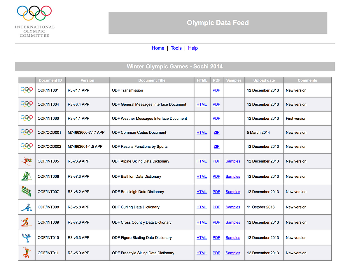
I am excited to share with you the project that kept us busy for the past few months.

The new DJB is bolder, savvier, smarter, and packed with insights from the world of data journalism and innovative storytelling.

We have a lot of new content lined up for you: articles, reviews, how-to guides and interviews with experts from the fields of data visualisations, programming and investigative reporting. As well as a few specials.

« Data » is a big buzz word, it’s also a great way to tell stories we couldn’t tell before.
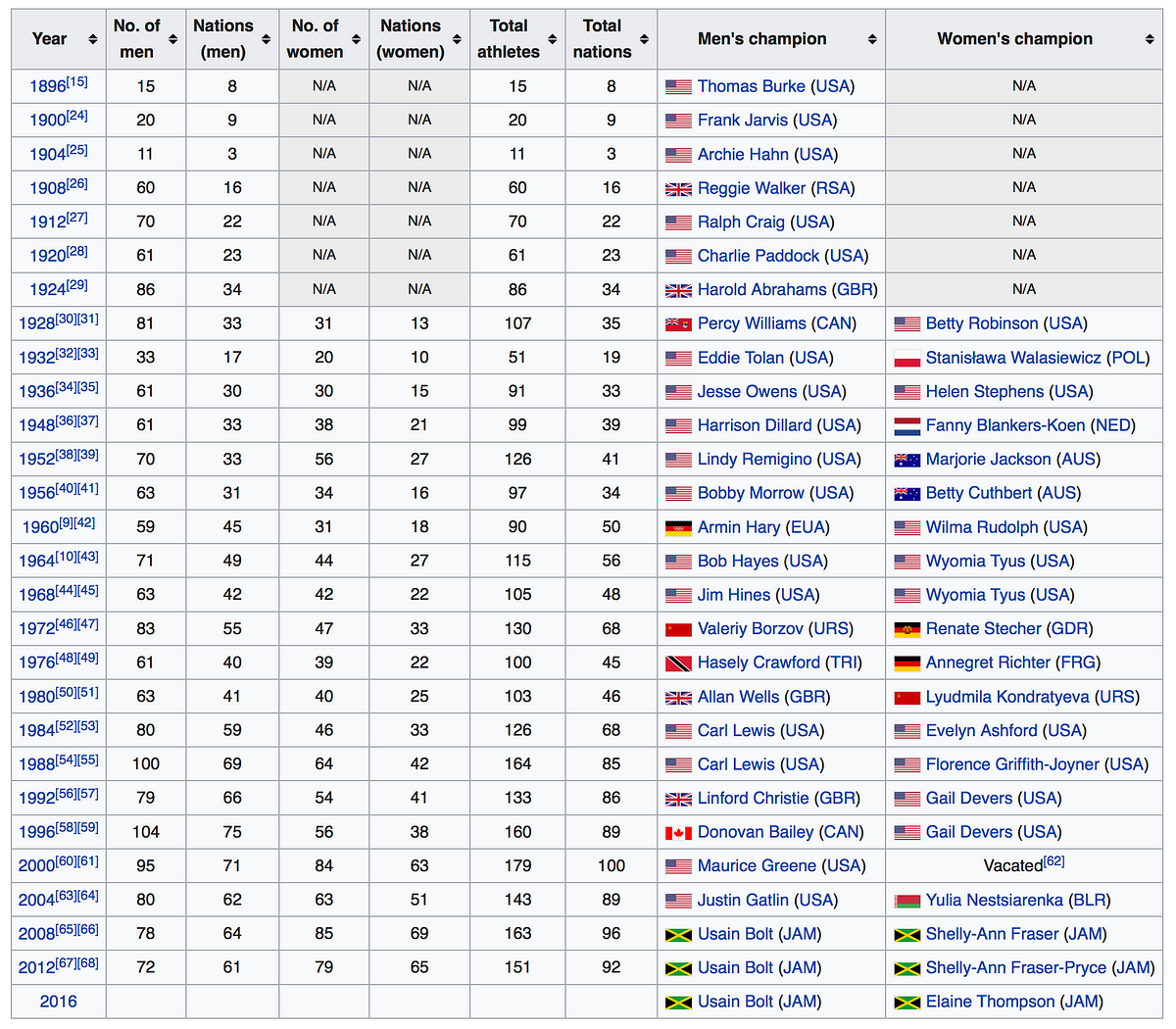
We hope to launch an array of compelling web projects in the near future that will inform our audience in an engaging way, while becoming the prime destination for knowledge on data journalism and innovative storytelling.
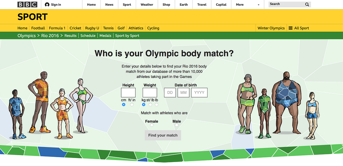
 

Hei-Da.org: a not-for-profit fostering data journalism and web innovation

So we have this great new look and lots of new content. But that’s not the only change that we’ve made. There’s more…
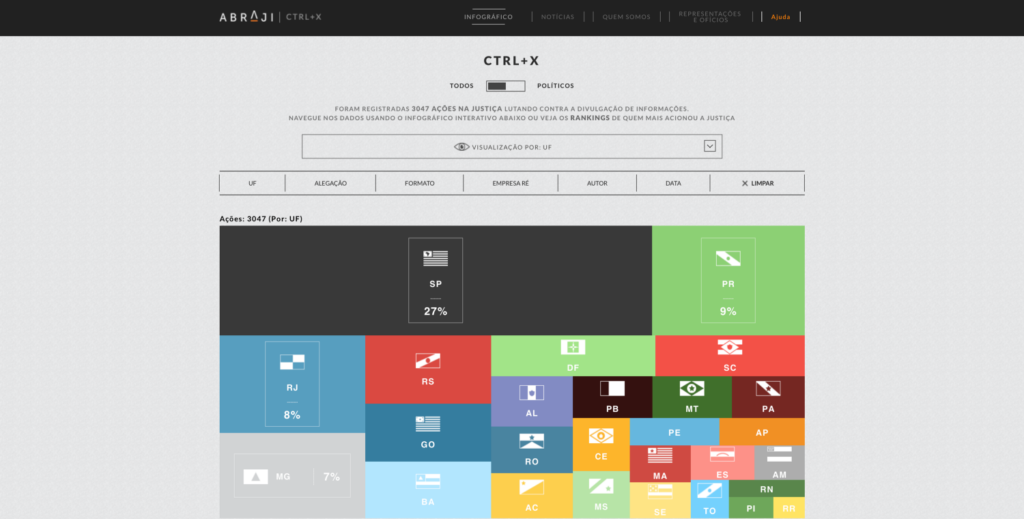
The DJB is now part of the Hei-Da social enterprise for data journalism and web innovation, and we are very excited about it. But what does it mean exactly?

Hei-Da is a not-for-profit organisation fostering the future of data journalism, open data and innovative storytelling.

Its mission is to nurture the future of its field by building an innovation hub dedicated to research in the field of data journalism and web innovation where experiments, training and conferences would take place, unlikely collaborations would blossom, and startups tackling technologies related to data journalism can get advice and support.

We believe it is important that knowledge, skills and ideas get shared and reflected upon. We also think that news is not the only place for data storytelling skills to be used. Many NGOs, charities, local communities, governments and other organisations have data at hands that could tell compelling stories, yet they rarely have the time nor expertise to produce them. Hei-Da was also created to help them harness that data and create interactive storytelling projects on the web that support their mission.

For this to happen, we will need to gather the partners, sponsors and funding necessary for such an ambitious project. If you think you can help, please get in touch.


The DJB at TechFugees

Today is the start of the TechFugees conference in London, an exciting, absolutely free and nonprofit event organised by TechCrunch editor at large Mike Butcher to find technology solutions to the refugee crisis.

The Data Journalism Blog supports this event and I will be talking at the conference about our initiative, how data journalism has been used to cover the refugee crisis, what challenges news organisations face to get data on the crisis and what technology solutions there could be to facilitate data gathering, publishing and storytelling on the ground.

We will be covering the conference on the Data Journalism Blog (you can already see an introductory post here) and Andrew Rininsland, senior developer at The Times and The Sunday Times, will tell us about his experience of the Techfugees Hackathon happening on Friday, October 2nd in London (if you want to join, tickets are still available here).


We’ve only just begun

The Data Journalism Blog is built for a global audience of journalists, designers, developers and other data enthusiasts. People who are interested in the emergence of open data, both experts and amateurs, and want to understand better how it could change the future of information. Or, people who really like fancy infographics and want to find more data visualisations from various sources. Part of the content is very specific and would require knowledge about data journalism, other parts are very broad and could suit more novice readers.

We will thrive to push innovation to the full and experiment new techniques for ourselves, team up with partners to create compelling and interactive storytelling projects as well as deliver news and insights from the industry here on the DJB. So sit back, let us know what you think and let’s enjoy the journey. This is only the beginning.

For more info on Hei-Da.org, go and check out the website.

I hope you enjoy the new look and would love to hear your views. Catch us on Facebook and Twitter.

marianne-bouchart
Marianne is the founder and director of Hei-Da.org, a not-for-profit organisation based in London, UK, that specialises in open data driven projects and innovative storytelling. She also created the Data Journalism Blog back in 2011 and used to work as the Web Producer EMEA, Graphics and Data Journalism Editor for Bloomberg News.
Passionate about innovative story telling, she teaches data journalism at the University of Westminster and University of the Arts, London.