Why journalists should hang out with hackers


JOURNOMEL.COM: By 

Editor’s note: I thought this blog post made a really good point: journalists and hackers should hang out together more. So I decided to share it with you. You can read the full article on Journomel.com.

First confesstion: I’m not very good with numbers and I don’t know how to program in Linux, so I’m naturally fearful of the super computer-savvy.

Second confession: my impression of a hacker had largely been shaped by a really mediocre 1990′s movie. Great soundtrack, but no way could I do what these folks were doing.

Fast forward 16 years and I’m a convert. Partnering with hackers is a natural fit: as more and more data is available to the public, there are stories to be told.

And despite the way they are portrayed by the media – yes, us – hackers are not in their basements dreaming up viruses to take over the world.

I’m part of a group that brought a Hacks/Hackers chapter to Ottawa, and I’m learning that when journalists and technology collide, amazing things happen.

At our first meetup in May I was surprised to hear from a hacker that he was just as thrilled to meet up with a group of hacks (not quite used to that title) as I was meeting him and hacker friends.

“What do you have to gain here?” I asked, “You can build apps, fusion tables, what do you get out of this?”

“Sure, I can build anything – but you know what stories people need to hear, and what they want to hear. You know the audience.”

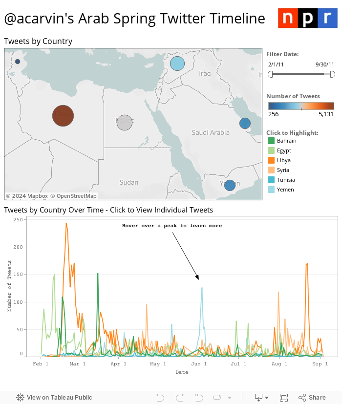
Third confession: I was more than a little intimidated when I bumped into Kate Myers and Andy Carvin from NPR at a hackathon held at the Online News Association conference this September.

Kate is the Product Manager for Social Media Tools, and Andy is the Senior Strategist for NPR’s Social media desk. [Read more…]

 

75+ Tools for Visualizing your Data, CSS, Flash, jQuery, PHP

Editor’s note: Back in 2009, Tripwire magazine published this comprehensive article about data visualisation tools. Although technology has come a long way since then, most of their tips are still relevant so we thought you’d like to take a pick. You’ll find some old school know-how to bring your data to life. Enjoy!

TRIPWIRE MAGAZINE – By LARS

Most people would agree that the old adage “A picture is worth a thousand words” is also true for web based solutions. There should be no discussion – Charts and Graphs are ideal to visualize data in order to quickly deliver an overview and communicate key messages. Whatever type of data presentation you prefer or suits you data (pie charts, bubble charts, bar graphs, network diagrams etc.), there are many different options but how do you get started and what is technologically possible? In this article tripwire magazine present more than 75 Tools for Visualizing your data on a website and most of the options available will be covered. If you are aware of a tool, script etc. that deserves to be added to the list I would kindly ask you to leave a comment to everyone’s benefit.

Introduction

Images says more than a thousands words. It is common sense and wise people has followed this rule for centuries by creating illustrations of thier ideas and thoughts. Today it is easier than ever as the technology for presenting nearly any type of information as a graph or chart on a web page is getting really mature. Reading through this article you will be faced with the problem on what technology and specific implementation you should use. It is not a trivial question and I recommend that you use comments on this article to share your ideas, concerns etc. with peer readers. This way you may get the input from the community that you need to create the optimal solution.

The article has been organised into the following sections.

Section 1: How to visualize you data using Javascript-based solutions

Section 2: How to visualize you data using CSS

Section 3: How to visualize you data using Server-side Solutions

Section 4: How to visualize you data using FLASH-based solutions

Section 5: How to visualize you data using Online Tools and Services

How to visualize you data using Javascript-based solutions

jqPlot Charts and Graphs for jQuery

The feature rich jqPlot is a plotting and charting plugin for the jQuery Javascript framework. There are plenty of hooks into the core jqPlot code allowing for custom event handlers, creation of new plot types and adding canvases to the plot.

jQuery

flot – Attractive Javascript plotting for jQuery

Flot is a pure Javascript plotting library for jQuery. It produces graphical plots of arbitrary datasets on-the-fly client-side. It has been developed with focus on simple usage (all settings are optional), attractive looks and interactive features like zooming and mouse tracking.
The plugin works with Internet Explorer 6/7/8, Firefox 2.x+, Safari 3.0+, Opera 9.5+ and Konqueror 4.x+ with the HTML canvas tag (Internet Explorer where the excanvas Javascript emulation helper is used).

jQuery

jQuery Sparklines

This jQuery plugin generates sparklines (small inline charts) directly in the browser using data supplied either inline in the HTML, or via javascript all with a single line of code.
The plugin is compatible with most modern browsers and has been tested with Firefox 2+, Safari 3+, Opera 9, Google Chrome and Internet Explorer 6, 7 & 8.

jQuery

Flotr Javascript Plotting Library

Flotr is a javascript plotting library based on the Prototype Javascript Framework and has been inspired by Flot (above). [Read more…]

How journalists can use Backbone to create data-driven projects

POYNTER – By Erik Hinton

Single page apps are great solutions for data journalism. By offloading the complexity from backends and servers, journalists can build rich programs and graphics out of just Javascript, HTML and CSS. In fact, these “backends” can shrink to a vanishing point. We can use Twitter in place of a database. Or we can get even simpler and store (static) data in JS/JSON/XML files.

We can make news apps without having to touch a server or write any Ruby, Python or PHP. This is important. It allows data journalists to focus on developing their stories instead of configuring servers. The time and effort to launch an interactive application is reduced to the point where it becomes feasible for journalistic outlets of all sizes to make applications for both long-term pieces and breaking news.

Using JavaScript frameworks to manage one-page apps

There is something of a disconnect between traditional software development models and those of deadline-driven news. In a more server-side oriented development scheme, we would write a program on our computers, set up a server somewhere, configure it to run the app, transfer the data to some database on the server, make sure it can handle the load of a lot of people looking at it and then finally release it. In the newsroom, we have limited time. [Read more…]

15 Well Designed Twitter Infographics


FLASHUSER

Infographics are probably the best way to show different statistics ( social media, internet marketing, online advertising etc. ) in a pleasant and enjoyable form. The infographic, in most cases, communicates complex datas in a simple and understandable fashion. With a few words and lot of stylish, fun images a well designed infographic for sure will remain for a long period of time in your memory.

Because I enjoyed much of using Twitter, I assembled some of the best infographics around this social media network. Some of them are funny, while others can help you in your Twitter bussiness process.

Sit back in your comfortable chair and enjoy this colorful list of Twitter infographics 2011. For a full-size version please click on each image or visit the source author website.

1. A Visual History of Twitter

Source: Mashable

infographic-graphics-twitter_history


2. Twitter Facts and Figures

Source: Touchagency

twitter-facts-figures

[Read more…]


99% v 1%: the data behind the Occupy movement – animation


THE GUARDIAN’S DATABLOG – By  and 

It has been the rallying cry of the Occupy movement for the past two months – but is the US really split 99% v 1%? As poverty and inequality reach record levels, how much richer have the rich got? This animation explains what the key data says about the state of America today

• Explore the data behind this animation and read the script


Click on the picture below to watch the video on The Guardian’s website:


Are You Addicted to Your Mobile Phone [Infographic]


INFOGRAPHICS SHOWCASE 

This UK-based infographic asks if you are addicted to your mobile phone.  They say that 83% of people own mobile phones, and I am thinking they are talking about the population of the UK, because no way for the whole world, you know?  Of that 83%, 35% own smartphones.  Of the people who own cell phones, about half of them admit to be addicted to their devices.  Scary. [Read more…]


How crowdsourcing is changing science

THE BOSTON GLOBE – By Gareth Cook

At the end of the 19th century, a team of British archeologists happened upon what is now one of the world’s most treasured trash dumps.

The site, situated west of the main course of the Nile, about five days journey south of Memphis, lay near the city of Oxyrhynchus. Garbage mounds are always a sweet target for those interested in the past, but what made the Oxyrhynchus dump special was its exceptional dryness. The water table lay deep; it never rained. And this meant that the 2,000-year-old papyrus in the mounds, and the text inscribed on it, were remarkably well preserved.

Eventually some half a million pieces of papyrus were drawn from the desert and shipped back to Oxford University, where generations of scholars have been painstakingly transcribing and translating them. The manuscripts are rich, fascinating, and varied. The texts include lost comedies by the great Athenian playwright Menander, and the controversial Gospel of Thomas, along with glimpses of daily life — personal notes, receipts for the purchase of donkeys and dates — and the occasional scrap of sex magic. [Read more…]

Thoughts from the Global Investigative Journalism Conference


OPEN SPENDING.ORG –  by 

This post is by Lucy Chambers, community coordinator at the Open Knowledge Foundation, and Friedrich Lindenberg, Developer on OpenSpending. They recently attended the Global Investigative Journalism Conference 2011 in Kyiv, Ukraine, and in this post, bring home their thoughts on journalist-programmer collaboration…

The conference

The Global Investigative Journalism Conference must be one of the most intense yet rewarding experiences either of us have attended since joining the OKF. With topics ranging from human trafficking to offshore companies, the meeting highlighted the importance of long-term, investigative reporting in great clarity.

With around 500 participants from all over the globe with plenty of experience in evidence gathering, we used this opportunity to ask many of them how platforms like OpenSpending can contribute, not only to the way in which data is presented, but also to how it is gathered and analyzed in the course of an investigation.

Spending Stories – the brainstorm

As many of you will be aware, earlier this year we won a Knight News Challenge award to help journalists contextualise and build narratives around spending data. Research for the project, Spending Stories, was one of the main reasons for our trip to Ukraine…

During the data clinic session as well as over drinks in the bar of “Hotel President” we asked the investigators what they would like to see in a spend analysis platform targeted at data journalists. Cutting to the chase, they immediately raised the key questions:

HOW WILL IT SUPPORT MY WORK?

It was clear that the platform should support the existing journalistic workflow through publishing embargos, private datasets and note making. At the same time, the need for statistical and analytical heuristics to dissect the data, find outliers and visualize distributions was highlighted as a means to enable truly data-driven investigations of datasets. The goal in this is to distinguish anomalies from errors and patterns of corruption from policies.

WHAT’S IN IT FOR MY READERS?

With the data loaded and analyzed, the next question is what value can be added to published articles. Just like DocumentCloud enabled the easy embedding of source documents and excerpts, OpenSpending should allow journalists to visualize distributions of funds, embed search widgets and data links, as well as information about how the data was acquired and cleaned.

WHAT DO I NEED TO LEARN TO DO IT?

Many of those we spoke to were concerned about the complexity required to contribute data. The recurring question was: should I even try myself or hire help? It’s clear that for the platform to be accessible to journalists, a large variety of data cleansing tutorials, examples and tools need to be at their disposal.

We’ve listed the full brainstorm on the OpenSpending wiki

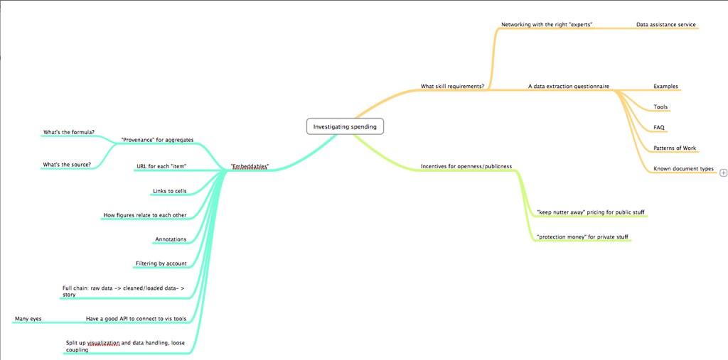
You can also see the mind map with concrete points below:

Hacks & Scrapers – How technical need data journalists be?

In a second session, “Data Camp” we went through the question of how to generate structured data from unstructured sources such as web pages and PDF documents. [Read more…]

Data Journalism – a new career


Monastic Musings Too – By Sister Edith

I had never heard of Data Journalism until a few weeks ago. I’m still not entirely sure I understand what it means – but there are seemingly job openings for Data Journalists.  Plenty of them.

What makes a person a data journalist? The ability to deal with data.  At first I thought this must be pretty simple: take a statistics class, learn the basics of data interpretation.  Want to know more? Take more statistics classes.  That was a social scientist‘s point of view – and it’s not true for data journalism.

Statistics vs Data Journalism

A data journalist definitely needs to know basic statistics.  No competent data journalist would confuse a proportion with a percentage, and then report that prices (or profits) had increased 1300%.  A data journalist understands the meaning of statistical significance, can accurately interpret reports of scientific research, and is energized, rather than terrified, but the presence of numbers.

The difference between the professions is found in the auxiliary skills.  A social scientist – the group most commonly compared to data journalists – expects to define variables, collect data that no one has collected before, or create unique data sets.  Even social scientists who specialize in secondary analysis – working with data collected by governments, international agencies, or public data sets – are interested primarily in exploring theories or evaluating which academic perspective is more likely to be true. So they study research methods, marinate themselves in the intricacies of social theories, and garner all the tools of academic discourse.

The data journalist does not expect or want to be the creator of data – although she may well aspire to be the one who combined existing data in new ways to generate a new perspective.  The data journalist needs all the skills of any journalist – tracking down all angles of a story, gathering the particular details and forming a coherent narrative that is supported by the facts of the situation.  For a data journalist, those facts are data – usually numbers – gathered by local, statewide, national, international governmental bodies as well as many non-profit agencies and dozens – hundreds – of public relations and advertising firms.  Oh yes – there’s also the data being generated by your cell phone,Facebook or Linked-In, your computer use and Google click-through, and the like.

Skills of the Data Journalist

Beyond the basics of statistics – understanding a frequency distribution table or a research report – the data journalist is an organizer of existing data.  They pursue topics not data sets or research agendas.  Rather than a long academic review of the literature on an issue like religious freedom or the psychological impact of unemployment, the data journalist wants to discover and create an underlying plot line, and support it with data from government reports, social scientists’ research projects, economic projections, and more. [Read more…]