” – Hey! Are you coming to the free seminar on data visualisation for journalists this Thursday?
– Where is it?
– Everywhere! I mean, anywhere you like, it’s broadcast live on the internet at 4pm UK time.
– hell, yeah, I’ll come! Who’s talking?
– Only some big names in data journalism: Xaquín G.V. from The New York Times, Annamarie Cumiskey from the Bureau of Investigative Journalism, Mar Cabra of the International Consortium of Investigative Journalists – ICIJ, and David Cabo of Pro Bono Público
– Pro Bono Publico? Is that held in Spain then?
– Yep, It’s happening in Madrid at Medialab-Prado, a program of the Department of Arts of the City Council. You should check out their website, they have some really interesting stuff in terms of arts and visualisations.
– Great!
– If you want more information, take a look at the schedule here. The conference will be conducted in Spanish and English and will be translated live.
– That’s gonna be interesting 😉 Will I be able to ask some questions at the end?
– There will be some discussion afterwards but I don’t know whether the online audience will be able to join in. A workgroup on data journalism will also be launched during the event, seeking to bring together professionals interested in data visualisations, from journalists to graphic designers, who will then meet regularly at Medialab-Prado.
– Looking forward to see how it turns out.. Thanks for the info, speak to you on Thursday! You will write something on the Data Journalism Blog about this right?
– Sure! I might just copy and paste this conversation though.. 🙂
– You should! ”
Visweek 2011 is upon us!
VISUALIZATION BLOG
The annual IEEE Visualization, IEEE Information Visualization and IEEE Visual Analytics Science and Technology conferences – together known as IEEE Visweekwill be held in Providence, RI from October 23rd to October 28th.The detailed conference program is spectacular and can be downloaded here.Some of the new events this year are under the Professional’s Compass category. It includes a Blind date lunch (where one can meet some researcher they have never met and learn about each others research), Meet the Editors (where one can meet editors from the top graphics and visualization journals), Lunch with the Leaders session (an opportunity to meet famous researchers in the field) and Meet the faculty/postdoc candidates (especially geared towards individuals looking for a postdoctoral position or a faculty position). I think this is an excellent idea and hope that the event is a hit at the conference.
I am also eagerly looking forward towards the two collocated symposia – IEEE Biological Data Visualization (popularly known as biovis) and IEEE LDAV (Large data analysis and visualization). Their excellent programs are out and I’d encourage you to take a look at them.
The tutorials this year look great and I am particularly looking forward to the tutorial on Perception and Cognition for Visualization, Visual Data Analysis and Computer Graphics by Bernice Rogowitz. Here is anoutline for the tutorial that can be found on her website. She was one of the first people to recommend that people STOP using the rainbow color map.
The telling stories with data workshop too looks great and will be a continuation of the great tutorial held by the same group last year. I am eagerly looking forward to it. [Read more…]
Data visualisation: in defence of bad graphics
THE GUARDIAN’S DATABLOG – By Simon Rogers
Well, not really – but there is a backlash gathering steam against web data visualisations. Is it deserved?
Are most online data visualisations, well, just not very good?
It’s an issue we grapple with a lot – and some of you may have noticed a recent backlash against many of the most common data visualisations online.
Poor Wordle – it gets the brunt of it. It was designed as an academic exercise that has turned into a common way of showing word frequencies (and yes, we are guilty of using it) – an online sensation. There’s nothing like ubiquitousness to turn people against you.
In the last week alone, New York Times senior software architect Jacob Harris has called for an end to word clouds, describing them as the “mullets of the Internet“. Although it has used them to great effect here.
While on Poynter, the line is that “People are tired of bad infographics, so make good ones”
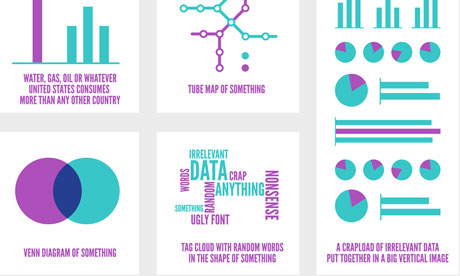
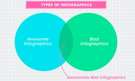 Awesomely bad infographics from How to Interactive Design Photograph: How To Interactive Design
Grace Dobush has written a great post explaining how to produce clear graphics, but can’t resist a cry for reason.
What’s the big deal? Everybody’s doing it, right? If you put [Infographic] in a blog post title, people are going to click on it, because they straight up can’t get enough of that crap. Flowcharts for determining what recipe you should make for dinner tonight! Venn diagrams for nerdy jokes! Pie charts for statistics that don’t actually make any sense! I have just one question—are you trying to make Edward Tufte cry?
Oh and there has also been a call for a pogrom of online data visualisersfrom Gizmodo’s Jesus Diaz:
The number of design-deficient morons making these is so ridiculous that you can fill an island with them. I’d do that. And then nuke it
A little extreme, no?
There has definitely been a shift. A few years ago, the only free data visualisation tools were clunky things that could barely produce a decent line chart, so the explosion in people just getting on and doing it themselves was liberating. Now, there’s a move back towards actually making things look, er, nice. [Read more…]
Twitter: Is It All About Timing? [Infographic]
SOCIALMOUTHS (Original post can be found here)
 Yes, it feels good to talk about Twitter after spending a full week discussing Facebook’s major announcement. And why not, a little bit of Google+ too.
By the way, I was just reading today’s post from Jeff Bullasand I’m happy to see that even when Facebook hijacked the Internet, Google+ was able to grow nearly 9 million in 2 days. That’s pretty impressive.
But like I said, let’s please talk about Twitter for a change.
This infographic from Lemon.ly talks about Twitter timing and I thought I’d share it with you because it seems to be a regular concern. One of the questions I often get from clients and readers is “What is the best time to Tweet?” and while I think there is no one-size-fits-all kind of answer for this, at least this data lets you visualize a trend.
For example in my case, I agree with the AM timeframe but in the PM, I find that I get the most activity and best results between 3 and 5pm. I also agree with the usage percentage by day of the week although one of my favorite days to spend on Twitter are Fridays and according to this analysis it doesn’t get the action Tuesdays get. Like I said, that’s just me, the point is that you might have your own preferences.
The important thing is that you allow yourself to test the waters.
That’s not all on the infographic, there are other interesting numbers like how many Tweets happen per second or what was the hottest event. Let’s take a look at it and share your thoughts in the comments section.

Infographic courtesy of Lemon.ly
Over To You
What do you think? What are YOUR best times to tweet? Are you more active on certain days of the week? Share your comments!
4 Simple Tools for Creating an Infographic Resume
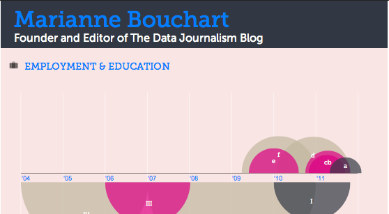
Editor’s note: As data journalists, designers or other data enthusiasts, what a better way to show off your skills than with an infographic resume? Here is a very useful article by Mashable’s Erica Swallow introducing four very interesting tools to make your profile stand out! Show us your infographic resume in our Data Art Corner. The best examples will be featured in the DJB’s front page next month!
MASHABLE – By Erica Swallow
As a freelancer or job seeker, it is important to have a resume that stands out among the rest — one of the more visually pleasing options on the market today is the infographic resume.
An infographic resume enables a job seeker to better visualize his or her career history, education and skills.
Unfortunately, not everyone is a graphic designer, and whipping up a professional-looking infographic resume can be a difficult task for the technically unskilled job seeker. For those of us not talented in design, it can also be costly to hire an experienced designer to toil over a career-centric infographic.
Luckily, a number of companies are picking up on this growing trend and building apps to enable the average job seeker to create a beautiful resume.
To spruce up your resume, check out these four tools for creating an infographic CV. If you’ve seen other tools on the market, let us know about them in the comments below.
1. Vizualize.me

Vizualize.me is a new app that turns a user’s LinkedIn profile information into a beautiful, web-based infographic.
After creating an account and connecting via LinkedIn, a user can edit his or her profile summary, work experience, education, links, skills, interests, languages, stats, recommendations and awards. And voila, astunning infographic is created.
The company’s vision is to “be the future of resumes.” Lofty goal, but completely viable, given that its iteration of the resume is much more compelling than the simple, black-and-white paper version that currently rules the world.
2. Re.vu

Re.vu, a newer name on the market, is another app that enables a user to pull in and edit his or her LinkedIn data to produce a stylish web-based infographic.
The infographic layout focuses on the user’s name, title, biography, social links and career timeline — it also enables a user to add more graphics, including stats, skill evolution, proficiencies, quotes and interests over time.
Besides the career timeline that is fully generated via the LinkedIn connection, the other graphics can be a bit tedious to create, as all of the details must be entered manually.
In the end, though, a very attractive infographic resume emerges. This is, by far, the most visually pleasing option of all of the apps we reviewed.
3. Kinzaa

Based on a user’s imported LinkedIn data, Kinzaa creates a data-driven infographic resume that focuses on a user’s skills and job responsibilities throughout his or her work history.
The tool is still in beta, so it can be a bit wonky at times — but if you’re looking for a tool that helps outline exactly how you’ve divided your time in previous positions, this may be your tool of choice.
Unlike other tools, it also features a section outlining the user’s personality and work environment preferences. Details such as preferences on company size, job security, challenge level, culture, decision-making speed and more are outlined in the personality section, while the work environment section focuses on the user’s work-day length, team size, noise level, dress code and travel preferences.
4. Brazen Careerist Facebook App

Brazen Careerist, the career management resource for young professionals, launched a new Facebook application in September that generates an infographic resume from a user’s Facebook, Twitter and LinkedIn information.
After a user authorizes the app to access his or her Facebook and LinkedIn data, the app creates an infographic resume with a unique URL — for example, my infographic resume is located atbrazen.me/u/ericaswallow.
The infographic features a user’s honors, years of experience, recommendations, network reach, degree information, specialty keywords, career timeline, social links and LinkedIn profile image.
The app also creates a “Career Portfolio” section which features badges awarded based on a user’s Facebook, Twitter and LinkedIn achievements. Upon signing up for the app, I earned eight badges, including “social media ninja,” “team player” and “CEO in training.” While badges are a nice addition, they aren’t compelling enough to keep me coming back to the app.
Scraperwiki now makes it easier to ask questions of data
OJB – By Paul Bradshaw
I was very excited recently to read on the Scraperwiki mailing list that the website was working on making it possible to create an RSS feed from a SQL query.
Yes, that’s the sort of thing that gets me excited these days.
But before you reach for a blunt object to knock some sense into me, allow me to explain…
Scraperwiki has, until now, done very well at trying to make it easier to get hold of hard-to-reach data. It has done this in two ways: firstly by creating an environment which lowers the technical barrier to creating scrapers (these get hold of the data); and secondly by lowering the social barrier to creating scrapers (by hosting a space where journalists can ask developers for help in writing scrapers).
This move, however, does something different.
It allows you to ask questions – of any dataset on the site. Not only that, but it allows you to receive updates as those answers change. And those updates come in an RSS feed, which opens up all sorts of possibilities around automatically publishing those answers.
The blog post explaining the development already has a couple of examples of this in practice:
Anna, for example, has scraped data on alcohol licence applications. The new feature not only allows her to get a constant update of new applications in her RSS reader – but you could also customise that feed to tell you about licence applications on a particular street, or from a particular applicant, and so on. [Read more…]
The convergence of big data, baseball and pizza at Strata
SPLUNK BLOG – By Paul Wilke
Last week, I was fortunate enough to attend the Strata Big Data Conference in New York. With the conference spanning four days, two hotels, and over 400 attendees one thing stood out… big data is a hot topic!
Splunk was featured in two sessions. On Tuesday, Splunk CIO Doug Harr was part of a panel discussion on the changing role of the CIO, where he and the panel (which included CIOs from Batchtags, Accenture and Revolution Analytics) pointed out that the CIO role is changing and expanding. The function has evolved into one of the most crucial positions in corporations focusing on sustainable growth.
On Friday Splunk Product Manager Jake Flomenberg took the stage with Denise Hemke from Salesforce.com to talk about gleaning new insights from massive amounts of machine data. Denise highlighted how at Salesforce a Chatter group is devoted to sharing ideas on how they work with Splunk so they can make the most of Splunk solutions. To highlight the usefulness of big data in a way that just about everyone could relate to, Jake showed how Splunk could be used to find the average price of pizza in New York City – definitely an example of using data for food, not evil!
Jake also gave a great interview at the conference, which you can see here:
[youtube RNGWPg27JVw]
Overall, a great crowd and very strong topics. One of my favorite sessions was current New York Mets’ executive Paul DePodesta talking about the big data behind Moneyball. It’s a shame the Mets aren’t taking it to heart this season. As the Splunk t-shirts we handed out at Strata say, “A petabyte of data is a terrible thing to waste”.
Read the original post on Splunk Blog here.
Data Driven Journalism: The Series Begins…
OKF – By Lucy Chambers
This post is by Lucy Chambers, Community Coordinator at the Open Knowledge Foundation. The post contains a link to a report on the OKF / EJC Data Driven Journalism workshop on EU Spending, which took place in Utrecht, the Netherlands, on 8th-9th September.
The report was written by Nicolas Kayser-Bril who attended the workshop, and may be helping to run the next in the series in Warsaw in October… stay tuned to the data-driven journalism mailing list for more on the upcoming workshops…
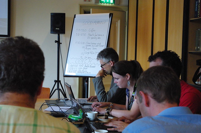
“Data journalism is hard, but that’s precisely what makes it worthwhile… Not every journalist has the skills, knowledge or the commitment to dig into the data…so the ones who do are at a massive advantage” – Chris Taggart [paraphrased], closing remarks
The first in what we hope will become series of data-driven journalism events, the European Journalism Centre and the OKF teamed up alongside a crack-team experts to help tackle some of the technical & research-based challenges facing the modern journalist.
I have no intention of re-inventing the wheel here by giving a full rundown; Nicolas sums up the workshop & gives his insightful ideas for future workshops in his report on the Data Driven Journalism Blog from the EJC far better than I would. You can read the full report here. But just to whet your appetite here and now, here is a snippet:
“As Friedrich Lindenberg was writing this abstruse code on his MacBook plugged on the beamer at the workshop on EU spending on 9 September, 20 journalists listened attentively as data started to speak before their eyes. In a conference room in Utrecht University’s 15th-century Faculty Club, the group from across Europe watched as Lindenberg compared a list of lobbying firms with the list of accredited experts at the European Commission: Any overlap would clearly suggest a conflict of interest.”
“More than watching, the audience actually followed in Lindenberg’s steps on Google Refine, an Excel-like tool, and was taming the data on their own laptops. At this point in time, more journalists were engaging in data-mining in Utrecht than in any other newsroom. This practical exercise was the climax of two days of learning to investigate the mountains of data produced by European institutions. Besides Lindenberg, the coder behindOpenSpending, EU datajournalist Caelainn Barr, OpenCorporates founder Chris Taggart and Erik Wesselius of Corporate Europe shared expertise with participants…”
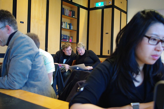
The workshop clearly indicated that there is a great demand for practical skill-based workshops amongst journalists to help them to reap maximum benefit from all the data that is available. One person even asked for a week-long version of the workshop, covering everything in more detail!
We’ll see about the week-long session, but if you are sorry to have missed the last short workshop, don’t despair, there are more workshops coming soon!
Data-journalist? Data-wrangler? Tech geek? New to the field?
Will you be in or around Warsaw on 19th October?
We will be holding a one-day workshop in Warsaw in the run-up to Open Government Data Camp. The important thing to stress about this workshop is that we are looking to have a good ratio of technical people (e.g. programmers & data wranglers) to journalists, so that we can create smaller groups to really go into detail to get the results, fast!
We will post more information about the workshop in the coming days, but places will be limited, so if you are keen (& organised) request an invitation by contacting us now.
Strata NY 2011 [Day 1]: The Human Scale of Big Data [VIDEO]

This post was written by Mimi Rojanasakul on Infosthetics.com. She is an artist and designer based in New York, currently pursuing her MFA in Communications Design at Pratt Institute. Say hello or follow her@mimiosity.
The 2011 Strata Conference in New York City kicked off on Thursday with a brief introduction byO’Reilly’s own Ed Dumbill. He ventures a bold assessment of the present social condition and how data science plays into it: the growth of our networks, government, and information feel as if they are slipping out of our control, evolving like a living organism. Despite this, Dumbill is optimistic, placing the hope to navigate this new “synthetic world” on the emerging role of the data scientist. And so sets the stage for the speakers to follow.
The first keynote comes from Rachel Sterne, New York City’s first Chief Digital Officer and a who’s who in the digital media world since her early twenties. Though there was some of the expected bureaucratic language, examples of what was being done with the city’s open data showed very real progress being made in making parts of government more accessible and allowing the public to engage more directly in their community. New York City is uniquely situated for a project of this nature, and the individual citizens are a key factor – densely packed in and cheerfully tagging, tweeting, and looking for someone to share their thoughts with (or perhaps gripe to). Through NYC Digital’s app-building competitions, hackathons, and more accessible web presence, New Yorkers are able to compose their own useful narratives or tools – from finding parking to restaurants on the verge of closing from health code violations. By the people and for the people — or at least an encouraging start.
 [ New York City evacuation zone map was shared with other parties to protect against heavy internet traffic taking down any individual site ]
On matters of a completely different spatial scale, we turn to Jon Jenkins of NASA’s SETI Institute and Co-Investigator of the Kepler mission. The Kepler satellite, launched in July of 2009, boasts a 100,000 pixel camera that checks for tiny planets blocking a star’s luminescence for over 145,000 stars in its fixed gaze, snapping a photo every 30 minutes with bated breath for potential candidates. As of February 2011, over 1200 planetary candidates were identified. Despite the cosmic scale of Kepler’s investigations, Jenkins’ communicates with a Carl-Sagan-like sense of wonder that is difficult not to get swept up in. Video renderings of distant solar system fly-bys show worlds not unlike our own, a reminder that the motives for some of our greatest accomplishments come from an innate, irrepressible curiosity.
 [ Photo and graphic representation of Kepler’s field of vision ]
 [ Recently discovered planet with two suns ]
Amazon’s John Rauser begins his own talk with a different story about staring at the sky. It’s 1750, Germany, and Tobias Mayer is about to discover the libration (wobble) in the Moon. Rauser argues that it was Mayer’s combination of “engineering sense” and mathematic abilities that allowed him to make the first baby steps toward establishing what we now know as data science. While an earlier presenter,Randy Lea of Teradata, focused mostly on the technological advancements made in the field of big data analytics, Rauser emphasized the human characteristics demanded for this career. Along with the more obvious need for programming fluency and applied math, he cites writing and communication as the first major difference in mediocracy and excellence, along with a strong, self-critical skepticism and passionate curiosity. These last three virtues could just as easily be transplanted into any other field, and judging from the applause and approving tweets, the relevancy clearly struck a nerve with the crowd.
From a design perspective, the obvious continuation to so many of these presentations was the successful visual communication of all this data. My aesthetic cravings immediately subside when Jer Thorp, current Data Artist in Residence at the New York Times, takes the stage. His presentation walks us through a commission to design an algorithm for Michael Arad’s 9/11 memorial that would place names according to the victims’ relationships to one another. Though clustering the 2900 names and 1400 adjacency requests was at first an issue of optimization-by-algorithm, manual typographic layout and human judgement was still necessary to achieve the aesthetic perfection needed. Thorp also made a great point about visualizations not only being an end-product, but a valuable part of the creative process earlier on.
 [ Early visualization of density of relationships ]
[vimeo 23444105]
WTC Names Arrangement Tool from blprnt on Vimeo.
[ Processing tool built to arrange the name clusters by algorithm and by hand ]
To be honest, I was skeptical at first of the decision to cluster the names by association rather than simple alphabetization — an unnecessary gimmick for what should be a uncomplicated, moving experience. Part of the power of the Vietnam Memorial was its expression of the enormous magnitude of human casualties with simple typographics, while its logical organization provided map and key for those purposefully looking for one name. But as Thorp explained these adjacencies in context, the beauty of the reasoning began to unfold. First, it is a matter of new ways of understanding. We do not browse, we search. And collecting and visualizing our identity based on our social networks has become second nature. It has the potential to tell stories about each individual’s lives that go beyond the individual experience, creating a physical and imagined space to extend this unifying connectivity.
Overall, it was a humanizing first experience with professional “big data.” Coming from a background in art and design, you could say I had some apprehensions about my ability to understand the myriad of technical disciplines represented at Strata. Despite this, the experience so far has been of unexpected delights — a keenly curated look at where we are with data today.
I admit this first post was low on data visualizations, but there were plenty of interface and graphics talks in the afternoon sessions to share in the next posts. Stay tuned!


