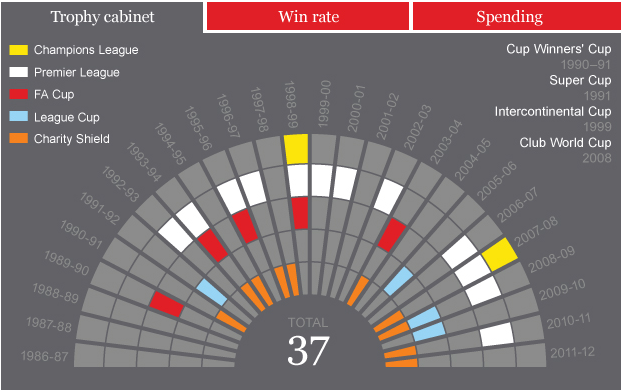
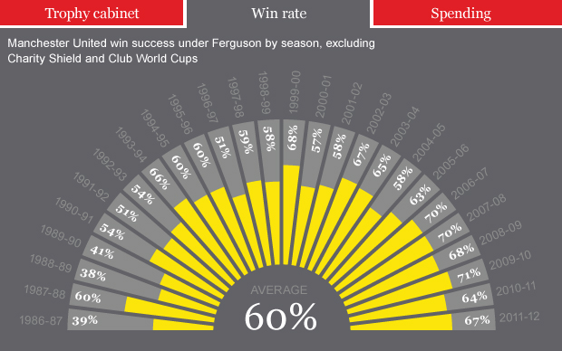
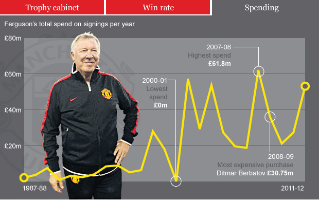
Graphic: Key data behind Sir Alex Ferguson’s 25 years at Old Trafford

THE TELEGRAPH – By Michael Norrish

In the build-up to Sir Alex Ferguson’s 25th anniversary at Manchester United, we chart the key data which have defined his managerial career at Old Trafford

Sunday marks a quarter of a century since Sir Alex Ferguson moved from Aberdeen to join Manchester United, who were then in the relegation zone and without a title since 1967. The next quarter of a century has reaped 12 league titles, two European Cups and five FA Cups.

The tales of Robins, Rotterdam and Ronaldo are now so familiar, they hardly need recounting again, but the longevity of his reign at United can hardly be overemphasised. When he began at Old Trafford, Chelsea manager Andre Villas Boas was eight years old. [Read more…]

The Marathon Route’s Evolving Neighborhoods

THE NEW YORK TIMES – By  GRAHAM ROBERTS, ALAN McLEAN, ARCHIE TSE, LISA WAANANEN, TIMOTHY WALLACE, XAQUIN G.V., JOE BURGESS and JOE WARD

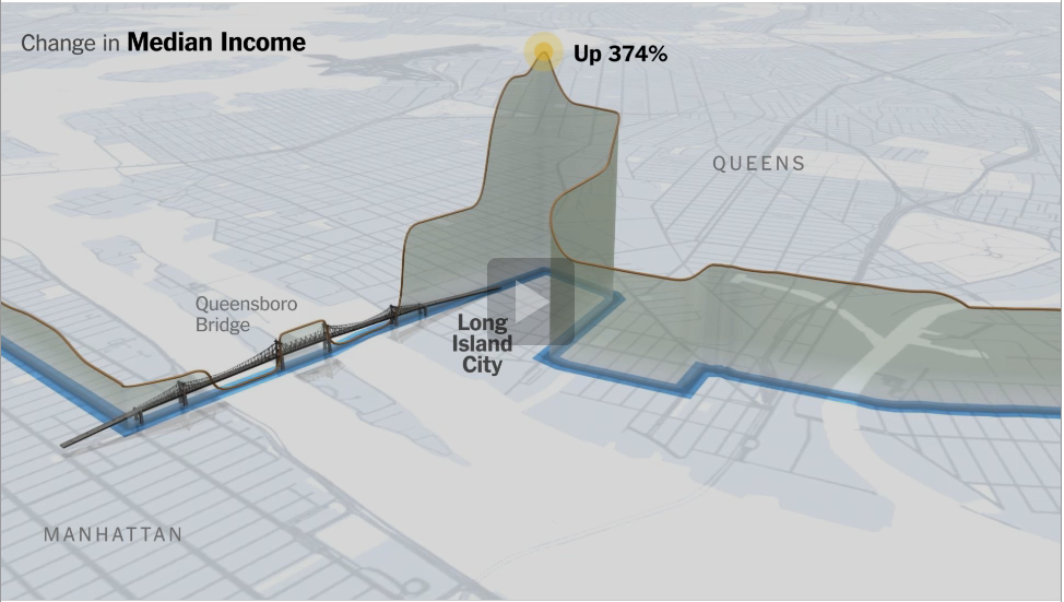
The New York City Marathon course has changed little since it first wound its way through all five boroughs in 1976. But the neighborhoods along the route have seen significant change: they are mostly richer and the ethnic makeup of many of them has shifted.

 [Read more…]

How does Google make money? [INFOGRAPHIC]

So Google is pretty much in every part of our online existence now. It helps us find information about random things, access our emails, watch videos online, sort our friends into circles, get analytics for our websites. It even helps us do data visualisations thanks to Google Fusion Tables.

There is no doubt that Google is making a lot of money but what is the actual break-down? Well, here is an awesome infographic found on the Awesome Inforgaphics website that answer that question. What do you think?

TOP 10 INFOGRAPHICS

AWESOME INFOGRAPHICS

Editor’s note: Here is a top 10 of the best data visualisations according to the blog Awesome Infographics, and they are pretty good indeed! Now we want to hear about you: what is your top data visualisation? Have you come across a stunning infographic lately? Tell us in the comment section..

ONE

Visualising Alcohol Use: What Percentage of the U.S. Drinks Regularly?

Neck it Infographic

Brought to you by Phlebotomist.net


TWO

The World’s Resources by Country

Cool Infographics

Credit: British Geological Survey


THREE

A HAND DRAWN infographic. Non of that inDesign bullshit for this guy.

Hand Drawn Infographic


FOUR

The Trilogy Meter

Trilogy Meter

FIVE

The Jedi Trainer’s Guide to Employee Management

Star Wars Infographic

Thanks to www.MindFlash.com for this one. [Read more…]


Nato operations in Libya: data journalism breaks down which country does what

THE GUARDIAN’S DATA BLOG – By 

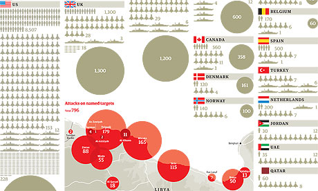
How many Nato attacks took place over Libya – and what did they hit? Here’s the most comprehensive analysis yet of who did what
• Get the data

Nato in Libya graphic


Nato‘s Libya operations have cost millions and involved thousands of airmen and sailors. But who’s contributed to Operation Unified Protector? That’s the official name for the attacks on the Gadaffi regime’s bases and tanks by Nato aircraft and ships, plus the enforcement of the no-fly zone and the arms embargo.

We have been monitoring the Nato situation updates which are released each day and give details of the operations – key targets hit, sorties flown and ships boarded.


The world at 7 billion: Interactive data journalism at the BBC

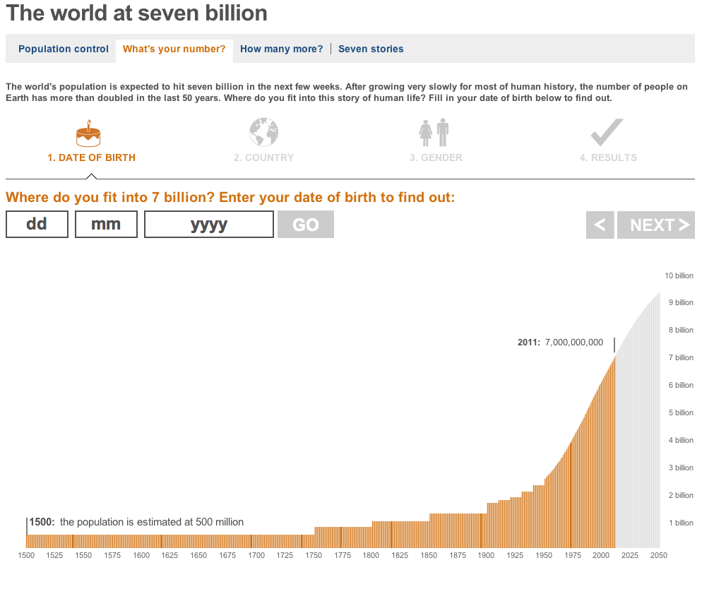
BBC News editor Steve Herrmann announced at the News:Rewired event earlier this month that the BBC News website will be developing more data journalism projects. “The World at Seven Billion” is a great example of what we could expect from them in the future, and it is really exciting! Have a play with it and tell us what you think in the comment section…

“The world’s population is expected to hit seven billion in the next few weeks. After growing very slowly for most of human history, the number of people on Earth has more than doubled in the last 50 years. Where do you fit into this story of human life? Fill in your date of birth below to find out.”


Groundbreaking data tracks carbon emissions back to their source

THE GUARDIAN’S ENVIRONMENT BLOG – By 

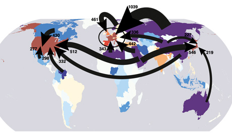
A new scientific paper allows us to see which countries extracted the fossil fuels burned to support lifestyles in other countries

Overview of carbon flows from fossil fuel extraction to the final consumers of goods and services

 
Which of the following accounts for the largest share of the UK’s carbon footprint? All our holiday flights, all the power used in our homes or … Russia?

Okay, so it’s kind of a trick question, but according to a scientific paper published this week, we might reasonably conclude that the answer is Russia – though to understand why it’s necessary to go back a couple of steps.

For the purposes of the Kyoto treaty, a nation’s carbon footprint is considered to be a sum of all the greenhouse gas released within its borders. But as many people – myself included – have been pointing out for years, that approach ignores all the laptops, leggings, lampshades and other goods that rich countries import from China and elsewhere.

If we want any chance of a fair global climate deal, the now-familiar argument goes, we need to rethink the way we measure emissions to allocate some of the carbon pouring out of Chinese, Indian and Mexican factories and power plants to the countries importing good from those countries.

The new scientific paper, published in the Proceedings of the National Academy of Sciences, points out that this argument – though persuasive – tells only half of the story. If you want to understand how carbon footprints are affected by international trade flows, the paper argues, you need to consider trade not only in gadgets and garments but also in fossil fuels themselves. After all, though country X might import a television that was made in country Y, it’s quite possible that country Y in turn imported some of the coal, oil or gas consumed by the television factory from country Z. [Read more…]


Occupy protests around the world: full list visualised

THE GUARDIAN’S DATA BLOG – By 

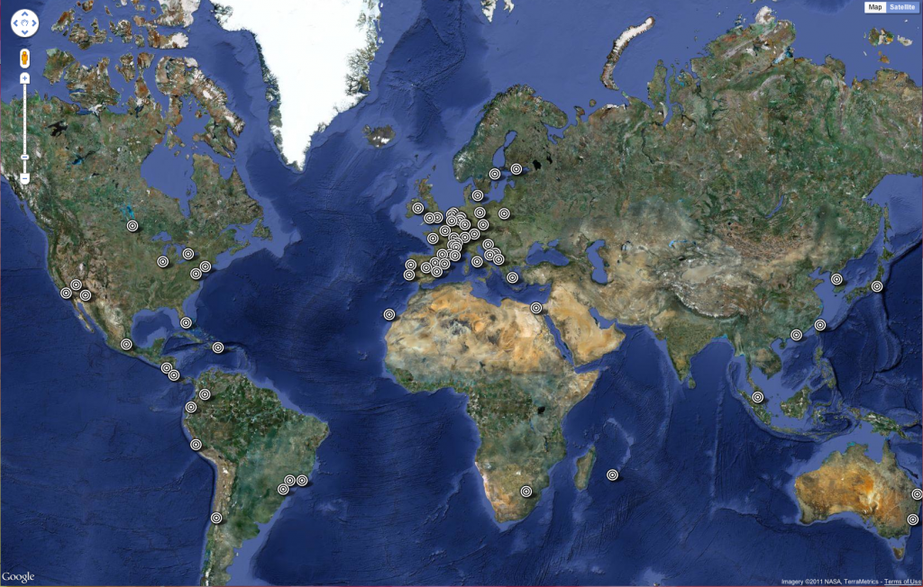
The Occupy protests have spread from Wall Street to London to Bogota. See the full list – and help us add more
• 
Get the data


“951 cities in 82 countries” has become the standard definition of the scale of the Occupy protests around the world this weekend, following on from the Occupy Wall Street and Madrid demonstrations that have shaped public debate in the past month.

We wanted to list exactly where protests have taken place as part of theOccupy movement – and see exactly what is happening where around the globe. [Read more…]

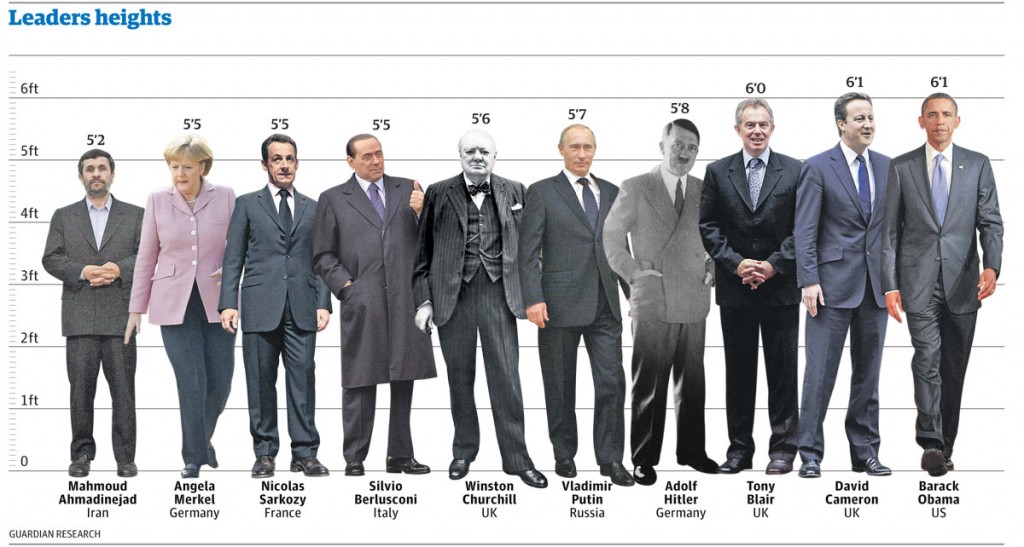
How tall are our world leaders? [Visualised]

THE GUARDIAN’S DATA BLOG – By 

It seems we like our political giants to be just that – giants – according to new research. See how they compare in the height stakes
• Get the data


World leaders’ heights: click image for graphic

Stature really does matter according to a new scientific paper published today in Social Science Quarterly.

Here at the Datablog we thought this was an opportunity too good to pass up. How tall really are our world leaders and how do they compare?

Psychologists from Texas Tech University found in a study that almost two-thirds of participants showed a preference to draw larger figures when asked to draw images of leaders. An evolutionary throwback has been suggested as the root of this. Nic Fleming writes today:

It is not for nothing that top politicians are known as political giants or “big beasts”. Voters see tall politicians as better suited for leadership, according to a survey of how people visualise their leaders. Psychologists believe the bias may stem from an evolved preference for physically imposing chiefs who could dominate enemies.

David Cameron and Barack Obama certainly fit the profile at 6ft 1in and have both beaten shorter candidates in past elections – Gordon Brownat 5ft 11ins and John McCain at 5ft 8ins. [Read more…]

Free seminar on data visualization for journalists: “Are you coming?”

” – Hey! Are you coming to the free seminar on data visualisation for journalists this Thursday?

– Where is it?

– Everywhere! I mean, anywhere you like, it’s broadcast live on the internet at 4pm UK time.

– hell, yeah, I’ll come! Who’s talking?

– Only some big names in data journalism: Xaquín G.V. from The New York Times, Annamarie Cumiskey from the Bureau of Investigative Journalism, Mar Cabra of the International Consortium of Investigative Journalists – ICIJ, and David Cabo of Pro Bono Público

– Pro Bono Publico? Is that held in Spain then?

– Yep, It’s happening in Madrid at Medialab-Prado, a program of the Department of Arts of the City Council. You should check out their website, they have some really interesting stuff in terms of arts and visualisations.

– Great!

– If you want more information, take a look at the schedule here. The conference will be conducted in Spanish and English and will be translated live.

– That’s gonna be interesting 😉 Will I be able to ask some questions at the end?

– There will be some discussion afterwards but I don’t know whether the online audience will be able to join in. A workgroup on data journalism will also be launched during the event, seeking to bring together professionals interested in data visualisations, from journalists to graphic designers, who will then meet regularly at Medialab-Prado.

– Looking forward to see how it turns out.. Thanks for the info, speak to you on Thursday! You will write something on the Data Journalism Blog about this right?

– Sure! I might just copy and paste this conversation though.. 🙂

– You should! ”