 source: Joel Gunter from Journalism.co.uk
The New York Times has one of the largest, most advanced graphics teams of any national newspaper in the world. The NYT deputy graphics editor Matthew Ericson led a two-hour workshop at the International Journalism Festival last week about his team’s approach to visualising some of the data that flows through the paper’s stories everyday. Here is a short guide on how to make good data journalism…
The New York Times data team follows four golden rules:
- Provide context
- Describe processes
- Reveal patterns
- Explain the geography
Provide context
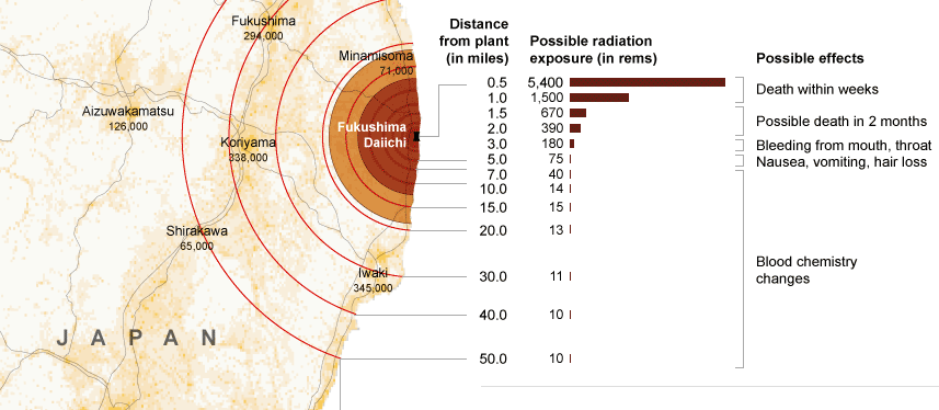
Graphics should bring something new to the story, not just repeat the information in the lead. A graphics team that simply illustrates what the reporter has already told the audience is not doing its job properly. “A graphic can bring together a variety of stories and provide context,” Ericson argued, citing the NYT’s coverage of the Fukushima nuclear crisis.
“We would have reporters with information about the health risks, and some who were working on radiation levels, and then population, and we can bring these things together with graphics and show the context.”
Describe processes
The Fukushima nuclear crisis has spurned a lot of graphics work in many news organisations across the world and Ericson explained hoe the New York Times went about it.
“As we approach stories, we are not interested in a graphic showing how a standard nuclear reactor works, we want to show what is particular to a situation and what will help a reader understand this particular new story.
Like saying: You’ve been reading about these fuel rods all over the news, this is what they actually look like and how they work.”
Reveal patterns
This is perhaps the most famous guideline in data visualisation. Taking a dataset and revealing the patterns that may tell us a story. Crime is going up here, population density down there, immigration changing over time, etc.
These so-called “narrative graphics” are very close to what we have been seeing for a while in broadcast news bulletins.
Explain geography
The final main objective was to show the audience the geographical element of stories.
Examples for this section included mapping the flooding of New Orleans following hurricane Katrina and a feature of demonstrating the size and position of the oil slick in the Gulf following the BP Deepwater Horizon accident, and comparing it with previous major oil spills.
Some of the tools in use by the NYT team, with examples:
Google Fusion Tables
Tableau Public: Power Hitters
Google Charts from New York State Test Scores – The New York Times
HTML, CSS and Javascript: 2010 World Cup Rankings
jQuery: The Write Less, Do More, JavaScript Library
jQuery UI – Home
Protovis
Raphaël—JavaScript Library
The R Project for Statistical Computing
Processing.org
Joel Gunter from Journalism.co.uk wrote a very interesting article on the workshop led by Ericson. He spoke to Ericson after the session about what kind of people make up his team (it includes cartographers!) and how they go about working on a story. Here is what he had to say.


