Nato operations in Libya: data journalism breaks down which country does what

THE GUARDIAN’S DATA BLOG – By 

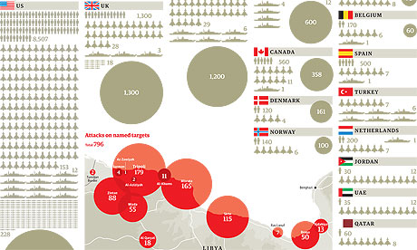
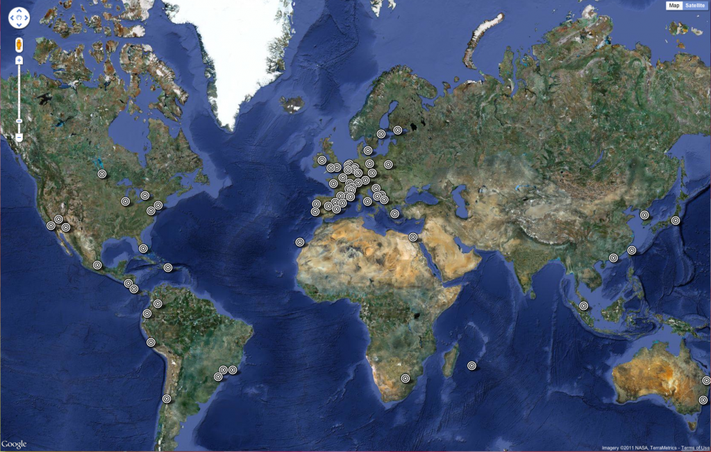
How many Nato attacks took place over Libya – and what did they hit? Here’s the most comprehensive analysis yet of who did what
• Get the data

Nato in Libya graphic


Nato‘s Libya operations have cost millions and involved thousands of airmen and sailors. But who’s contributed to Operation Unified Protector? That’s the official name for the attacks on the Gadaffi regime’s bases and tanks by Nato aircraft and ships, plus the enforcement of the no-fly zone and the arms embargo.

We have been monitoring the Nato situation updates which are released each day and give details of the operations – key targets hit, sorties flown and ships boarded.


The Data Journalism Handbook at #MozFest 2011 in London

The following post is from Jonathan Gray, Community Coordinator at the Open Knowledge Foundation.

With the Mozilla Festival approaching fast, we’re getting really excited about getting stuck into drafting the Data Journalism Handbook, in a series of sessions run by the Open Knowledge Foundation and the European Journalism Centre.

As we blogged about last month, a group of leading data journalists, developers and others are meeting to kickstart work on the handbook, which will aim to get aspiring data journalists started with everything from finding and requesting data they need, using off the shelf tools for data analysis and visualisation, how to hunt for stories in big databases, how to use data to augment stories, and plenty more.

We’ve got a stellar line up of contributors confirmed, including:

Here’s a sneak preview of our draft table of contents:

  • Introduction
    • What is data journalism?
    • Why is it important?
    • How is it done?
    • Examples, case studies and interviews
      • Data powered stories
      • Data served with stories
      • Data driven applications
    • Making the case for data journalism
      • Measuring impact
      • Sustainability and business models
    • The purpose of this book
    • Add to this book
    • Share this book
  • Getting data
    • Where does data live?
      • Open data portals
      • Social data services
      • Research data
    • Asking for data
      • Freedom of Information laws
      • Helpful public servants
      • Open data initiatives
    • Getting your own data
      • Scraping data
      • Crowdsourcing data
      • Forms, spreadsheets and maps
  • Understanding data
    • Data literacy
    • Working with data
    • Tools for analysing data
    • Putting data into context
    • Annotating data
  • Delivering data
    • Knowing the law
    • Publishing data
    • Visualising data
    • Data driven applications
    • From datasets to stories
  • Appendix
    • Further resources

If you’re interested in contributing you can either:

  1. Come and find us at the Mozilla Festival in London this weekend!
  2. Contribute material virtually! You can pitch in your ideas via the public data-driven-journalismmailing list, via the #ddj hashtag on Twitter, or by sending an email to bounegru@ejc.net.

We hope to see you there!

SVT launch Guardian inspired data blog

DATAIST – By 

On Thursday the Swedish public broadcaster SVT launched a new exciting platform called SVT Pejl. It describes itself as a news blog producing journalism based on stats, facts and numbers. “Our ambition is to explain current events and make numbers and facts available in an accessible way”, writes Kristofer Sjöholm who is the leader of the project.

The presentation of the blog features an interview with Simon Rogers of Guardian’s Data blog. And this is clearly where the inspiration comes from. This is the Data blog of Sweden.

If you know some Swedish it is well worth taking a look at this introductory video explaining what data-driven journalism and SVT Pejl is. [Read more…]


Scraping data from a list of webpages using Google Docs

OJB – By Paul Bradshaw

Quite often when you’re looking for data as part of a story, that data will not be on a single page, but on a series of pages. To manually copy the data from each one – or even scrape the data individually – would take time. Here I explain a way to use Google Docs to grab the data for you.

Some basic principles

Although Google Docs is a pretty clumsy tool to use to scrape webpages, the method used is much the same as if you were writing a scraper in a programming language like Python or Ruby. For that reason, I think this is a good quick way to introduce the basics of certain types of scrapers.

Here’s how it works:

Firstly, you need a list of links to the pages containing data.

Quite often that list might be on a webpage which links to them all, but if not you should look at whether the links have any common structure, for example “http://www.country.com/data/australia” or “http://www.country.com/data/country2″. If it does, then you can generate a list by filling in the part of the URL that changes each time (in this case, the country name or number), assuming you have a list to fill it from (i.e. a list of countries, codes or simple addition).

Second, you need the destination pages to have some consistent structure to them. In other words, they should look the same (although looking the same doesn’t mean they have the same structure – more on this below).

The scraper then cycles through each link in your list, grabs particular bits of data from each linked page (because it is always in the same place), and saves them all in one place.

Scraping with Google Docs using =importXML – a case study

If you’ve not used =importXML before it’s worth catching up on my previous 2 posts How to scrape webpages and ask questions with Google Docs and =importXML and Asking questions of a webpage – and finding out when those answers change.

This takes things a little bit further. [Read more…]

An Analysis of Steve Jobs Tribute Messages Displayed by Apple


Editor’s Note: We found this great example of data mining and thought it would be a shame not to share it with you. Neil Kodner analysed the data from all the tribute messages that were sent to Apple  after Steve Jobs passed away and checked for patterns and trends in what people were saying. Here is how he did it…

Neil Kodner.com 

Two weeks have passed since Apple’s Co-Founder/CEO Steve Jobs passed away.  Upon his passing, Apple encouraged people to share their memories, thoughts, and feelings by emailing rememberingsteve@apple.com. Earlier this week, Apple posted asite (http://www.apple.com/stevejobs) in tribute to Steve Jobs. According to the site, over a million people have submitted messages. The site cycles through the submitted messages.

I decided to take a closer look at what people are saying about Steve Jobs, as a whole. Looking at how the site updates, it appears to use Ajax to retrieve and display new messages. Using Chrome’s developer tools, I monitored the requests it was making to get the new messages.


Once I found the location of the individual messages, it was trivial to download all of them. The message endpoint URLs are in the format

and a sample message looks like


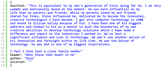
The site makes a request to http://www.apple.com/stevejobs/messages/main.json which returns


So it appears that it cycles through 10975 messages. I didn’t decompose the javascript powering the site to determine this, I just made an assumption. I tried querying values greater than 10975 and they returned 404. I wrote a quick python program to download the messages:
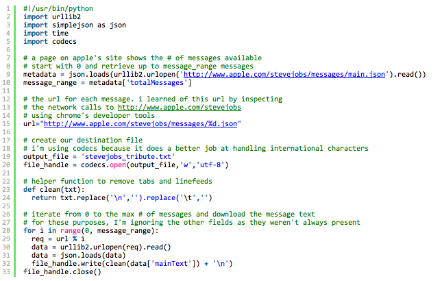
So now, we have over ten thousand tribute messages saved to the file stevejobs_tribute.txt. What I was most interested in seeing how many of these messages contain a reference to a certain Apple product.
I came up with a few search terms based on some legendary Apple product names including

  • Newton
  • Macintosh
  • MacBook
  • iBook
  • Mac
  • iPhone
  • iPod
  • iMac
  • iPad
  • Apple II family
  • OSX
  • iMovie
  • Apple TV
  • iTunes
  • LaserWriter (yes, Laserwriter)
Each product received an entry in a python dictionary. The value is another dictionary containing a regex for the product name and a count for the running totals. Some of the regular expressions are as simple as testing for an optional s at the end of the product name, some are a little more complex – check the Apple II regular expression to match all of entire product Apple 2 line. As I’m ok but not great with regular expressions, I welcome your corrections.

Here’s a screenshot of me testing the Apple II regular expression, using the excellent Regexr.

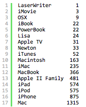
Overall, out of 10975 messages downloaded(as of now), 2,186, or just under 20% mentioned an apple product by name. Here’s the breakdown of the products mentioned:

More than one out of every ten messages included a reference to a Mac! Nearly one in ten mentioned an iPhone – not bad for a device that’s been out a fraction of the time the Mac has been available. [Read more…]

Groundbreaking data tracks carbon emissions back to their source

THE GUARDIAN’S ENVIRONMENT BLOG – By 

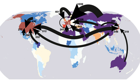
A new scientific paper allows us to see which countries extracted the fossil fuels burned to support lifestyles in other countries

Overview of carbon flows from fossil fuel extraction to the final consumers of goods and services

 
Which of the following accounts for the largest share of the UK’s carbon footprint? All our holiday flights, all the power used in our homes or … Russia?

Okay, so it’s kind of a trick question, but according to a scientific paper published this week, we might reasonably conclude that the answer is Russia – though to understand why it’s necessary to go back a couple of steps.

For the purposes of the Kyoto treaty, a nation’s carbon footprint is considered to be a sum of all the greenhouse gas released within its borders. But as many people – myself included – have been pointing out for years, that approach ignores all the laptops, leggings, lampshades and other goods that rich countries import from China and elsewhere.

If we want any chance of a fair global climate deal, the now-familiar argument goes, we need to rethink the way we measure emissions to allocate some of the carbon pouring out of Chinese, Indian and Mexican factories and power plants to the countries importing good from those countries.

The new scientific paper, published in the Proceedings of the National Academy of Sciences, points out that this argument – though persuasive – tells only half of the story. If you want to understand how carbon footprints are affected by international trade flows, the paper argues, you need to consider trade not only in gadgets and garments but also in fossil fuels themselves. After all, though country X might import a television that was made in country Y, it’s quite possible that country Y in turn imported some of the coal, oil or gas consumed by the television factory from country Z. [Read more…]


Occupy protests around the world: full list visualised

THE GUARDIAN’S DATA BLOG – By 

The Occupy protests have spread from Wall Street to London to Bogota. See the full list – and help us add more
• 
Get the data


“951 cities in 82 countries” has become the standard definition of the scale of the Occupy protests around the world this weekend, following on from the Occupy Wall Street and Madrid demonstrations that have shaped public debate in the past month.

We wanted to list exactly where protests have taken place as part of theOccupy movement – and see exactly what is happening where around the globe. [Read more…]

How tall are our world leaders? [Visualised]

THE GUARDIAN’S DATA BLOG – By 

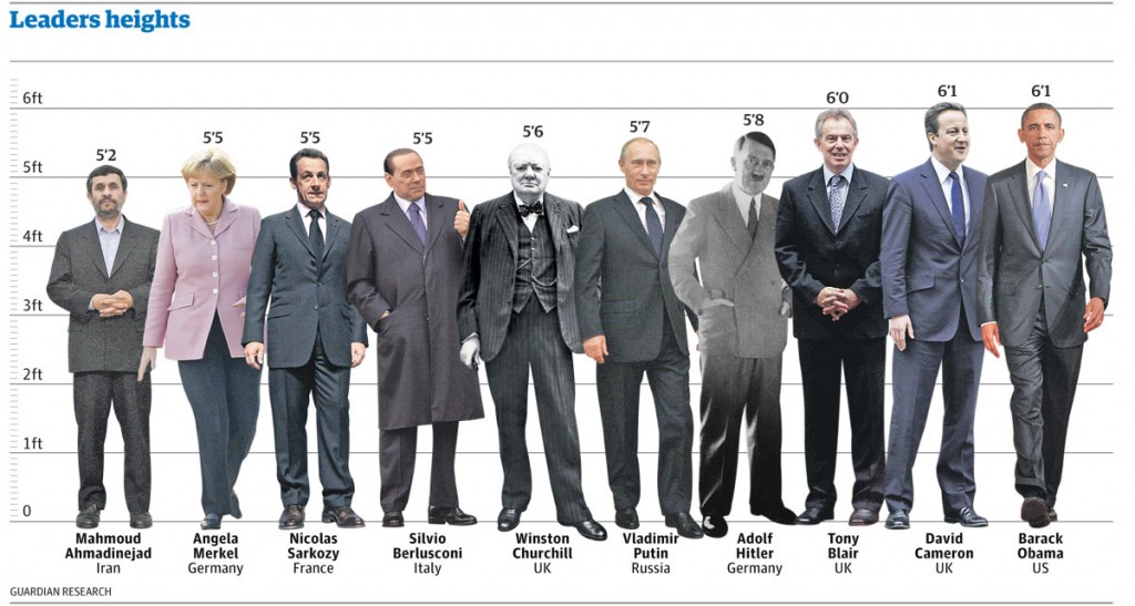
It seems we like our political giants to be just that – giants – according to new research. See how they compare in the height stakes
• Get the data


World leaders’ heights: click image for graphic

Stature really does matter according to a new scientific paper published today in Social Science Quarterly.

Here at the Datablog we thought this was an opportunity too good to pass up. How tall really are our world leaders and how do they compare?

Psychologists from Texas Tech University found in a study that almost two-thirds of participants showed a preference to draw larger figures when asked to draw images of leaders. An evolutionary throwback has been suggested as the root of this. Nic Fleming writes today:

It is not for nothing that top politicians are known as political giants or “big beasts”. Voters see tall politicians as better suited for leadership, according to a survey of how people visualise their leaders. Psychologists believe the bias may stem from an evolved preference for physically imposing chiefs who could dominate enemies.

David Cameron and Barack Obama certainly fit the profile at 6ft 1in and have both beaten shorter candidates in past elections – Gordon Brownat 5ft 11ins and John McCain at 5ft 8ins. [Read more…]

Visweek 2011 is upon us!

VISUALIZATION BLOG


The annual IEEE Visualization, IEEE Information Visualization and IEEE Visual Analytics Science and Technology conferences – together known as IEEE Visweekwill be held in Providence, RI from October 23rd to October 28th.The detailed conference program is spectacular and can be downloaded here.Some of the new events this year are under the Professional’s Compass category. It includes a Blind date lunch (where one can meet some researcher they have never met and learn about each others research), Meet the Editors (where one can meet editors from the top graphics and visualization journals), Lunch with the Leaders session (an opportunity to meet famous researchers in the field) and Meet the faculty/postdoc candidates (especially geared towards individuals looking for a postdoctoral position or a faculty position). I think this is an excellent idea and hope that the event is a hit at the conference.

I am also eagerly looking forward towards the two collocated symposia – IEEE Biological Data Visualization (popularly known as biovis) and IEEE LDAV (Large data analysis and visualization).  Their excellent programs are out and I’d encourage you to take a look at them.

The tutorials this year look great and I am particularly looking forward to the tutorial on Perception and Cognition for Visualization, Visual Data Analysis and Computer Graphics by Bernice Rogowitz. Here is anoutline for the tutorial that can be found on her website. She was one of the first people to recommend that people STOP using the rainbow color map.

The telling stories with data workshop too looks great and will be a continuation of the great tutorial held by the same group last year. I am eagerly looking forward to it. [Read more…]

Data visualisation: in defence of bad graphics

THE GUARDIAN’S DATABLOG – By 

Well, not really – but there is a backlash gathering steam against web data visualisations. Is it deserved?

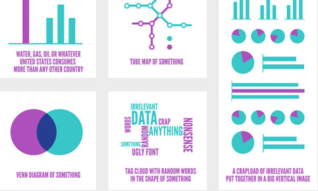
Most popular infographics

Most popular infographics by Alberto Antoniazzi

Are most online data visualisations, well, just not very good?

It’s an issue we grapple with a lot – and some of you may have noticed a recent backlash against many of the most common data visualisations online.

Poor Wordle – it gets the brunt of it. It was designed as an academic exercise that has turned into a common way of showing word frequencies (and yes, we are guilty of using it) – an online sensation. There’s nothing like ubiquitousness to turn people against you.

In the last week alone, New York Times senior software architect Jacob Harris has called for an end to word clouds, describing them as the “mullets of the Internet“. Although it has used them to great effect here.

While on Poynter, the line is that “People are tired of bad infographics, so make good ones

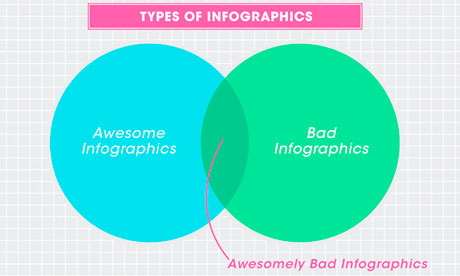
Awesomely bad infographicsAwesomely bad infographics from How to Interactive Design Photograph: How To Interactive Design

Grace Dobush has written a great post explaining how to produce clear graphics, but can’t resist a cry for reason.

What’s the big deal? Everybody’s doing it, right? If you put [Infographic] in a blog post title, people are going to click on it, because they straight up can’t get enough of that crap. Flowcharts for determining what recipe you should make for dinner tonight! Venn diagrams for nerdy jokes! Pie charts for statistics that don’t actually make any sense! I have just one question—are you trying to make Edward Tufte cry?

Oh and there has also been a call for a pogrom of online data visualisersfrom Gizmodo’s Jesus Diaz:

The number of design-deficient morons making these is so ridiculous that you can fill an island with them. I’d do that. And then nuke it

A little extreme, no?

There has definitely been a shift. A few years ago, the only free data visualisation tools were clunky things that could barely produce a decent line chart, so the explosion in people just getting on and doing it themselves was liberating. Now, there’s a move back towards actually making things look, er, nice. [Read more…]