A GUIDE TO LIBYA’S SURVEILLANCE NETWORK

OWNI.eu – By Jean Marc Manach

After repeated interrogations lead by Reflets.infoOWNI, the Wall Street Journal and the Figaro, Amesys, the French company that sold Internet surveillance systems to Gaddafi’s Libya tried to calm things down with a statement posted on its website (mirror):

The contract only concerned the sale of materials capable of analysing a fraction of existing internet connections, only a few thousand.

However, the documents in OWNI’s possession tell a different story, in fact, the exact opposite story. In contrast to traditional surveillance systems that target specific connections, the “massive” (sic) Amesys surveillance system is used to intercept and analyze the entirety of the telecommunications network, to the scale of an entire country.

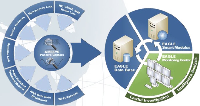
In its presentations for the high-end surveillance service, Amesys flaunts EAGLE as having been conceived to monitor the whole spectrum of telecommunications: IP traffic (internet), mobile and landline telephone networks, WiFi, satellite, radio and micro waves thanks to its “passive waves, invisible and inaccessible to any intruder.”

The massive system (EAGLE GLINT, GLobal INTelligence, which was the system sold to Libya), was conceived to respond to interception and surveillance needs at a national level and to be capable of aggregating all kinds of information and analyzing, in real time, a national data flow, from a few terabytes to a few dozens petabytes [1peta-octet = 1024 tera-octets, 1 tera-octet = 1024 giga octets and that the total amount of everything ever written by the human race in all languages is estimated at 50 peta-octets…]


EAGLE is therefore able to aggregate, in an automatic fashion, email and physical addresses, telephone numbers, photos of suspects, but also to make automatic searches by date, hour, telephone number, email address, keyword, localization… [Read more…]

Data-Driven Journalism In A Box: what do you think needs to be in it?

The following post is from Liliana Bounegru (European Journalism Centre), Jonathan Gray (Open Knowledge Foundation), and Michelle Thorne (Mozilla), who are planning a Data-Driven Journalism in a Box session at the Mozilla Festival 2011, which we recently blogged about here. This is cross posted at DataDrivenJournalism.net and on the Mozilla Festival Blog.

We’re currently organising a session on Data-Driven Journalism in a Box at the Mozilla Festival 2011, and we want your input!

In particular:

  • What skills and tools are needed for data-driven journalism?
  • What is missing from existing tools and documentation?

If you’re interested in the idea, please come and say hello on our data-driven-journalism mailing list!

Following is a brief outline of our plans so far…

What is it?

The last decade has seen an explosion of publicly available data sources – from government databases, to data from NGOs and companies, to large collections of newsworthy documents. There is an increasing pressure for journalists to be equipped with tools and skills to be able to bring value from these data sources to the newsroom and to their readers.

But where can you start? How do you know what tools are available, and what those tools are capable of? How can you harness external expertise to help to make sense of complex or esoteric data sources? How can you take data-driven journalism into your own hands and explore this promising, yet often daunting, new field?

A group of journalists, developers, and data geeks want to compile a Data-Driven Journalism In A Box, a user-friendly kit that includes the most essential tools and tips for data. What is needed to find, clean, sort, create, and visualize data — and ultimately produce a story out of data?

There are many tools and resources already out there, but we want to bring them together into one easy-to-use, neatly packaged kit, specifically catered to the needs of journalists and news organisations. We also want to draw attention to missing pieces and encourage sprints to fill in the gaps as well as tighten documentation.

What’s needed in the Box?

  • Introduction
    • What is data?
    • What is data-driven journalism?
    • Different approaches: Journalist coders vs. Teams of hacks & hackers vs. Geeks for hire
    • Investigative journalism vs. online eye candy
  • Understanding/interpreting data:
    • Analysis: resources on statistics, university course material, etc. (OER)
    • Visualization tools & guidelines – Tufte 101, bubbles or graphs?
    • Acquiring data
  • Guide to data sources
  • Methods for collecting your own data
  • FOI / open data
  • Scraping
    • Working with data
  • Guide to tools for non-technical people
  • Cleaning
    • Publishing data
  • Rights clearance
  • How to publish data openly.
  • Feedback loop on correcting, annotating, adding to data
  • How to integrate data story with existing content management systems

What bits are already out there?

What bits are missing?

  • Tools that are shaped to newsroom use
  • Guide to browser plugins
  • Guide to web-based tools

Opportunities with Data-Driven Journalism:

  • Reduce costs and time by building on existing data sources, tools, and expertise.
  • Harness external expertise more effectively
  • Towards more trust and accountability of journalistic outputs by publishing supporting data with stories. Towards a “scientific journalism” approach that appreciates transparent, empirically- backed sources.
  • News outlets can find their own story leads rather than relying on press releases
  • Increased autonomy when journalists can produce their own datasets
  • Local media can better shape and inform media campaigns. Information can be tailored to local audiences (hyperlocal journalism)
  • Increase traffic by making sense of complex stories with visuals.
  • Interactive data visualizations allow users to see the big picture & zoom in to find information relevant to them
  • Improved literacy. Better understanding of statistics, datasets, how data is obtained & presented.
  • Towards employable skills.

Keen On… Michael Fertik: Why Data is the New Oil and Why We, the Consumer, Aren’t Benefitting From It

TECH CRUNCH – By Andrew Keen

As he told me when he came into our San Francisco studio earlier this week,Reputation.com CEO & Founder Michael Fertik is “ecstatic” about our new reputation economy. In today’s Web 3.0 personal data rich economy, reputation is replacing cash, Fertik believes. And he is confident that his company, Reputation.com, is well placed to become the new rating index of this digital ecosystem.

But Fertik isn’t ecstatic about the way in which new online products, such as facial recognition technology, are exploiting the privacy of online consumers. Arguing that “data is the new oil,” Fertik believes that the only people not benefitting from today’s social economy are consumers themselves. Rather than government legislation, however, the solution, Fertik told me, are more start-up entrepreneurs like himself providing paid products that empower consumers in our Web 3.0 world of pervasive personalized data.

This is the second and final part of my interview with Fertik. Yesterday, he explained to me why people will pay for privacy.

Why data is the new oil

[youtube xgvEp0CWKjw]


The Science of Social Timing [infographic]

Mind Jumpers – By Charu Dwivedi

We all post content on Facebook. Sometimes it’s well read, sometimes not, in spite of putting in our best effort and intentions. Well, apart from what we post, it is important to know when we post. In this blog post, I will attempt to highlight the different social media timing preferences and how they impact different businesses by looking at Buddy Media’s report on effective wall posts published earlier this year together with a recent infographic by Dan Zarrella atHubSpot.

To understand the impact of accurate social media timing, we earlier referred to the Buddy Media report that gave sector wise break-ups of the interest level for every post and time at which it is supposed to peak and tank.

Most effective time to post
According to the Buddy Media report, brands that post outside business hours have 20% higher engagement rates. As a result, for instance content aimed for US, Asian and European consumers will benefit from being timed differently. In the same way, every industry is said to have different traction on different days. The same report also quotes that posts show a higher engagement on a few days compared to others. For example, sports industry and automotive industry have the highest traction on Sundays whereas entertainment peaks on Thursdays and Fridays (18% higher rates). Business and finance hit high on mid week.

General observations:
– Shares on Facebook spike around 7PM, while Twitter spikes around noon.

– On Facebook, content shared on a Saturday is more effective, while Twitter gets the highest engagement mid week. Also, it is good to share 1 post in every 2 days on Facebook.

However, here is an interesting infographic on timing in social networks, which I found on Socialmediagraphics.com. It highlights consumer behaviour on different social media channels, namely Twitter and Facebook. The infographic, The Science of Social Timing, gives us insight into posting at which time to make the content most sharable.

Take a look at the infographic here:

science-of-social-timing-part-1

BEST OF Chaos Communication Camp 2011 INTERVIEWS

OWNI.Eu

OWNI erected its tent at the Chaos Communication Camp this year for five days. Where? In an ancient Soviet military base, complete with airplanes and an open air museum. 3,500 hackers were expected for what is known to be the largest assembly of the kind in Europe. Here’s a collection of the best of OWNI’s interviews from these five days in the heart of hackerdom.

Birgitta Jónsdóttir: “Keep the freedom of information what it should be: free.”

The Icelandic deputy Birgitta Jónsdóttir is the backbone behind the Icelandic Media Modernization Initiative (IMMI), a resolution that aims to make Iceland into a paradise for freedom of expression.

[vimeo 27685673]


Macro: “I hope that being part of a hackerspace will no longer be so underground.”

Created in 1995 in Berlin, the C-Base was one of the first hackerspaces in the world, even if it has begun to think of itself as more of a makerspace. 350 members strong, it hosts CCC events and artistic performances. We look under the tent with Marco, their current “chief.”

[vimeo 27685289]

[Read more…] 

TELLING STORIES WITH DATA: THE NEXT CHAPTER


Telling Stories With Data – By Adam, Jessica, Joan, Karrie, and Nicholas

Sunday, October 23, 2011 in Providence, Rhode Island(at VisWeek 2011)

While visualization is an excellent tool for discovery and analysis, it is also a powerful medium for communication. The best information graphics do more than just present numbers: they tell a story, engage and convince their readers, invite them to make a personal connection to the data, and help them tell stories of their own.

This VisWeek 2011 workshop will examine the construction of narratives with visualization. We plan to draw participants with interests in visualization, social media, journalism, and storytellers.

Last year, at VisWeek 2010, the first workshop on ‘Telling Stories with Data’ took place in Salt Lake City.  This workshop brought together dozens of visualization researchers, journalists, humanities scholars, and tool builders to talk about how data has the potential to promote increasingly sophisticated and data-literate conversations to the world at large. [Read more…]

Visualize This: How to Tell Stories with Data

BRAIN PICKINGS – By Maria Popova

How to turn numbers into stories, or what pattern-recognition has to do with the evolution of journalism.


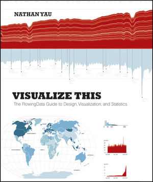
Data visualization is a frequent fixation around here and, just recently, we looked at 7 essential books that explore the discipline’s capacity for creative storytelling. Today, a highly anticipated new book joins their ranks —Visualize This: The FlowingData Guide to Design, Visualization, and Statistics, penned by Nathan Yau of the fantastic FlowingDatablog. (Which also makes this a fine addition to our running list of blog-turned-book success stories.) Yu offers a practical guide to creating data graphics that mean something, that captivate and illuminate and tell stories of what matters — a pinnacle of the discipline’s sensemaking potential in a world of ever-increasing information overload.

And in a culture of equally increasing infographics overload, where we are constantly bombarded with mediocre graphics that lack context and provide little actionable insight, Yau makes a special point of separating the signal from the noise and equipping you with the tools to not only create better data graphics but also be a more educated consumer and critic of the discipline.

[youtube Q9RWwKntuXg]

From asking the right questions to exploring data through the visual metaphors that make the most sense to seeing data in new ways and gleaning from it the stories that beg to be told, the book offers a brilliant blueprint to practical eloquence in this emerging visual language. [Read more…]


Contextual Analytics & The Physicality of Data -> #journalism #content #communities #transmedia #innovation

A Literacy of the Imagination – By Gunther Sonnenfeld

[vimeo 26449216]

Here’s a video excerpt of another talk I gave recently at Miami Ad School on immersive media, and more specifically, data methodologies for understanding or contextualizing consumer behavior and the various ways we can engage communities of people who are connected through content.

A couple of notes:

– Since the time of this talk (May), we’ve already added new social metrics onHeardable, and are about to release several new modules, including a semantic engine that measures digital influence (not just social media influence), as well as an SEO analyzer that allows users to track and optimize popular keywords. We are also developing a system that gives users the ability to quickly generate reports comprised of rich, competitive insights. [Read more…]

A Data Visualization of U.S. Newspaper History

10,000 WORDS – By Meranda Watling

A few weeks ago, I shared a link to the coolest way to visually see what’s news around the world. Now, here comes an interesting way to see what was news. Well, rather, who was covering the news and when in the U.S. It’s a data visualization of newspapers past. And it’s pretty cool, if somewhat depressing.

The Rural West Initiative at Standford University created the map by plotting the U.S. Library of Congress catalog of newspapers (140,000 publications??) over time and space. These are the results (click to see the real maps).

Through the sidebar content as you scroll through the timeline, you get a feel for the different “eras” of newspapering, from the colonies to the frontier to yellow journalism and merger mania. [Read more…]

6 ways of communicating data journalism (The inverted pyramid of data journalism part 2)

OJB – By Paul Bradshaw

Last week I published an inverted pyramid of data journalism which attempted to map processes from initial compilation of data through cleaning, contextualising, and combining that. The final stage – communication – needed a post of its own, so here it is.

UPDATE: Now in Spanish too.

Below is a diagram illustrating 6 different types of communication in data journalism. (I may have overlooked others, so please let me know if that’s the case.)

Communicate: visualised, narrate, socialise, humanise, personalise, utilise

Modern data journalism has grown up alongside an enormous growth in visualisation, and this can sometimes lead us to overlook different ways of telling stories involving big numbers. The intention of the following is to act as a primer for ensuring all options are considered.

1. Visualisation

Visualisation is the quickest way to communicate the results of data journalism: free tools such as Google Docs allow it with a single click; more powerful tools like Many Eyes only require the user to paste their raw data and select from a range of visualisation options. [Read more…]