Data journalism at the Guardian: what is it and how do we do it?

Data journalism. What is it and how is it changing? Photograph: Alamy

The Guardian’s Data Blog – By 

Simon Rogers: Our 10 point guide to data journalism and how it’s changing

Here’s an interesting thing: data journalism is becoming part of the establishment. Not in an Oxbridge elite kind of way (although here’s some data on that) but in the way it is becoming the industry standard.

Two years ago, when we launched the Datablog, all this was new. People still asked if getting stories from data was really journalism and not everyone had seen Adrian Holovaty’s riposte. But once you’ve hadMPs expenses and Wikileaks, the startling thing is that no-one asks those questions anymore. Instead, they want to know, “how do we do it?”

Meanwhile every day brings newer and more innovative journalists into the field, and with them new skills and techniques. So, not only is data journalism changing in itself, it’s changing journalism too.

These are some of the threads from my recent talks I thought it would be good to put in one place – especially now we’ve got an honourable mention in the Knight Batten award for journalistic innovation. This is about how we do it at the Guardian. In 10 brief points.

1. It may be trendy but it’s not new
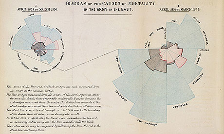
Nightingale graphic
Florence Nightingale's 'coxcomb' diagram on mortality in the army


Data journalism has been around as long as there’s been data – certainly at least since Florence Nightingale’s famous graphics and report into the conditions faced by British soldiers of 1858. The first ever edition of the Guardian‘s news coverage was dominated by a large (leaked) table listing every school in Manchester, its costs and pupil numbers. [Read more…]

 

KF Alumn to lead Knight Mozilla Effort

Photo by Daniel X. O'Neill

KNIGHT GARAGE – By PAM MAPLES

Dan Sinker, a 2008 Knight Fellow, is joining Mozilla to lead the Knight-Mozilla News Technology Partnership.

The program is funded by the Knight Foundation and run by Mozilla, makers of the Firefox web browser. The goal is to help create deeper collaboration between journalists and technologists through a series of design challenges like this one in San Francisco last spring,  learning labs and a fellowship program that puts developers in residence at newsrooms around the world. This year, the partner newsrooms for fellows are Al Jazeera, the BBC, the Guardian, Die Zeit and the Boston Globe. [Read more…]

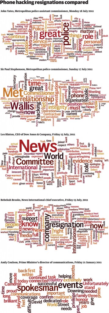
Phone hacking resignation statements: visualised and listed

THE GUARDIAN DATA STORE – By

Andy Coulson, Rebekah Brooks, LesHinton, Met Commissioner Sir Paul Stephenson and now John Yates – see what their resignation statements had in common

Get the data

News of the World phone hacking resignations - as a Wordle

The News of the World phone hacking scandal has prompted resignation after resignation, and with each one has come with a statement issued to the press.

So far, we have had five major resignations in the wake of the scandal:

• Andy Coulson, Prime Minister’s director of communications, Friday 21 January 2011 | full statement
• Rebekah Brooks, News International chief executive, Friday 15 July, 2011 | full statement
Les Hinton, CEO of Dow Jones & Company, Friday 15 July, 2011 | full statement
• Sir Paul Stephenson, Metropolitan police commissioner, Sunday 17 July 2011 | full statement
• John Yates, Metropolitan police assistant commissioner, Monday 18 July, 2011 | full statement

And with each statement, the language has been carefully planned and calibrated to say exactly what resignee wants to get across to the world. [Read more…]

Visual.ly: The Future of Data-Based Infographics

EAGEREYES – By Robert Kosara

Visual.ly‘s launch today made big waves, but a lot of people seemed to be disappointed by what they saw. The problem is that what you can see on the website is not the really exciting part of Visual.ly. What is much more interesting is how they want to turn the creation of data-based graphics from a tedious manual process into something fast and flexible. That has a lot more potential impact than you might realize at first.

Exploration, Analysis, Presentation

Let’s take a step back and look at the three stages we generally talk about in visualization: exploration, analysis, and presentation. Academic work and tools like Tableau focus on the first two, while there is still very little actual work on the latter. The usual assumption is that the same tools and techniques can be used there as for exploration and analysis, and little attention is typically paid to it.

The result is that presentation is taken over by infographics with varying levels of quality, because people simply get tired of looking at the same bar chart for every piece of data. I think it’s clear that infographics aren’t just popular, they are also more memorable, and when they’re done well, can be very effective.

The key difference between visualization and infographics is that the former is easy to automate and generic, while the latter are specific and usually hand-drawn. Now imagine a better way to create infographics based on data: a way that lets designers work with numbers more easily to create graphics that are visually exciting while still true to the data; a way that encourages and embodies best practices in visualization for designers. That’s Visual.ly. [Read more…]


Data journalism, data tools, and the newsroom stack

O’REILLY RADAR – By 

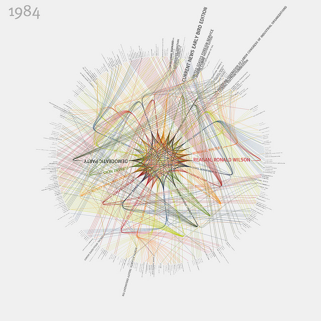
New York Times 365/360 - 1984 (in color) By blprnt_van

MIT’s recent Civic Media Conference and the latest batch of Knight News Challenge winners made one reality crystal clear: as a new era of technology-fueled transparency, innovation and open government dawns, it won’t depend on any single CIO or federal program. It will be driven by a distributed community of media, nonprofits, academics and civic advocates focused on better outcomes, more informed communities and the new news, whatever form it is delivered in.

The themes that unite this class of Knight News Challenge winners were data journalism and platforms for civic connections. Each theme draws from central realities of the information ecosystems of today. Newsrooms and citizens are confronted by unprecedented amounts of data and an expanded number of news sources, including a social web populated by our friends, family and colleagues. Newsrooms, the traditional hosts for information gathering and dissemination, are now part of a flattened environment for news, where news breaks first on social networks, is curated by a combination of professionals and amateurs, and then analyzed and synthesized into contextualized journalism.


Data journalism and data tools


In an age of information abundance, journalists and citizens alike all need better tools, whether we’re curating the samizdat of the 21st century in the Middle East, like Andy Carvin, processing a late night data dump, or looking for the best way to visualize water quality to a nation of consumers. As we grapple with the consumption challenges presented by this deluge of data, new publishing platforms are also empowering us to gather, refine, analyze and share data ourselves, turning it into information. [Read more…]

ProPublica’s newest news app uses education data to get more social

NIEMANLAB – By Megan Garber

Yesterday, the U.S. Department of Education’s Office of Civil Rights released a data set— the most comprehensive to date — documenting student access to advanced classes and special programs in public high schools. Shorthanded as the Civil Rights survey, the information tracks the availability of offerings, like Advanced Placement courses, gifted-and-talented programs, and higher-level math and science classes, that studies suggest are important factors for educational attainment — and for success later in life.

ProPublica reporters used the Ed data to produce a story package, “The Opportunity Gap,” that analyzes the OCR info and other federal education data; their analysis found among other things that, overall and unsurprisingly, high-poverty schools are less likely than their wealthier counterparts to have students enrolled in those beneficial programs. The achievement gap, the data suggest, isn’t just about students’ educational attainment; it’s also about the educational opportunities provided to those students in the first place. And it’s individual states that are making the policy decisions that affect the quality of those opportunities. ProPublica’s analysis, says senior editor Eric Umansky, is aimed at answering one key question: “Are states giving their kids a fair shake?”

The fact that the OCR data set is relatively comprehensive — reporting on districts with more than 3,000 students, it covers 85,000 schools, and around 75 percent of all public high schoolers in the U.S. — means that the OCR data set is also enormous. And while ProPublica’s text-based takes on the info have done precisely the thing you’d want them to do — find surprises, find trends, make it meaningful, make it human — the outfit’s reporters wanted to go beyond the database-to-narrative formula with the OCR trove. Their solution: a news app that encourages, even more than your typical app, public participation. And that looks to Facebook for social integration. [Read more…]


OKCon 2011: Introduction and a Look to the Future

OPEN KNOWLEDGE FOUNDATION – By Rufus Pollock

This is a blog post by Rufus Pollock, co-Founder and Director of the Open Knowledge Foundation.

OKCon, the annual Open Knowledge Conference kicked off today and it’s been great so far. For those not here in Berlin with us you can follow main track talks via video streaming:http://www.ustream.tv/channel/open-knowlegde

Below are my slides from my introductory talk which gives an overview of the Foundation and its activities and then looked to what the challenges are for the open data community going forward.

Looking to the Future

The last several decades the world has seen an explosion of digital technologies which have the potential to transform the way knowledge is disseminated.

This world is rapidly evolving and one of its more striking possibilities is the creation of an open data ecosystem in which information is freely used, extended and built on. [Read more…]

Dating with data

O’REILLY RADAR – By 


OkCupid is a free dating site with seven million users. The site’s blog, OkTrends, mines data from those users to tackle important subjects like “The case for an older woman” and “The REAL ‘stuff white people like’.”

Beyond clever headlines, OkCupid also uses an unusual pedigree to separate itself from the dating site pack: The business was founded by four Harvard-educated mathematicians.

“It probably scared people when they first heard that four math majors were starting a dating site,” said CEO Sam Yagan during a recent interview. But the founders’ backgrounds greatly influenced how they approached the problem of dating.

“A lot of other dating sites are based on psychology,” Yagan said. “The fundamental premise of a site like eHarmony is that they know the answer. Our approach to dating isn’t that there’s some psychological theory that will be the answer to all your problems. We think that dating is a problem to be solved using data and analytics. There is no magic formula that can help everyone to find love. Instead, we bring value by building a decent-sized platform that allows people to provide information that helps us to customize a match algorithm to each person’s needs.”

OkCupid works by having users state basic preferences and answering questions like “Is it wrong to spank a child who’s been bad?” Users are matched based on the overlap of their answers and how important each question is to both users.

Yagan said data was built into the business model from the beginning. “We knew from the time we started the company that the data we were generating would have three purposes: helping us match people up, attracting advertisers since that was the core of our revenue model, and that the data would also be interesting socially.” [Read more…]


Winners of myNewsBiz competition to launch data journalism training business

JOURNALISM.CO.UK – By Sarah Marshall

Ben Whitelaw and Nick Petrie have won £1,000 to launch a business to teach journalists skills in data journalism.

Whitelaw and Petrie, both part of the Wannabe Hacks site were today announced as the winners of the myNewsBizstudent journalism enterprise competition, sponsored by Kingston University.

A £500 prize was also awarded to five journalism students from Kingston University to launch Relish Magazine, a cooking magazine for men.

Whitelaw and Petrie’s winning proposal is to launch the Visualist, to “provide journalists, both wannabes and old pros, within smaller media organisations with the skills needed to do data journalism”. They plan to “teach journalists how to use relevant programs and tools and also provide additional support with collating data and producing visualisations before a given deadline”.

Whitelaw and Petrie have both secured jobs – Whitelaw atGuardian Professional and Petrie at the Telegraph – but say their careers will not stop them from launching the business. [Read more…]

Data journalism – is it worth it?

IN PUBLISHING – By Paul Bradshaw

Whether it is the desire to replicate the enormous sales successes of the MPs’ expenses and WikiLeaks revelations, or publishers wanting to expand into selling data services, it seems everyone wants to do something with data. The only question, writes Paul Bradshaw, is: where to start?

When Simon Rogers first asked to publish data on the Guardian website, someone asked: “Who on earth would want to look at a spreadsheet online?” It turned out that over 100,000 people would regularly hit the website to do just that. One person’s audit, it seemed, was another’s sticky content. And the past few years have seen data transformed from conversation killer to hot topic – in both newsroom and boardroom.

Tapping into development talent

For some publishers, the advantage of a data-driven approach to news production is that it allows them to tap into latent development talent within the readership. The Guardian and the New York Times are among an increasing number of media organisations to publish APIs – Application Programming Interfaces – that allow web developers to build new products with their content and – equally importantly – the data surrounding it. In return, the new services can carry advertising sold by the publisher, drive new traffic to the original site, or act as market research to demonstrate demand for a more developed proposition (as happened, for example, with the Guardian’s mobile app).

To stimulate this development, organisations organise ‘Hack Days’ where developers are invited to spend a day or a weekend creating quick editorial ‘hacks’. The investment is minimal when compared to the cost of doing everything in-house: a small amount of staff time, and a lot of pizza.

Hack day events have led to all sorts of outcomes from personalised mobile editions, applications which would alert people to events and route them to the location, even a tool which suggests recipes based on an image uploaded by the user. The Guardian say they benefit from “being able to reach new markets that we might not otherwise find. We grow our vertical ad network through high quality partners [taking part in hack days]. We’re also able to offer our end users innovative, clever and useful interactive services provided by experts outside of our domain.” [Read more…]