6 Data Journalism Blogs To Bookmark, Part 2

10,000 WORDS – By Elana Zak

Editor’s Note: This is the second part of a post from 10,000 Words. Find the first one here which included the Guardian’s Data Blog, Pro Publica and your very own Data Journalism Blog…

Last week, I started a list of six data journalism blogs you should take note of. The post stemmed from a project some journalists are leading to develop a data-driven journalism handbook that covers all aspects of the field. This weekend, thanks to a massive effort by attendees at the Mozilla Festival in London, the project morphed from the bare bones of an idea into something very tangible.

In just two days, 55 contributors, from organizations such as the New York Times, the Guardian and Medill School of Journalism, were able to draft 60 pages, 20,000 words, and six chapters of the handbook. The goal is to have a comprehensive draft completed by the end of the year, said Liliana Bounegru of the European Journalism Centre, which is co-sponsoring production of the handbook. If you’re interested in contributing, email Bounegru at bounegru@ejc.net. You can see what the group has so far atbit.ly/ddjbook.

Since the handbook is still being tweaked, why not check out these data journalism blogs?

Open
Like the Guardian, the New York Times is widely known for its spectacular use of data journalism and news apps. Open is written by the news organization’s developers, highlighting hacking events and describing general news of interest to the bloggers.

Data Desk
The Los Angeles Times is at the forefront of data journalism, with its Data Desk blog covering topics from crime to the Lakers to vehicle complaints. Everything on the site is a great example of how to use data to find and craft stories that will matter to your readers. One project I highly recommend you take a look at is mapping LA’s neighborhoods. It is something that could be replicated in almost any town and would grab your audience’s’ attention.

News Apps Blog
The News Apps blog is where developers from the Chicago Tribune discuss “matters of interest” and give their tips and suggestions on how to make some of the stunning maps and apps that appear in the paper. This is one of, if not the, place to go to see what experts in the field are talking about.

What data journalism blogs do you go to?

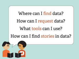
Image from the Data Journalism Handbook presentation.

6 Data Journalism Blogs To Bookmark, Part 1


Editor’s note: We are not publishing this article about data journalism blogs to bookmark just because the DJB is one of them. Alright, partly because of that but also because we think the other blogs mentioned  are the ultimate references for data journalism. Also because it mentioned the Mozilla Festival and that we really loved the event. Which blogs would YOU add to the list? Let us know in the comment section!

10,000 WORDS – By Elana Zak

Today is the start of Mozilla Festival, a weekend-long celebration of sorts that brings together web developers, journalists, media educators and students to work on open web projects and learn from one another. #MozFest’s program includes design challenges, learning labs, presentations and more. There will also be plenty of time for people to simply chat with one another and possibly brainstorm the next idea that will transform the web.

One event that stood out to me calls for a group to kickstart the writing of a data-driven journalism handbook. Led by the Open Knowledge Foundation and the European Journalism Centre, the project’s goal is to create a handbook that will “get aspiring data journalists started with everything from finding and requesting data they need, using off the shelf tools for data analysis and visualisation, how to hunt for stories in big databases, how to use data to augment stories, and plenty more.”

Data journalism has quickly become a popular field yet many reporters are still in the dark about it. How do you go about getting the data? What do you do once you have the data? A perfect resource would be the data journalism handbook, but since it hasn’t been written yet, I came up with a list of six blogs that should definitely be added to your bookmarks tab, whether you’re looking for inspiration, basic skills, or advanced knowledge.

The first three are below and the last half will be published on Monday.

ProPublica Nerd Blog

ProPublica is constantly creating amazing tools using data journalism. In the last year, they’ve created apps that delve into topics such as education and healthcare. On the Nerd Blog, members of ProPublica’s News apps desk not only explain the latest apps and how to use them but also how the team created them. I highly recommend you check out the post, “Scraping for Journalism: A Guide for Collecting Data.” Dan Nguyena ProPublica news developer, gives a step-by-step explanation of how the team created itsDollars for Docs app and shows readers exactly what tools to use to recreate the app (or even make another one.)

The Guardian’s Data Blog

Almost every week, The Guardian is rolling out stories and graphics based on data journalism, many of which are highlighted on its Data Blog, making it a great place to go for inspiration. For example, take a look at their story on where the super poor are in the US. It includes maps and charts, all derived from a ton of data. While the site is aimed at already experienced data journalists, it is a great place for all levels to go and see what the experts in the field are doing.

Data Journalism Blog

The Data Journalism Blog isn’t specifically attached to any one news organization but instead acts more as an overall resource for data journalists. The site, led by multimedia journalist Marianne Bouchart, not only displays examples of great graphics, but it also provides how-tos, guides, and interviews with other data journalists. If you’re looking for a new concept to try out or where the next data journalism seminar will be held, I’d recommend visiting this blog.

Don’t forget to check back on Monday for Part 2: 6 Data Journalism Blogs To Bookmark.

A Data Visualization of U.S. Newspaper History

10,000 WORDS – By Meranda Watling

A few weeks ago, I shared a link to the coolest way to visually see what’s news around the world. Now, here comes an interesting way to see what was news. Well, rather, who was covering the news and when in the U.S. It’s a data visualization of newspapers past. And it’s pretty cool, if somewhat depressing.

The Rural West Initiative at Standford University created the map by plotting the U.S. Library of Congress catalog of newspapers (140,000 publications??) over time and space. These are the results (click to see the real maps).

Through the sidebar content as you scroll through the timeline, you get a feel for the different “eras” of newspapering, from the colonies to the frontier to yellow journalism and merger mania. [Read more…]