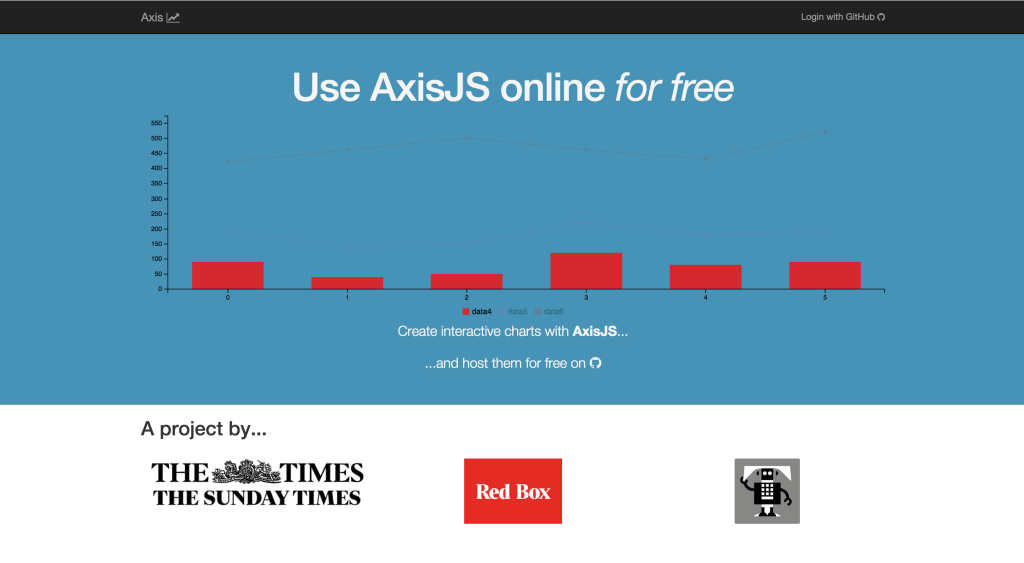
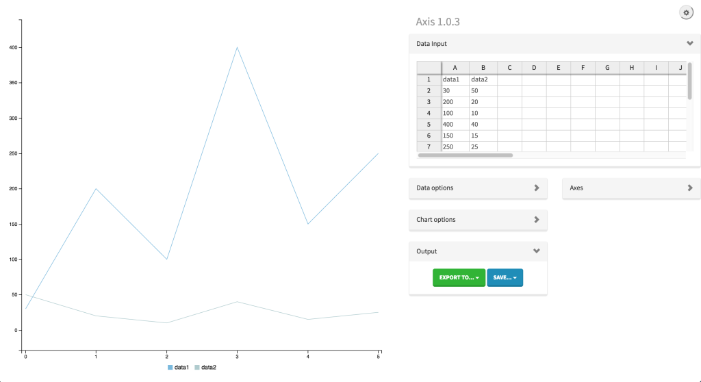
When we started our Red Box politics vertical at The Times, we needed the ability to quickly generate charts for the web in a style that was consistent with the site’s design. There had been a few attempts to build things like this; we considered using Quartz’s Chartbuilder project for quite some time, but ultimately felt its focus on static charts was a bit limiting. From this, Axis was born, which is both a customisable chart building web application and a framework for building brand new applications that generate interactive charts. It’s also totally open source, and free for anyone to use.

Design considerations
From the outset, we set a few broader project goals, which have persisted over the last year as we’ve developed Axis:
- Enable easy creation of charts via a simple interface
- Accept a wide array of data input methods
- Be modular enough to allow chart frameworks to easily be replaced
- Allow for straightforward customisation and styling
- Allow for easy integration into existing content management systems
- Allow journalists to easily create charts that are embeddable across a wide array of devices and media
At the moment, the only D3-based charting framework Axis supports is C3.js (which I’m also a co-maintainer of), though work is underway to provide adapters for NVD3 and Vega. This means Axis supports all the basic chart types (line, bar, area, stacked, pie, donut and gauge charts) and will gain new functionality as C3 evolves. Of course, once other charting libraries are integrated and adding new ones is more straightforward than it currently is, the sky’s the limit in terms of the types of charts Axis will be able to produce.
This is all possible because Axis isn’t so much a standalone webapp as a chart application framework. In order to achieve this level of modularity, Axis was built as an AngularJS app making extensive use of services and providers, meaning it’s relatively simple to swap around various components. As a nice side effect of this, it’s really easy to embed Axis in a wide variety of content management systems — at present, we’ve created a WordPress plugin that integrates really nicely with the media library and is currently one of the more feature-rich chart plugins out there for WordPress, plus a Drupal implementation is being developed by the Axis community. Integrating Axis into a new content management system is as difficult as extending the default export service — for instance, Axisbuilder is a Node-based server app that saves charts directly to a GitHub repo supplied by the user and is intended more for general public use, whereas Axis Server saves chart configurations into a MongoDB database and is intended more for news organisations who want to use it as a centralised internal tool. It can also be used entirely without a server component, depending on the needs of the organisation using it.

Output is king
Charts are used universally by news organisations, whether that be in print, on the website or in a mobile app. As such, Axis was built to provide for a very wide variety of use cases — you can save Axis charts as a standalone embed code that can be pasted into a blog or forum post, Axis charts can be exported to a CMS, they can be saved as PNG for the web or SVG for print. In fact, print output is an important feature we’ve been developing recently so that chart output is ready to be placed in InDesign or Methode with little-or-no further tweaking. At the moment, basic charts for print at The Times and Sunday Times are produced by hand in Adobe Illustrator. The hope is that we can save our talented illustrators countless hours by dramatically reducing the time it takes to produce the large number of simple line graphs or pie charts needed for a single edition. The extensible configuration system means that customising the design of the output for a new section or title is as difficult as copying a config and CSS file and then customising to suit.
Proudly open source
Although Axis has been in development for just over a year, it’s really feature-rich — mainly as a result of working directly with journalists across The Times and Sunday Times to create the functionality they need. There are still a few sundry features we want to implement here and there, but ultimately the rest of version 1 will focus on stability and performance improvements. Version 2 — release date rather far into the future; we’re only in the pre-planning stages — will break away from this, with a restructuring of the internals, a redesign of the interface, and a whole boatload of new features.
Although we’ve built Axis with Times journalists in mind, we truly want it to grow as an open source project and welcome contributions both large and small (for example, we recently added i18n support, and are currently looking for translators to help internationalise the interface into different languages). Though designed to be powerful enough to support major news organisations, Axis is simple enough for anyone to use, and we particularly hope that student newspapers running WordPress will be encouraged to explore data journalism and visualisation using Axis.
For more about Axis and its related projects, please visit axisjs.org or follow us on Twitter at @axisjs. To try using Axis, visit use.axisjs.org.
Ændrew Rininsland is a senior newsroom developer at The Times and Sunday Times and all-around data visualisation enthusiast. In addition to Axis, he’s the lead developer for Doctop.js, generator-strong-d3, Github.js and a ludicrous number of other projects. His work has also been featured by The Guardian, The Economist and the Hackney Citizen, and he recently contributed a chapter to Data Journalism: Mapping the Future?, edited by John Mair and Damian Radcliffe and published by Abramis. Follow him on Twitter and GitHub at @aendrew.


