Next Big Thing: New Tools for Digital Digging [VIDEO]

Nicola Hughes from ScraperWiki shared this video on Twitter recently and we thought it would be a shame not to share it with you too.

Experts in data mining gathered at the Paley Center for Media on 10 November 2011 to discuss the future of journalism and how to sustain a journalism watchdod in the digital age. This session is about data mining and the new tools available online.

Watch the video and let us know what you think. If you’ve used some of them, tell us how good -or how bad- you think they are…

Next Big Thing: New Tools for Digital Digging from The Paley Center For Media on FORA.tv

Presenters include:

Bill Allison

Bill Allison is the Editorial Director at the Sunlight Foundation. A veteran investigative journalist and editor for nonprofit media, Bill worked for the Center for Public Integrity for nine years, where he co-authored The Cheating of America with Charles Lewis, was senior editor of The Buying of the President 2000 and co-editor of the New York Times bestseller The Buying of the President 2004.

He edited projects on topics ranging from the role of international arms smugglers and private military companies in failing states around the world to the rise of section 527 organizations in American politics. Prior to joining the Center, Bill worked for eight years for The Philadelphia Inquirer — the last two as researcher for Pulitzer Prize winning reporters Donald L. Barlett and James B. Steele.


David Donald

David Donald, United States , is data editor at the Center for Public Integrity, where he oversees data analysis and computer-assisted reporting at the Washington-based investigative journalism nonprofit.


Sheila Krumholz

Sheila Krumholz is the Center for Responsive Politics’ executive director, serving as the organization’s chief administrator, the liaison to its board and major funders and its primary spokesperson.

Sheila became executive director in 2006, having served for eight years as the Center’s research director, supervising data analysis for OpenSecrets.org and the Center’s clients. She first joined the Center in 1989, serving as assistant editor of the very first edition of Open Secrets, the Center’s flagship publication.

In 2010, Fast Company magazine named Sheila to its “Most Influential Women in Technology” list. Sheila has a degree in international relations and political science from the University of Minnesota.

Jennifer 8. Lee

Jennifer 8. Lee authors The Fortune Cookie Chronicles ($24.99). Also, she’s a New York Times reporter.


Nadi Penjarla

Nadi Penjarla is the chief architect and designer of the Ujima Project. The Ujima Project (www.ujima-project.org) is a collection of databases, documents and other resources that aims to bring transparency to the workings of governments, multinational non-governmental organizations and business enterprises.

Nadi’s work demonstrates that data analysis provides unique insights into international and local political controversies and brings the facts of the world into sharper focus. He has spoken and conducted workshops on computer assisted reporting at international forums such as the ABRAJI Conference in Sao Paulo, Brazil, the GLMC Investigative Journalism Forum in Kigali, Rwanda, and at the Annual Investigative Reporters & Editors (IRE) Conference.

Nadi possesses a strong background in data analysis and data mining, including work as an investment banker, and a strategy and business analytics consultant. Past projects include consulting for Fortune 500 companies on how to improve strategic decision-making, enhance operations, conduct complementary marketing and transform related business processes by properly analyzing data and its implications. In 2003 Nadi was the founding editor of Global Tryst, an online magazine focusing on international issues from a grassroots perspective.

Nadi holds an MBA from the University of Chicago, an M.S in Engineering and Computer Science, and a B.S. in Engineering. He can be reached at 202-531-9300 or at nadi.penjarla@gmail.com

6 Data Journalism Blogs To Bookmark, Part 2

10,000 WORDS – By Elana Zak

Editor’s Note: This is the second part of a post from 10,000 Words. Find the first one here which included the Guardian’s Data Blog, Pro Publica and your very own Data Journalism Blog…

Last week, I started a list of six data journalism blogs you should take note of. The post stemmed from a project some journalists are leading to develop a data-driven journalism handbook that covers all aspects of the field. This weekend, thanks to a massive effort by attendees at the Mozilla Festival in London, the project morphed from the bare bones of an idea into something very tangible.

In just two days, 55 contributors, from organizations such as the New York Times, the Guardian and Medill School of Journalism, were able to draft 60 pages, 20,000 words, and six chapters of the handbook. The goal is to have a comprehensive draft completed by the end of the year, said Liliana Bounegru of the European Journalism Centre, which is co-sponsoring production of the handbook. If you’re interested in contributing, email Bounegru at bounegru@ejc.net. You can see what the group has so far atbit.ly/ddjbook.

Since the handbook is still being tweaked, why not check out these data journalism blogs?

Open
Like the Guardian, the New York Times is widely known for its spectacular use of data journalism and news apps. Open is written by the news organization’s developers, highlighting hacking events and describing general news of interest to the bloggers.

Data Desk
The Los Angeles Times is at the forefront of data journalism, with its Data Desk blog covering topics from crime to the Lakers to vehicle complaints. Everything on the site is a great example of how to use data to find and craft stories that will matter to your readers. One project I highly recommend you take a look at is mapping LA’s neighborhoods. It is something that could be replicated in almost any town and would grab your audience’s’ attention.

News Apps Blog
The News Apps blog is where developers from the Chicago Tribune discuss “matters of interest” and give their tips and suggestions on how to make some of the stunning maps and apps that appear in the paper. This is one of, if not the, place to go to see what experts in the field are talking about.

What data journalism blogs do you go to?

Image from the Data Journalism Handbook presentation.

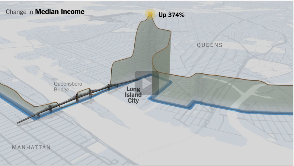
The Marathon Route’s Evolving Neighborhoods

THE NEW YORK TIMES – By  GRAHAM ROBERTS, ALAN McLEAN, ARCHIE TSE, LISA WAANANEN, TIMOTHY WALLACE, XAQUIN G.V., JOE BURGESS and JOE WARD

The New York City Marathon course has changed little since it first wound its way through all five boroughs in 1976. But the neighborhoods along the route have seen significant change: they are mostly richer and the ethnic makeup of many of them has shifted.

 [Read more…]

Journalism in the Age of Data: A video report on Data Visualisation a storytelling medium

STANFORD.EU: Geoff McGhee

[vimeo 14777910]

Journalists are coping with the rising information flood by borrowing data visualization techniques from computer scientists, researchers and artists. Some newsrooms are already beginning to retool their staffs and systems to prepare for a future in which data becomes a medium. But how do we communicate with data, how can traditional narratives be fused with sophisticated, interactive information displays? [Watch the full version with annotations and links on Stanford.eu]

The New York Times’ Cascade: Data Visualization for Tweets [VIDEO]

[youtube yQBOF7XeCE0]

MASHABLE – by Jolie O’Dell

The research and development department of The New York Times has recently been pondering the life cycle of the paper’s news stories in social media — specifically, on Twitter. Cascade is a project that visually represents what happens when readers tweet about articles.

Even now, however, Cascade is more than just a nifty data visualization. [Read more…]


The 4 Golden rules to Data Journalism from the NYT

 
data visualisation by the New York Times graphics team
 
 
source: Joel Gunter from Journalism.co.uk
 

The New York Times has one of the largest, most advanced graphics teams of any national newspaper in the world. The NYT deputy graphics editor Matthew Ericson led a two-hour workshop at the International Journalism Festival last week about his team’s approach to visualising some of the data that flows through the paper’s stories everyday. Here is a short guide on how to make good data journalism…

The New York Times data team follows four golden rules:

  • Provide context
  • Describe processes
  • Reveal patterns
  • Explain the geography

Provide context

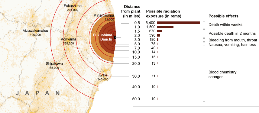
Graphics should bring something new to the story, not just repeat the information in the lead. A graphics team that simply illustrates what the reporter has already told the audience is not doing its job properly. “A graphic can bring together a variety of stories and provide context,” Ericson argued, citing the NYT’s coverage of the Fukushima nuclear crisis.

“We would have reporters with information about the health risks, and some who were working on radiation levels, and then population, and we can bring these things together with graphics and show the context.”

Describe processes

The Fukushima nuclear crisis has spurned a lot of graphics work in many news organisations across the world and Ericson explained hoe the New York Times went about it.

“As we approach stories, we are not interested in a graphic showing how a standard nuclear reactor works, we want to show what is particular to a situation and what will help a reader understand this particular new story.

Like saying: You’ve been reading about these fuel rods all over the news, this is what they actually look like and how they work.”

Reveal patterns

This is perhaps the most famous guideline in data visualisation. Taking a dataset and revealing the patterns that may tell us a story. Crime is going up here, population density down there, immigration changing over time, etc.

These so-called “narrative graphics” are very close to what we have been seeing for a while in broadcast news bulletins.

Explain geography

The final main objective was to show the audience the geographical element of stories.

Examples for this section included mapping the flooding of New Orleans following hurricane Katrina and a feature of demonstrating the size and position of the oil slick in the Gulf following the BP Deepwater Horizon accident, and comparing it with previous major oil spills.

Some of the tools in use by the NYT team, with examples:

Google Fusion Tables

Tableau Public: Power Hitters

Google Charts from New York State Test Scores – The New York Times

HTML, CSS and Javascript: 2010 World Cup Rankings

jQuery: The Write Less, Do More, JavaScript Library

jQuery UI – Home

Protovis

Raphaël—JavaScript Library

The R Project for Statistical Computing

Processing.org

Joel Gunter from Journalism.co.uk wrote a very interesting article on the workshop led by Ericson. He spoke to Ericson after the session about what kind of people make up his team (it includes cartographers!) and how they go about working on a story. Here is what he had to say.