99% v 1%: the data behind the Occupy movement – animation


THE GUARDIAN’S DATABLOG – By  and 

It has been the rallying cry of the Occupy movement for the past two months – but is the US really split 99% v 1%? As poverty and inequality reach record levels, how much richer have the rich got? This animation explains what the key data says about the state of America today

• Explore the data behind this animation and read the script


Click on the picture below to watch the video on The Guardian’s website:



Occupy protests around the world: full list visualised

THE GUARDIAN’S DATA BLOG – By 

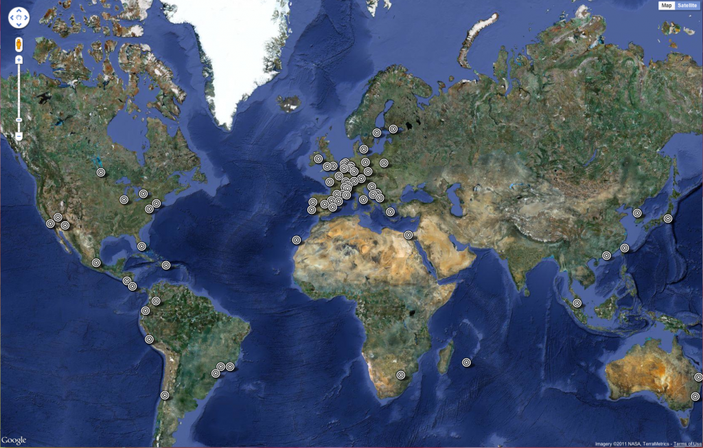
The Occupy protests have spread from Wall Street to London to Bogota. See the full list – and help us add more
• 
Get the data


“951 cities in 82 countries” has become the standard definition of the scale of the Occupy protests around the world this weekend, following on from the Occupy Wall Street and Madrid demonstrations that have shaped public debate in the past month.

We wanted to list exactly where protests have taken place as part of theOccupy movement – and see exactly what is happening where around the globe. [Read more…]