I’ve been working in data journalism since 2012. And one of the biggest personal challenges I still face is balancing between learning new tools, become more proficient with older ones, and not missing deadlines because I am spending too much time learning how to use data journalism tools.
When I started as a data journalism student, I began filling in a spreadsheet with links to inspiring tools I wanted to use and learn. I collected these from mailing lists, tweets, blogs and friends’ suggestions. At first, the spreadsheet was simply an ugly dump of links that I used as a student, then as a freelancer, then as a data journalist and data expert at Silk. A month ago I decided to turn it into something useful for other data journalists as well: an interactive and searchable database of data journalism tools. I knew that there were already many resources listing hundreds of (data) journalism tools. But all the ones I saw were lacking the data structure that would make it easy (and beautiful) to sift through the information.
Silk.co is a platform for publishing, visualizing and sharing data on the Web. I realized that this was also the best tool to publish my data journalism tools’ database.
On Silk I could:
- quickly upload a spreadsheet to organize the information in an interactive database
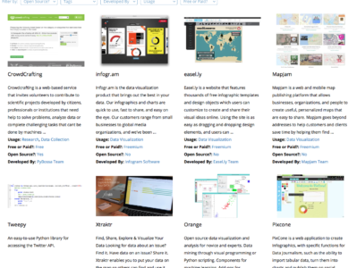
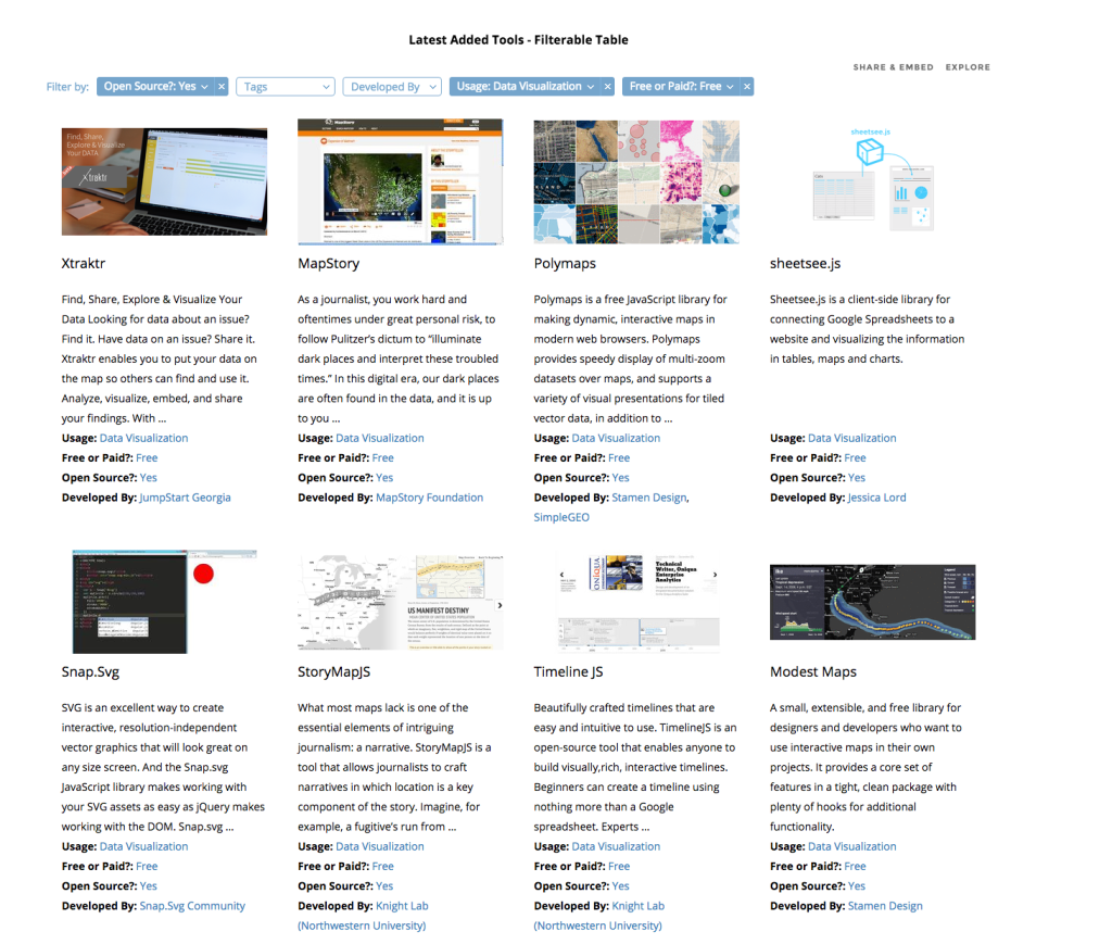
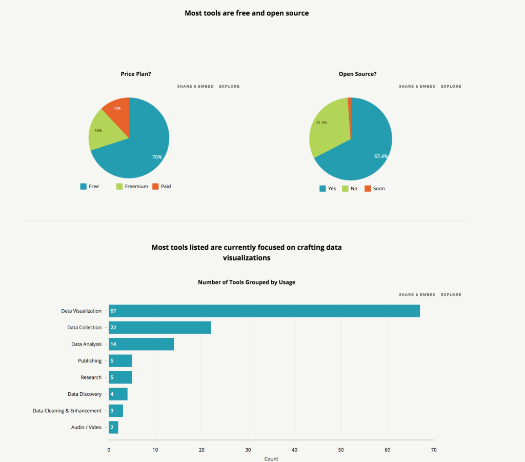
- visualize information about the tools, either as individual entries in galleries or tables or as a chart showing types of tools and other data
- have individual profiles for each tool
- generate inline filters that each time would allow me to find the tool I needed.
The project went live two weeks ago. You can find it at data-journalism-tools.silk.co. I am regularly updating the Data Journalism Tools Silk, adding about 10 new tools every week. You can go to the website to check it out, or you can also “follow” it to receive free updates via email every time something new is added.
Just as this Data Journalism Tools Silk is intended for the community, it will greatly benefit from the community’s input. For this, I’ve made a Google Form so that anyone can suggest a favourite tool.
The key thing for me is that adding real structure to data adds tremendous power to whatever presentation vector you choose to deploy. There are blogs and lists that contain many, many more journalism tools than this one. But by adding structure to each tool and putting it onto its own structured Web page, we can unlock the power of the data as a filtering, visualization and discovery tool. More structured data equals more discovery.
Alice Corona is an Italian data journalist. She received an MA of data journalism MA in The Netherlands and is currently a data journalism lead at the data and web publishing platform Silk.co. Here she regularly creates data-driven projects like “Through The Gender Lens: Analysis of 6,000 Movies”, “Playboy, Then and Now”, “Women at the International Film Festivals” and “Patents by the National Security Agency” You can email her at alice@silk.co.


