15 Well Designed Twitter Infographics


FLASHUSER

Infographics are probably the best way to show different statistics ( social media, internet marketing, online advertising etc. ) in a pleasant and enjoyable form. The infographic, in most cases, communicates complex datas in a simple and understandable fashion. With a few words and lot of stylish, fun images a well designed infographic for sure will remain for a long period of time in your memory.

Because I enjoyed much of using Twitter, I assembled some of the best infographics around this social media network. Some of them are funny, while others can help you in your Twitter bussiness process.

Sit back in your comfortable chair and enjoy this colorful list of Twitter infographics 2011. For a full-size version please click on each image or visit the source author website.

1. A Visual History of Twitter

Source: Mashable

infographic-graphics-twitter_history


2. Twitter Facts and Figures

Source: Touchagency

twitter-facts-figures

[Read more…]


Twitter: Is It All About Timing? [Infographic]

SOCIALMOUTHS (Original post can be found here)

Yes, it feels good to talk about Twitter after spending a full week discussing Facebook’s major announcement. And why not, a little bit of Google+ too.

By the way, I was just reading today’s post from Jeff Bullasand I’m happy to see that even when Facebook hijacked the Internet, Google+ was able to grow nearly 9 million in 2 days. That’s pretty impressive.

But like I said, let’s please talk about Twitter for a change.

This infographic from Lemon.ly talks about Twitter timing and I thought I’d share it with you because it seems to be a regular concern. One of the questions I often get from clients and readers is “What is the best time to Tweet?” and while I think there is no one-size-fits-all kind of answer for this, at least this data lets you visualize a trend.

For example in my case, I agree with the AM timeframe but in the PM, I find that I get the most activity and best results between 3 and 5pm. I also agree with the usage percentage by day of the week although one of my favorite days to spend on Twitter are Fridays and according to this analysis it doesn’t get the action Tuesdays get. Like I said, that’s just me, the point is that you might have your own preferences.

The important thing is that you allow yourself to test the waters.

That’s not all on the infographic, there are other interesting numbers like how many Tweets happen per second or what was the hottest event. Let’s take a look at it and share your thoughts in the comments section.

Twitter timing infographic

Infographic courtesy of Lemon.ly

Over To You

What do you think? What are YOUR best times to tweet? Are you more active on certain days of the week? Share your comments!

The Science of Social Timing [infographic]

Mind Jumpers – By Charu Dwivedi

We all post content on Facebook. Sometimes it’s well read, sometimes not, in spite of putting in our best effort and intentions. Well, apart from what we post, it is important to know when we post. In this blog post, I will attempt to highlight the different social media timing preferences and how they impact different businesses by looking at Buddy Media’s report on effective wall posts published earlier this year together with a recent infographic by Dan Zarrella atHubSpot.

To understand the impact of accurate social media timing, we earlier referred to the Buddy Media report that gave sector wise break-ups of the interest level for every post and time at which it is supposed to peak and tank.

Most effective time to post
According to the Buddy Media report, brands that post outside business hours have 20% higher engagement rates. As a result, for instance content aimed for US, Asian and European consumers will benefit from being timed differently. In the same way, every industry is said to have different traction on different days. The same report also quotes that posts show a higher engagement on a few days compared to others. For example, sports industry and automotive industry have the highest traction on Sundays whereas entertainment peaks on Thursdays and Fridays (18% higher rates). Business and finance hit high on mid week.

General observations:
– Shares on Facebook spike around 7PM, while Twitter spikes around noon.

– On Facebook, content shared on a Saturday is more effective, while Twitter gets the highest engagement mid week. Also, it is good to share 1 post in every 2 days on Facebook.

However, here is an interesting infographic on timing in social networks, which I found on Socialmediagraphics.com. It highlights consumer behaviour on different social media channels, namely Twitter and Facebook. The infographic, The Science of Social Timing, gives us insight into posting at which time to make the content most sharable.

Take a look at the infographic here:

science-of-social-timing-part-1

#Sparktweets: Wall Street Journal visualising data in tweets

NEWS:REWIRED – by Sarah Marshall

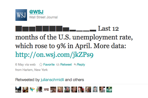
The Wall Street Journal has started using data visualisation (albeit in a fairly simple form) in tweets, using an online tool called Sparkblocks. The tweets are being called “sparktweets”.

And other so-called sparktweets have since been created:

We tracked the use of the hashtag #sparktweets using Hashtags.org:

Zach Seward’s blog explains how the Wall Street Journal’s unemployment sparktweet came about. He says that the team first tried using Unicode to display graphics in tweets, but found there were problems when viewing on Macs. [Read more…]

Breaking Bin Laden: visualizing the power of a single tweet

The shape of rumours on Twitter by Social Flow


SOCIAL FLOW

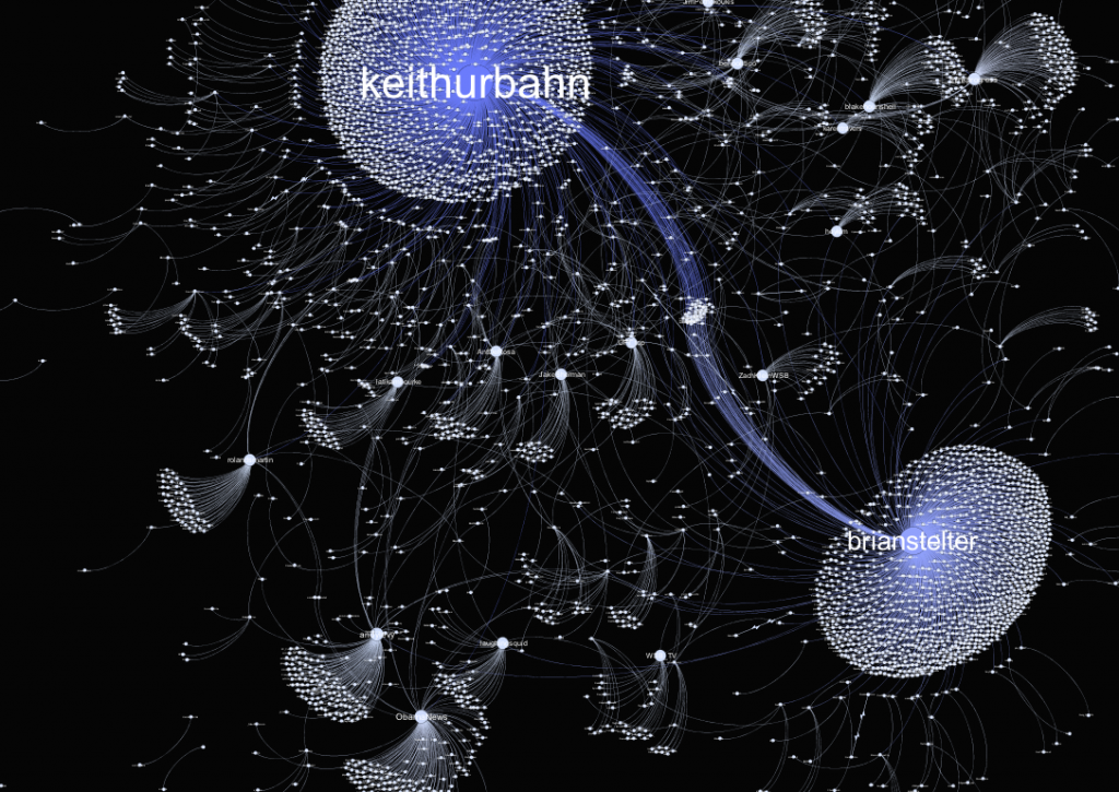
A full hour before the formal announcement of Bin-Laden’s death, Keith Urbahn posted his speculation on the emergency presidential address. Little did he know that this Tweet would trigger an avalanche of reactions, Retweets and conversations that would beat mainstream media as well as the White House announcement.

Keith Urbahn wasn’t the first to speculate Bin Laden’s death, but he was the one who gained the most trust from the network. Why did this happen?

Before May 1st, not even the smartest of machine learning algorithms could have predicted Keith Urbahn’s online relevancy score, or his potential to spark an incredibly viral information flow. While politicos “in the know” certainly knew him or of him, his previous interactions and size and nature of his social graph did little to reflect his potential to generate thousands of people’s willingness to trust within a matter of minutes.

While connections, authority, trust and persuasiveness play a key role in influencing others, they are only part of a complex set of dynamics that affect people’s perception of a person, a piece of information or a product. Timing, initiating a network effect at the right time, and frankly, a dash of pure luck matter equally. [Read more…]


The New York Times’ Cascade: Data Visualization for Tweets [VIDEO]

[youtube yQBOF7XeCE0]

MASHABLE – by Jolie O’Dell

The research and development department of The New York Times has recently been pondering the life cycle of the paper’s news stories in social media — specifically, on Twitter. Cascade is a project that visually represents what happens when readers tweet about articles.

Even now, however, Cascade is more than just a nifty data visualization. [Read more…]